- REVIEWS
Camera Reviews 
More Reviews Mobile Reviews Photography Reviews - GALLERIES
- VIDEOS
- BUYER'S GUIDES
Red River San Gabriel SemiGloss Fiber: Rich B&W, Subtle Color
Choosing the right paper for your prints is often a matter of surface texture and tone, but there’s more to it than that when printing for exhibition or display. It’s what the paper is made of, and the inks it can handle, that make the difference between a “warrantied” saleable print and one that might be used for quick display or repro. While there are no industry standards for print longevity as of yet, working with papers that could be dubbed “archival” by their very makeup is a good place to start.

The rich colors were not “infected” by the slight paper warmth, although I had to boost saturation after first proof run. Note the subtle differentiation in the highlights of the skull, something the paper reproduced to perfection. Technical info: Rolleiflex 2.8E, Fujichrome Velvia 100 film; no exposure recorded but I’d guess good old f/16 at 1/125 sec.
All Photos © George Schaub
The latest paper from Red River, San Gabriel SemiGloss Fiber, has many of the attributes you should consider when creating prints you can sell with confidence that you have done your part, at least, in maintaining print integrity over the long run. Coated on alpha-cellulose base, the paper uses a Baryta whitener layer (claimed pure barium sulfate) rather than optical brighteners (OBAs), and the company says the paper is totally acid free and is “exhibition and museum ready.”
This single-sided paper (coating on only one side) is dubbed semigloss, yet is not a “flat” gloss but shows a very slight stipple when you move it side to side. This subtle texture has the effect of breaking up any excessive sheen that might be apparent in other semigloss stock yet is only apparent when you closely examine it. The tone is slightly warm, a characteristic of Baryta/no optical brightener agent included papers, but I would characterize it as a quite neutral warmth that does not fill highlights in grayscale prints with as “toned” an appearance as warmer stock does.
The paper is hardy, at 300gsm (18 mil), thus, for most standard printers, requires a manual front (or rear, depending on printer) single-sheet load. The thickness of the stock is appreciated later, and there’s no sense that the paper will crease or yield with handling.
Lit by high ceiling lights that cast a warm and diffuse glow, the subtle nature of the color and tone was reproduced perfectly on the print. Technical info: Canon EOS 5D, EF 16-35mm f/2.8 lens; f/3.5 at 1/25 sec at ISO 800.
Print Tests
I printed on an Epson Stylus Pro 3800, a pigment-ink printer that keeps on a-tickin’. Before printing I went to the Red River Paper website and downloaded their profile for that printer. (I must say that Red River always does their homework and I have yet to test a new paper from them that did not already have profiles at the ready when the paper is released.) I went the usual download route and placed the profile in my Profiles folder on the Mac with no trouble whatsoever. I printed both color and black and white from Photoshop CS6. For the black-and-white prints I tried both the Red River and the Epson Advanced B&W profiles (Photoshop and printer-controlled color management, respectively).
I started with color and chose both a vibrant, well saturated image made from a scan of a Velvia medium format transparency shot with my Rolleiflex and a more subtle photo made under low light inside a church in Cologne shot with a Canon EOS 5D. My monitor and printer played nicely together.
While the colors were true on the more vibrant image they seemed to lack some punch. This might be unfair as Velvia is a color saturation beast, but the scan and monitor showed the colors in nearly all their glory. So I amped up saturation a bit and moved the midtone slider ever so slightly and got as true a print as I could want.
This only goes to show that sometimes certain images need a helping hand to make your perception match the reality of what’s on the paper and takes into account the “monitor boost” you’ll sometimes get with very richly saturated images. One thing that impressed me greatly was the differentiation in the white “O’Keeffeian” skull (this was from a flea market in Santa Fe). The bleached skull has “clear” white highlights (with very slight texture) and more subtle gray mottling. Every tonal differentiation showed up in the print. I was also impressed with the fact that the warmth of the paper, which is slight, did not interfere with the color look or feel or infect the bright white highlights to any degree.
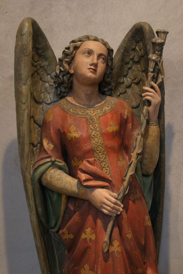
The photo of the angel carving is an entirely different type of image. The light was soft and diffuse and there were many subtle shadows throughout. The print delivered all these subtle colors and tones, and there’s no blocking in the shadows, where more intricate carving can be seen. Transfer this quality to quietly lit portraits and this paper would pay great dividends in wall prints for friends and clients.

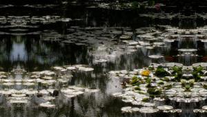
I love photographing coastal Maine with its infinite variety of forms and tones that always yield interesting subjects for abstraction. The tonal richness of the print made on the San Gabriel surface paid extra dividends and captured all the range I could desire. Technical info: Canon EOS 5D, EF 16-35mm f/2.8 lens; f/11 at 1/640 sec at ISO 250. Converted in Photoshop CS6.
Does this mean that I’d recommend this paper for more subtle and softer lit images? Not at all, as long as you are willing to proof and then enhance if need be to compensate for more brilliant and contrasty light.
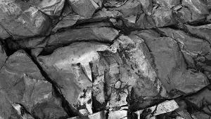
My black-and-white print tests are what finally sold me on the paper. As usual I tried out both company profiles and Epson Advanced B&W profile routes, and as usual, at least with Red River papers, both delivered gorgeous results, with the Red River profile yielding more subtle differentiation of tones and the Epson a snappier print. The image I used was an abstract from the tidal pools at Pemaquid Point on the coast of Maine that had tonal values that ranged from inky blacks to textural highlights.
I was impressed on a number of points. First and foremost are the blacks—healthy and hearty, with no mottling or muddiness. (I had recently printed this image on a fairly lightweight glossy and could really see the difference.) Midtones are separated beautifully with all the subtlety I could desire. Highlights are bright and lustrous and, as with the color images, had no “infection” of overwhelming warmth in their reproduction. The Epson profile was fine but I much preferred the Red River profile in terms of tonal separation, so be sure to use it when you print.
Conclusions
So, is it me, or do papers seem to be getting better and better? I can see using this paper for a good bunch of my black and white and low-sat grayscales (color shots with the color saturation turned way down low in processing), as well as for color portraits and scenics. The weight is just right for exhibition prints and the handling they may undergo, even though they enforce, in many printers, single-sheet printing. Overall, I certainly think you should give Red River’s San Gabriel SemiGloss Fiber a try.
The paper is available in the usual cut sheet as well as full roll sizes. Cost per sheet in a 20-sheet box of 13x19” size is about $2.60.
More information is available at www.redriverpaper.com.


![]()
Get the Latest Photo Tips, News & Reviews from Shutterbug!
| Camera Reviews Other Reviews | Mobile Reviews Photography Reviews Columns | News | Features | How-To | Resources |
 © 2026 Shutterbug
AVTech Media Americas Inc., USA
All rights reserved