- REVIEWS
Camera Reviews 
More Reviews Mobile Reviews Photography Reviews - GALLERIES
- VIDEOS
- BUYER'S GUIDES
Ilford Galerie Gold Mono Silk: Dedicated To B&W Printmakers
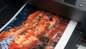
In olden times there was paper for printing color and for printing black and white. Structure, emulsions, and processing chemistry all determined how you matched media and paper, and it was all pretty self-evident. Surface choices were wider for black-and-white printmakers and while there were some choices for color (gloss, matte, semigloss) much of the surface treatment for color prints was added with sprays and varnish. Of course that’s all changed, and the “rules” regarding media and paper matching have been tossed.
Most paper companies don’t even suggest that you use a particular paper type for color or “monochrome” (which includes “toned” or even low-saturation prints), mainly I suppose because that might limit sales. And most printmakers instinctively know how paper surface will affect the look and feel of their images. That’s why I was interested to try out Ilford’s Galerie Gold Mono Silk, because as the branding suggests Ilford is specifically aiming the paper at black-and-white printmakers.
According to Ilford, “GALERIE Prestige Gold Mono Silk is a true black and white media for inkjet printers allowing photographers specializing in monochrome photography to achieve stunning images reminiscent of darkroom prints. Fans of traditional black and white products no longer need a darkroom to bring to life their black and white prints. The contrast and transition between shadow and highlight areas is seamless thanks to the unique ILFORD nanoporous coating layer technology and, coupled with exceptional Dmax and Dmin values, Gold Mono Silk is capable of delivering deep, rich blacks and bright whites.” In other words, turn off the safelight, darling, it’s time to come upstairs.
As one of those fans of traditional black and white I feel I can speak with some experience about tonality and depth of blacks and textural highlights. And I don’t need a densitometer to tell which way the wind blows. It’s got to look and feel right and match what’s in my mind for the image. Surface is not dominant (except in very flat and very high gloss) but it definitely can affect how those tones come through, and matching surface to the overall impression is an important part of the mix.
© George Schaub
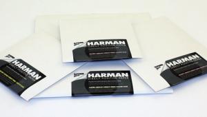
Some Specs & Comments
Before I get into comments about the paper let’s look at some specs. The paper weight is what could be dubbed “medium,” at 270 gsm, and is composed of an acid-free and lignin-free base, which qualifies it as “archival,” one of those terms that has yet to be more than a summation of characteristics rather than an industry tested and agreed-upon standard. However, optical brighteners are used, and that’s a bit of a demerit in the archival corner, as these are generally UV sensitive and can cause the print, over a long (though undetermined) period of time, to not so much fade as to lose snap.
It’s a fairly “cold” and bright neutral surface, meaning it’s bright white next to warm cotton papers. The nanoporous coating aids in ink absorption and really kicks up the acutance, or sharpness, but does give the paper a bit of an RC surface look and feel. (Ilford claims that the paper is fine for both dye and pigment inks, but I suspect most using it will work with pigment.)
© George Schaub
Printing Tests
I tested the paper on an Epson pigment-ink printer and worked only in black and white, although a one-off color image looked fine and crisp. I used both an Ilford-supplied profile (Photoshop managed) and Epson’s Advanced B&W (printer controlled) setup. I chose images that were fairly demanding in terms of tonal values, mainly to check out the deep black (Dmax) and textural highlight (Dmin) claims. My printer and monitor are in balance, and my workspace is lit appropriately, and what I see on the monitor is for the most part what I see on the final print, given the correct profile is used. I am also a faithful user of Epson’s Advanced B&W printer-controlled profile, and have used it for years in this setup to create very satisfying prints.
I downloaded the Ilford profile (www.ilford.com) for the paper matched to my printer and got to work first using that profile in Photoshop CS6. I used images that have become staples in my testing of papers so I knew what they “should” look like.
Unfortunately, just about every image I tried turned out too light. It’s not that tonality was lacking; it was more a matter of the intent of the image was missing. Yes, highlights were not entirely washed out and deep blacks were present, but the image simply did not couple or bridge them in the way to which I had grown accustomed. I attempted the same with less contrasty images and while tonality was good in the midtones I felt that the resultant prints were a bit tepid.
Ordinarily, there’s a simple fix for this, and that’s to modify the result by dialing back the brightness of the image on the screen, but again I have not had to do this with scores of prints on this setup and with these images in the past. I was sure it was not a fault of the paper itself, and more that of the profile supplied, so I switched over to Epson’s Advanced B&W (printer managed) profile and made the prints from the same set of images. That turned out to be much more successful, so all I can say is that for this printer and ink set (Epson UltraChrome K3) and this monitor that the profile supplied was not helpful.
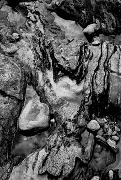
So I will judge the results on the successful prints made with the Epson profile and leave it at that. One image I use for testing is of white flowers against a deep background where highlight differentiation is key. There are very light shadows among the petals, and a few somewhat darker midtones, but the background has been burned down to a fairly deep black. The paper passed this tough test with flying colors, if you will, and the differentiation in the highlights and very light grays was palpable. The impressive part was the gradual differentiation of tones in these lighter areas, something that might not come across in repro but was certainly present in the “live” print.

© George Schaub
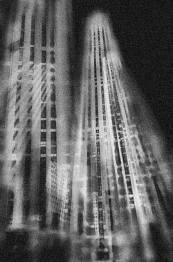
My next image was a multi-exposure of some buildings in Midtown New York, to which I had added an overall layer of grain. The key here is a considerably deeper sky than building faces and the edge sharpness and strong midtone play and separation in the windows and architectural details peeking through the noise. Again, the paper performed well in all regards and using the Epson profile matched the intent of the image very well.
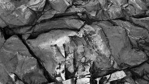
My initial print test, which to me revealed the flaw in the Ilford profile, was of details in a streambed that has a very wide range of often challenging values that range from sun-bleached rocks to deep shadows. I have worked this image considerably to bring out all that I could from these tonal values, and use it almost like a grayscale spectrum chart. The printer-controlled profile did the trick, and showed me the capabilities of this paper. The surface and values played very well together to bring out the etch-edge sharpness and tonal play that makes this image work for me.
Finally, a word about surface. Frankly, some might like it and some might not. It is semigloss (though some selling sites show it as “silk,” and it is branded as same, although for me it is decidedly not) and thus displays some of the sheen that results from moving the print side to side in bright light, but that’s the nature of this type of surface choice. This sheen tends to create an impression of gloss differential, although I must say that inks absorbed well and it is not overall bothersome. My feeling is that surface can have a profound effect on the overall print impression and smooth gloss and even semigloss is not my first choice, but that’s my prejudice. I would love to see the mix and approach of this Mono Silk paper on more surface choices in the future.
The paper is available in all the usual suspect cut sheet and roll sizes. In many printers it is light enough for stack feeding, but in some (check your printer specs) it will have to be single feed. It runs about or just under $3 a sheet in 13x19” size, 25-sheet pack on most website retailers.
For more information, contact Ilford at www.ilford.com.


![]()
Get the Latest Photo Tips, News & Reviews from Shutterbug!
| Camera Reviews Other Reviews | Mobile Reviews Photography Reviews Columns | News | Features | How-To | Resources |
 © 2026 Shutterbug
AVTech Media Americas Inc., USA
All rights reserved