- REVIEWS
Camera Reviews 
More Reviews Mobile Reviews Photography Reviews - GALLERIES
- VIDEOS
- BUYER'S GUIDES
Epson Exhibition Watercolor Paper Textured: Rich Color & Cotton Fiber To Boot
If you, like me, had come to associate “watercolor” with a stippled and rough surface, my first tip on this paper is not to be concerned with the moniker. It is a somewhat rough surface, but more in its tooth than its topography, and is more akin to high-quality painting stock than some of the stuff that had been passed off as watercolor inkjet in the past. And while this paper might be aimed at the “fine art” market (reproduction of paintings and drawings for portfolios and presentation and possible sale) it is also quite apt for photographers who want rich color on an “archival,” matte/textured surface. Epson describes the surface as “unique,” and you can feel and “hear” the surface as you run your thumb over it. I found that while the surface texture is somewhat rough it does not intrude on the ink laydown; in fact, it seems to enhance it.

All Photos © George Schaub
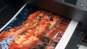
According to Epson, this 310 gsm, 22 mil paper is “100 percent cotton fiber and acid-, lignin-, and OBA-free.” Being that thick, most printers will require single sheet, front or rear feed. And because the paper is not rigid (though it is somewhat stiff) and has some play, there are times you will have to wrangle it a bit to get it to pass through in the initial setup loading. Some might need a thin support sheet as a pass-through aid; after a few runs I was able to load sheets without a skew problem. (Practice makes perfect, and some printers are more tolerant than others in this regard, and you should check if your printer handles this thickness, and how you might need to load it.)
Paper And Profile Tests
My first step was to download profiles for this stock from the Epson website, and while available for the Epson Stylus Pro 4900 I use for testing, they were not (as of this writing) specifically available for the Epson Stylus Pro 3800 I also use. Epson advised me that the 4900 profile should work fine for the 3800 (and one would assume other Epson printers) but if in doubt use the Epson Fine Art route in the page setup and pick the Watercolor-Radiant White profile.
While perhaps more generic, it worked quite well for me and that did not seem to make much of a difference in the results from the specific profile, although I must say that you might want to open shadow values a bit in processing, either when going through Raw processing or with Curves, with that generic profile. I cannot speak to other brand printers (namely Canon) and the effect of a generic “Fine Art-Watercolor” profile route, as I don’t have a Canon on which to test the paper, and vigorous searching on the Epson site did not result in me finding a profile for Canon printers for this paper anyway.
Note: My feeling is that this paper is aimed at the pro printing market and that profiles for typical enthusiast printers may not be immediately forthcoming, but you can use the above profile with confidence.
The first samples Epson showed me were very colorful and rich, but I figured they had juiced them a bit, all being fair in love and trade shows, so I purposely chose a number of rich color images to take them up on their word.
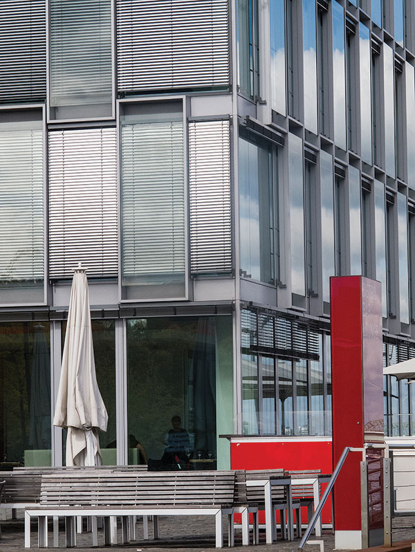
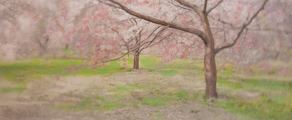
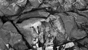
As the prints came off, what really struck me about this surface were the amazingly rich colors it produced on an ostensibly matte surface paper (it does use matte black ink). All I can say is that I have never seen such rich colors on a matte or rough surface paper. This is usually the realm of gloss and “satin” surface, but the combination of surface and profile (which determines ink laydown) was quite exciting. I worked with images that had splashes of rich color, as well as digital images of prints “worked” with pastels, and even a portrait to see if the skin tones would get too saturated. (See image captions for more.)
These are “fine art” looks regardless of subject, and while the thickness of the paper requires some special loading care, the finals are very easy to handle in terms of strength, and when you go to matte and mount them. In fact, I might even be tempted to “float” mount them without glass—the textural look is that pleasing. And, I also checked for any “dry-down” effect and, as is my usual practice, left them to cure overnight. This did not affect the color or contrast and there was no discoloration or changes that I noted. Lack of OBAs (Optical Brightening Agents) does not seem to diminish the highlight quality.

Epson dubs this paper as part of their “Signature Worthy” line, and I would agree. The paper comes in cut sheet and roll in various sizes, the cut sheet available in 8.5x11”, 13x19”, and 17x22” sizes. As you might expect, it ain’t cheap, coming in at about $5.19 per sheet in the 25-sheet 13x19” box. But given the print quality and paper’s archival “ingredients,” it could make for an excellent choice for your best images for the gallery wall, and your best clients.
For more information about this paper, contact Epson America, Inc. at www.epson.com.


![]()
Get the Latest Photo Tips, News & Reviews from Shutterbug!
| Camera Reviews Other Reviews | Mobile Reviews Photography Reviews Columns | News | Features | How-To | Resources |
 © 2026 Shutterbug
AVTech Media Americas Inc., USA
All rights reserved