- REVIEWS
Camera Reviews 
More Reviews Mobile Reviews Photography Reviews - GALLERIES
- VIDEOS
- BUYER'S GUIDES
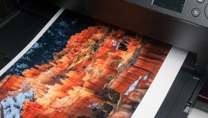
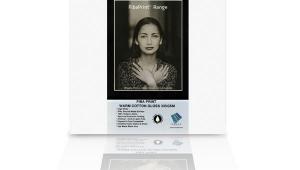
Red River Polar Matte Magna: A Cool White Art Paper
While weight is just one measure of a paper’s resilience and usefulness for fine art printing, it can also have an effect on how that paper is handled, depending on the printer. In the case of Red River’s Polar Matte Magna, which is a 96 lb (320 gsm) stock, it means working with individual sheet feeding rather than with a stack loader in almost every printer you might have. This feed-through also limits the printers that can make use of this nice surface—those without a single feed option need not apply, as well as, according to Red River’s notes, HP printers with front feed paper trays (which have also proven problematic with other heavyweight surfaces). It should also be noted that the problem is not in the paper but in the nature of the wheel feed on the printers, which makes transporting heavier stock problematic at best.
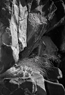
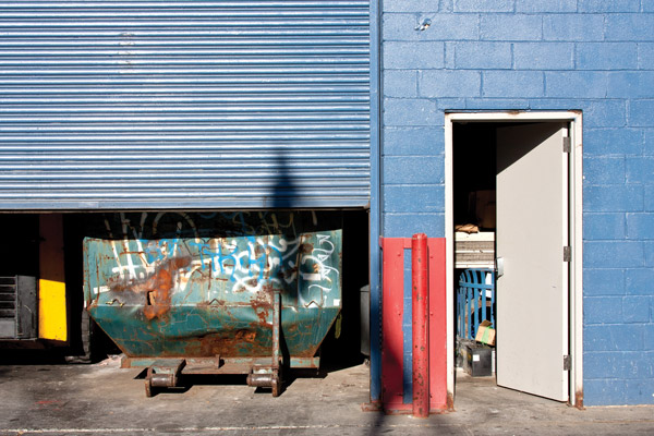
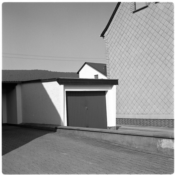
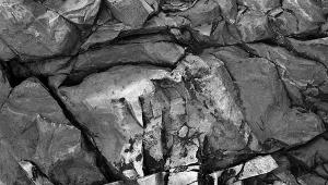
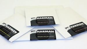
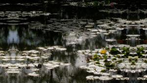
All Photos © George Schaub
Other specs of note include its microporous coating on what the company claims is acid-free paper stock, one-sided printing (the smoother side, very self-evident), and the fact that optical brighteners (OBAs) are used in its manufacture, not as unusual as you might think in a flat matte surface. The best use of this paper is with what Red River terms “higher-end desktop” units and larger printers like the Canon imagePROGRAF series, and not with dye-ink printers. In other words, this paper is specifically aimed at those who are very much into printing their own work on a mid-level and up pigment-ink printer.
What is somewhat surprising is its price: the Red River website shows the 50-sheet 13x19” package going for $75, about $1.50 per sheet, quite a bit below what one might expect.
The Tests
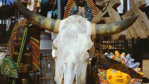
I tested using the 11x14” paper on an Epson R3000. I downloaded the profile from the Red River website and placed it in the profiles folder on my MacBook Pro. I used this as a control but also used the Red River-recommended substitute, the Ultra Premium Presentation Paper Epson profile (loaded with the R3000 printer software) and Epson’s Advanced B&W mode (with “printer controls color” chosen in the print dialog box). I printed a selection of color, monochrome, and “toned” monochrome images that were apt for, and, in some cases, not apt for a matte surface paper.
As to the different profile results, it took a good deal of perusal to see any difference in results in color printing. I chose an image where there is a slim edge of bright white next to a larger area of cream white and the paper and profile held that edge. Reds were true to the scene and even a bright and highly saturated yellow came through in a way that surprised me for a matte surface. Blues were true as well. In fact, differentiating the Ultra Premium Presentation profile print from the Red River profile was near impossible, and a flip of the coin. This doesn’t tell us much other than the profile is not finicky, at least for this printer and ink. What it does tell us clearly is that color is more vibrant than one might expect, which is a nice surprise for this surface. Perhaps it is the presence of optical brighteners in the mix, but this is a nice paper for color scenes.
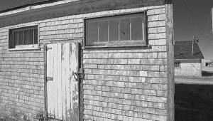
I then worked on black-and-white and monochrome “toned” images, which are my usual fare for a matte surface. I printed using the profiles described, and found that the Epson Presentation Matte profile was a tad more contrasty and warmer (and I do mean slightly), while the Polar profile was neutral and “right on” with my screen image. The Epson Advanced B&W profile was somewhere between the two, so if you want a neutral black and white that, for me, matches the screen, then the Polar profile is the one to use.

I let my prints stand open to the air overnight to cure to see if there was any darkening effect or “metamerism,” the shifting of color under different light. I did not note any particular “dry down” effect with the paper, certainly no “curing” effect, and no metamerism, the last being a tip of the hat to the Epson UltraChrome K3 inks as much as to the paper. And of course there was no bronzing, or gloss differential.
One thing I did notice is that there was a slight tendency to flatten some of the highlight and shadow areas in fully continuous toned images (not surprising on a matte surface) and that pinching in the Levels or playing with Curves a bit to kick up contrast was a good idea. I noted that I could kick up contrast more than I normally would, and very much more than I would do on a glossy or pearl surface, with no ill effect, and in fact it aided the look of the print overall without making it look harsh. But it is a fine line we walk here, so test for yourself.
The tonal differentiation on the paper is impressive, as seen in a test image I often use that has white on white shade and numerous levels of grayscale. Shadows remain open without going too flat, and highlights hold their own nicely and with excellent differentiation. Note that this applies mainly to the Polar profile on the R3000—I cannot speak to what you might get from other printers. The same goes for “colorized” or toned monochrome images. Here I find myself printing somewhat darker than I would on smoother surfaces, which seemed to aid the effect I desired.
Recommendations
In all, matte surface papers such as this have emerged from their occasionally murky depths of the past to give us a nice flat surface that yields a full range of tones, from bright white to deep shadows. True, matte surfaces can be trickier to work with, but the rewards for certain images are great. I have always felt that image content and particularly tonal range are a strong guide to choosing paper surface, and here there is no doubt that if you have images that “work” with a matte surface then you cannot go too far off the mark with the “heavyweight” Red River Polar Matte Magna. An added benefit, by the way, is that you can work the surface with color photo pencils and even graphite or charcoal for an added effect, something smoother surfaces never allow.
Comments On OBAs
There’s no question that prints with this additive have more “vivace,” a result of what I understand to be an “excitement” of the OBAs under UV light, and that might be why the color prints here look so good. It is said that over time and exposure to light that the OBA effect will fade in a print (perhaps too much excitement?) leaving a duller looking print than we might have hoped for way down the road—some say the prints will look warmer, some flatter. Others have noted that it’s difficult to find a matte surface these days without OBAs; others say at least if the prints look flatter at the outset because they lack OBAs you know what you’re getting down the road. Alas, there is no “testing” standard yet for all this, just opinion and conjecture, and in fact many matte—not pearl or semigloss—papers contain them.
For more information on sizing and pricing, contact Red River Paper at: www.redriverpaper.com.


![]()
Get the Latest Photo Tips, News & Reviews from Shutterbug!
| Camera Reviews Other Reviews | Mobile Reviews Photography Reviews Columns | News | Features | How-To | Resources |
 © 2026 Shutterbug
AVTech Media Americas Inc., USA
All rights reserved