- REVIEWS
Camera Reviews 
More Reviews Mobile Reviews Photography Reviews - GALLERIES
- VIDEOS
- BUYER'S GUIDES
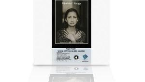
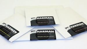
Moab “Slickrock” Metallic: High Sheen In A Medium Weight RC Paper
Having worked with numerous types and brands of “metallic” surface papers I have some expectations as to what they can deliver. Metallic is a bit of a misnomer as these papers have a glossy surface on a paper (here acid-free) base with an opalescent sheen diffused throughout the emulsion coating. This gives a spark and edge to a print that glossy shares, but there is an extra kick in the paper surface that works quite well with some images, and not so well with others. It is a particular choice, one that should be part of your printing arsenal but hardly dominated by it.

I generally feel it is best to ignore marketing copy, but sometimes it’s fun to see how folks spin their yarn. Moab’s has always been somewhat transcendent, here telling us that the surface is “reminiscent of the ultra-smooth and slick sandstone surface of the famous bike trail that loops through the desert plains of Moab…” Well, never having done the loop that may well be so, but if so the bike’s tires better have crampons, since this surface is quite slick. What is more to the point is that the copy makes a more straightforward claim that “black-and-white images shine on this new paper producing deep blacks and ultra-bright highlights.” That, and other matters, was the subject of my printing tests.
Like all Moab papers, the company offers ICC profiles online, so I downloaded the profile for the Epson 3800 I used in the test. Once you download the profile you just drag it into the appropriate folder on your machine (instructions are included on the download page) and it shows up in the print driver. There are numerous printers listed for Mac and PC OS.
This is a medium weight paper (260 gsm/12 mil), so it has some handling heft. Do be careful with how you touch the surface because like all papers, and gloss in particular, it can fingerprint fairly easily. It can be loaded in the cut sheet slots of my (and most) printers and it’s single sided so you should have little difficulty knowing which end is up and how to load it into your printer. It can be used in both dye and pigment-ink printers, but Moab recommends pigment. I did not have a dye ink printer to do a comparison.
I made a number of color and black-and-white prints, choosing images that I thought might work best on this surface. My feeling is that some papers narrow your choices in image selection and this is especially true in metallics. But the hope is that the surface will bring something extra to the image that other papers will not. I worked with graphic monochrome, bright and wide-ranging color, a soft portrait, and full-scale black-and-white images. I printed using Moab’s ICC profile, the Epson Pro Luster profile (which I have always found works best on metallics of all the Epson driver canned profiles for my setup), and Epson’s Advanced B&W printing profile mode in both neutral and cool versions, feeling that sepia and this paper are not a match made in visual heaven.
I show the images here for reference and to indicate the kinds of images I choose for this type of surface. Note that my monitor and printer are well in tune and prints match what I see on screen, given that profile and color management, etc. are properly done. Which brings us to an important part of the workflow that needs to be included when working with this paper—soft proofing.
When you open an image at first it looks how you processed it. But when you soft proof and work with the profile you loaded for the paper you see how the paper/ink/profile combo will actually look when all is said and done. For example, one of the images for my test is a portrait of Kallie Polgrean I often use in the testing of metallic paper. It is a diffuse, fairly high-key shot that I have processed with low color saturation that looks great on a metallic surface. Image #1A is how I processed it and how I want it to print. Now look at Image #1B. This is how Slickrock paper and the Moab profile “see” this image as processed and will print it.

All Photos © George Schaub
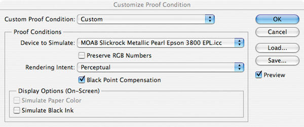
To get to the soft proof view first load the profile, then in Photoshop go to View>Soft Proof>Custom. You then get a dialog box (#1C) that allows you to indicate the profile you will set in the print dialog box. You then get a look at how the combo will produce the image, which it did later when using the Moab profile.
So, to use this paper (and others) properly you have to know how the setup sees it so you won’t freak out when the paper comes marching out of the printer later.
I then printed the portrait with two profile options—one using my go-to profile for metallics, Epson Pro Luster, and the other the Moab profile. Both matched the print emotionally, that is, with a high-key mood to catch the glow these paper surfaces can impart. But as seen in the Moab profile soft proof the print came out way too color saturated for me, while the Luster profile maintained the look of the processed image. At that point I had a choice—stick with the Luster profile to maintain the look of the image (and the paper nailed it) or work back from the Moab profile via the soft proof to the look I wanted and had processed for in the past.
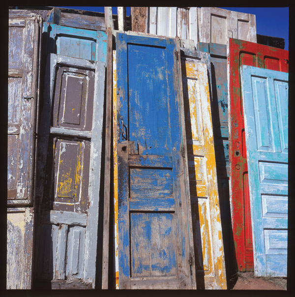
I wanted to make sure that this was not just some quirk in the portrait file so I moved on to a very colorful shot of painted doors (#2) found at a flea market. I printed using both the Epson Pro Luster and Moab Slickrock profiles with Photoshop managing color and no color management checked. The Slickrock-profile print is more dazzling, but there is something exaggerated, even garish about it, as if someone had pumped up the blue in particular and color saturation in general. The colors looked, well, effervescent. Again, soft proofing solved this visual dilemma, as did using the Epson Pro Luster profile.
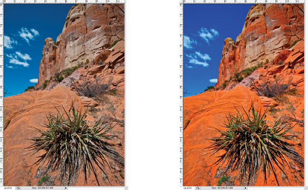
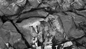
I was convinced that the main difference was in saturation, so I opened a red rock canyon shot (not made in Moab) and processed in my standard way (#3A). I then used soft proofing to see how the Moab profile perceived it and got the red-hot colors you see here (#3B). To convince myself that the saturation was the “culprit” I opened a hue/saturation adjustment layer and dropped the saturation as you see here (#3C) and voila, the image looked (and printed) as I initially processed it.

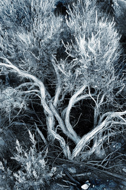
When you test it’s good to always dig deeper and I did so with a duotone file, a blue graphic of a sage bush (#4). The Epson profile reproduced the blue I had on screen and had mixed in duotones, but the Moab profile in soft proofing looked like the blue had been mixed with a very healthy dose of bright cyan, making it a more “cheery” blue than the “neutral” dark blue I had created for this image.
In short, the Moab profile is quite aggressive in terms of color, at least in images I have processed and have in my files. I have seen shifts when going from glossy to matte or luster, but never, in the color realm, shifts this pronounced. It must be a product of this paper and its surface, and while this characteristic can be exploited for some quite explosive color images, not knowing about soft proofing, or not having it available as a pre-printing check, might make this a frustrating experience for some. In fact, if you do not have soft proofing in your software my advice would be to stick with the Epson Pro Luster, or similar profile that works for you.
In other words, I would test a number of profiles in your printer to see what matches what you have on screen. For me the Moab profile was trying to make everything color rich, which may be apt for this surface and some images but is not what I had in mind and certainly did not match the screen image I saw, and I didn’t always feel like dropping back saturation to tame this fauvist tendency.
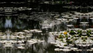
I then turned to black-and-white prints, looking to see if Moab’s claims for the surface and how it enhanced black and white rang true. My first image (#5) was of some plants marooned in the dunes at White Sands National Monument. There’s no question that the Slickrock surface gave the prints a special look, and that the silvery sheen of the paper enhanced the image. And when I soft proofed the image it stayed as it came up on the screen and did not shift in tonality, color cast, or contrast.
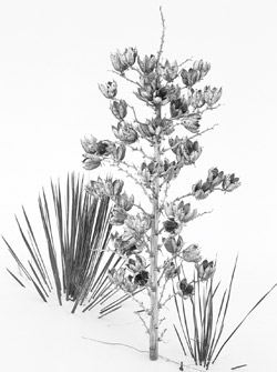
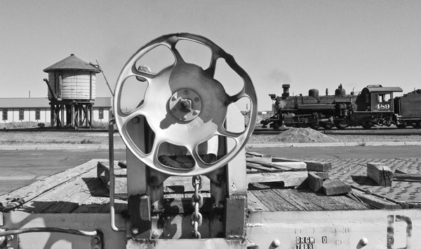
I tried other profiles. The Epson Advanced B&W mode profile produced the most contrasty version of the lot. The Moab profile was best of all, producing a wide range of open tones and no color cast. The same held true of the photo made in the Cumbres & Toltec train yard in southern Colorado (#6). Here I tried Epson’s Advanced B&W mode in both neutral and cool tints, and Luster and Moab profiles. The Moab produced the most open values in the shadows with good highlight tone and in fact matched the tonal coloration of the neutral Epson B&W mode and the Epson Luster. There was no sense of tonal over-richness I saw in the color shots with the Moab profile. If you use this paper for black and white I’d stick with the Moab profile all the way.
Yielding tonally rich and true images from files is laudable, and this paper and profile does so for black-and-white images. If using it for color then be sure to soft proof or, if you have no such feature, use another profile that has worked for you in the past with luster-surface paper. The question remains whether you are a fan of that extra sparkle that metallic papers impart. For some it will be just the touch they might have been looking for; for others, it might seem a bit of a gimmick, though here the trick is not necessarily splashy and a bit more refined than an all-out special effects paper per se. If you find that you are in the former group then the Moab Slickrock Metallic might be just the paper you have been seeking.
Technical Specifications
Weight: 260 gsm/12 mil
Brightness: 80 percent ISO
Surface: Resin coated, acid-free, single sided
Cost: 50-sheet box of 8.5x11”: $49.98; 50-sheet box of 13x19”: $139.98. Also available in larger sheet and roll sizes.
For more information, contact Moab at: www.moabpaper.com.


![]()
Get the Latest Photo Tips, News & Reviews from Shutterbug!
| Camera Reviews Other Reviews | Mobile Reviews Photography Reviews Columns | News | Features | How-To | Resources |
 © 2026 Shutterbug
AVTech Media Americas Inc., USA
All rights reserved