- REVIEWS
Camera Reviews 
More Reviews Mobile Reviews Photography Reviews - GALLERIES
- VIDEOS
- BUYER'S GUIDES
Photo Paper Reviews
Sort By: Post DateTitle Publish Date
|
Jul 01, 2009
|
Oct 01, 2013 |
First Published: Sep 01, 2013

|
Apr 20, 2012
|
Jun 02, 2015
|
Oct 27, 2011 |
First Published: Sep 01, 2011
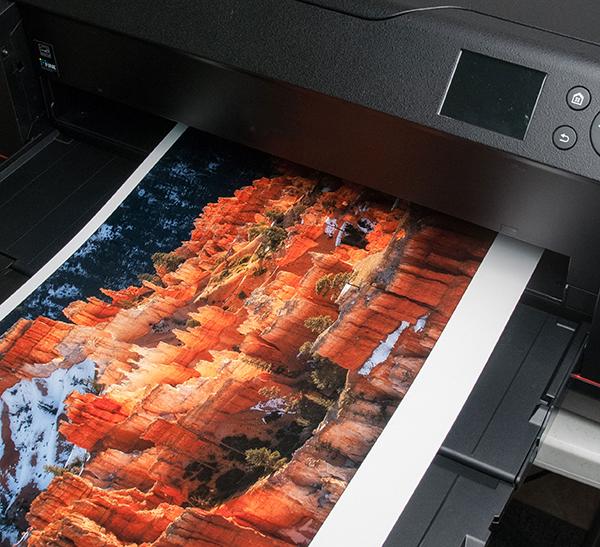
 Let’s face it—some images just look better on a glossy surface. Yet, some folks spurn gloss for its “commercial” cachet and snapshot aesthetic. For those who prefer a “crisp” look to their prints but eschew gloss for practical and aesthetic reasons, a paper like the new Lasal Exhibition Luster could do the trick. Replacing Moab’s former Lasal Photo Luster (a 270 gsm paper vs. this one’s 300 gsm), this Resin-Coated (RC) paper has a bright white base, is flexible yet strong, and touts a new coating technology that the company claims yields improved scratch resistance and enhanced “opacity.” The paper is affordable for its class, with letter-size paper well below $1 per sheet (in 50-sheet packs), 13x19” at slightly under $2 a sheet, and a 17”x100’ roll at $143, all quoted from the company’s website.
|
Jul 07, 2011 |
First Published: Jun 01, 2011
|
Jul 31, 2012 |
First Published: Jun 01, 2012
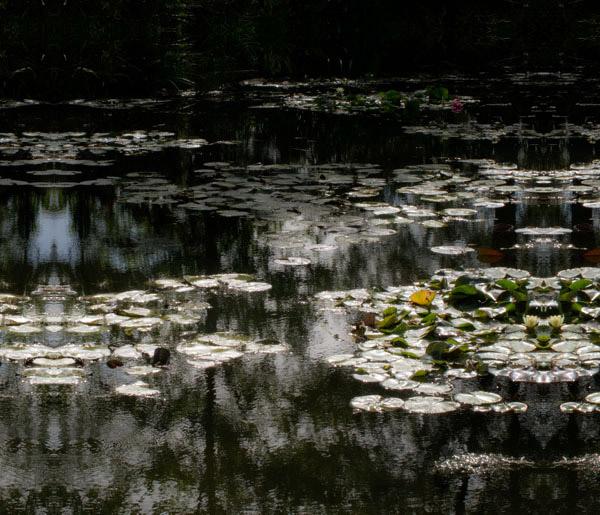
 Having worked with numerous types and brands of “metallic” surface papers I have some expectations as to what they can deliver. Metallic is a bit of a misnomer as these papers have a glossy surface on a paper (here acid-free) base with an opalescent sheen diffused throughout the emulsion coating. This gives a spark and edge to a print that glossy shares, but there is an extra kick in the paper surface that works quite well with some images, and not so well with others. It is a particular choice, one that should be part of your printing arsenal but hardly dominated by it.
|
Aug 29, 2017
|
Sep 01, 2003
|
Mar 01, 2002
|
Jul 31, 2015

|
Sep 01, 2008

|
Dec 15, 2015
|
Dec 12, 2012

|
Dec 19, 2011 |
First Published: Nov 01, 2011
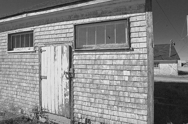
 There’s no question that glossy and satin or pearl-type surfaces give an image more “pop,” but on the other hand you might want to use a matte surface to enhance the look and feel of certain images that rely less on pop than a quieter mood. It could be boiled down to a simple rule of thumb: for rich, high-saturation images you might use a glossy or semigloss; for more subtle colors it might be better to use a matte or satin. In the black-and-white realm it’s more of a toss-up but I think the same general rule applies. For example, for architectural images of adobe or stucco wall buildings I use matte; for glass and steel skyscrapers I choose glossy. Notice that I always modify the recommendations with “might”: if you really get into papers for printing you’ll make your own judgments. But there’s no denying that surface decisions play a role in overall effectiveness of the image.
Pages
PHOTO OF THE DAY

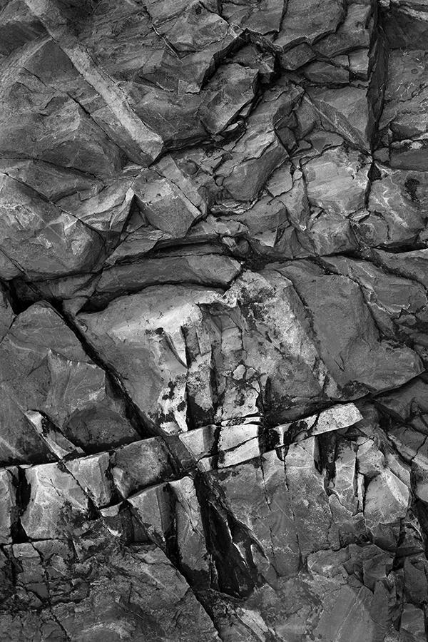
Today’s photo is Shake Out by Linn Smith
eNEWSLETTER SIGNUP
![]()
Get the Latest Photo Tips, News & Reviews from Shutterbug!
| Camera Reviews Other Reviews | Mobile Reviews Photography Reviews Columns | News | Features | How-To | Resources |
 © 2026 Shutterbug
AVTech Media Americas Inc., USA
All rights reserved