- REVIEWS
Camera Reviews 
More Reviews Mobile Reviews Photography Reviews - GALLERIES
- VIDEOS
- BUYER'S GUIDES
|
Sep 14, 2012 |
First Published: Aug 01, 2012

|
Aug 15, 2012 |
First Published: Jul 01, 2012
|
Jun 08, 2012
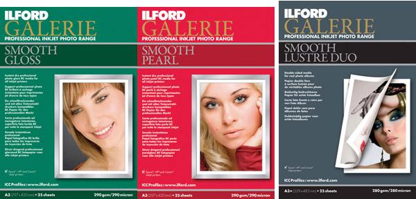
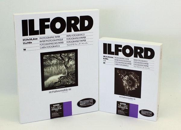
 Ilford has relaunched their Galerie brand of inkjet papers, with one segment dubbed their “Prestige” brand. This is a first hands-on test of their Galerie Prestige Smooth High Gloss 215 gsm, based on pre-launch samples I was supplied.
|
Jul 31, 2012 |
First Published: Jun 01, 2012
 Having worked with numerous types and brands of “metallic” surface papers I have some expectations as to what they can deliver. Metallic is a bit of a misnomer as these papers have a glossy surface on a paper (here acid-free) base with an opalescent sheen diffused throughout the emulsion coating. This gives a spark and edge to a print that glossy shares, but there is an extra kick in the paper surface that works quite well with some images, and not so well with others. It is a particular choice, one that should be part of your printing arsenal but hardly dominated by it.
|
Apr 20, 2012
|
Dec 19, 2011 |
First Published: Nov 01, 2011
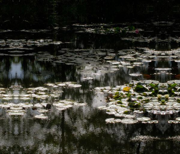
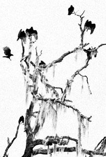
 There’s no question that glossy and satin or pearl-type surfaces give an image more “pop,” but on the other hand you might want to use a matte surface to enhance the look and feel of certain images that rely less on pop than a quieter mood. It could be boiled down to a simple rule of thumb: for rich, high-saturation images you might use a glossy or semigloss; for more subtle colors it might be better to use a matte or satin. In the black-and-white realm it’s more of a toss-up but I think the same general rule applies. For example, for architectural images of adobe or stucco wall buildings I use matte; for glass and steel skyscrapers I choose glossy. Notice that I always modify the recommendations with “might”: if you really get into papers for printing you’ll make your own judgments. But there’s no denying that surface decisions play a role in overall effectiveness of the image.
|
Oct 27, 2011 |
First Published: Sep 01, 2011
 Let’s face it—some images just look better on a glossy surface. Yet, some folks spurn gloss for its “commercial” cachet and snapshot aesthetic. For those who prefer a “crisp” look to their prints but eschew gloss for practical and aesthetic reasons, a paper like the new Lasal Exhibition Luster could do the trick. Replacing Moab’s former Lasal Photo Luster (a 270 gsm paper vs. this one’s 300 gsm), this Resin-Coated (RC) paper has a bright white base, is flexible yet strong, and touts a new coating technology that the company claims yields improved scratch resistance and enhanced “opacity.” The paper is affordable for its class, with letter-size paper well below $1 per sheet (in 50-sheet packs), 13x19” at slightly under $2 a sheet, and a 17”x100’ roll at $143, all quoted from the company’s website.
|
Oct 24, 2011 |
First Published: Sep 01, 2011
|
Jul 07, 2011 |
First Published: Jun 01, 2011
|
Mar 01, 2011
|
Feb 01, 2011
|
May 01, 2010

Compact Camera NewsCompact Camera ReviewsDSLR NewsDSLR ReviewsFilm Photography NewsLens NewsLens ReviewsMedium Format Camera NewsMedium Format Camera ReviewsMirrorless Camera NewsMirrorless Camera ReviewsNewsPhoto Paper NewsPhoto Paper ReviewsPrinter NewsPrinter ReviewsVideo Camera NewsVideo Camera Reviews
Pages
PHOTO OF THE DAY

Today’s photo is Shake Out by Linn Smith
eNEWSLETTER SIGNUP
![]()
Get the Latest Photo Tips, News & Reviews from Shutterbug!
| Camera Reviews Other Reviews | Mobile Reviews Photography Reviews Columns | News | Features | How-To | Resources |
 © 2026 Shutterbug
AVTech Media Americas Inc., USA
All rights reserved