George Schaub

Sort By: Post Date | Title | Publish Date
George Schaub  |  Dec 15, 2015  |  0 comments

Print surface decisions are usually conditional, that is, they depend on the look you want for each image and how you might intend to display the print later. There is a general wisdom that states that glossy surfaces make prints look “sharper” and matte makes them look “softer”, although that softness is more in overall tone and mood (and ink dispersion) than edge definition.

George Schaub  |  Dec 12, 2012  |  0 comments

While weight is just one measure of a paper’s resilience and usefulness for fine art printing, it can also have an effect on how that paper is handled, depending on the printer. In the case of Red River’s Polar Matte Magna, which is a 96 lb (320 gsm) stock, it means working with individual sheet feeding rather than with a stack loader in almost every printer you might have. This feed-through also limits the printers that can make use of this nice surface—those without a single feed option need not apply, as well as, according to Red River’s notes, HP printers with front feed paper trays (which have also proven problematic with other heavyweight surfaces).

George Schaub  |  Dec 19, 2011  |  First Published: Nov 01, 2011  |  0 comments

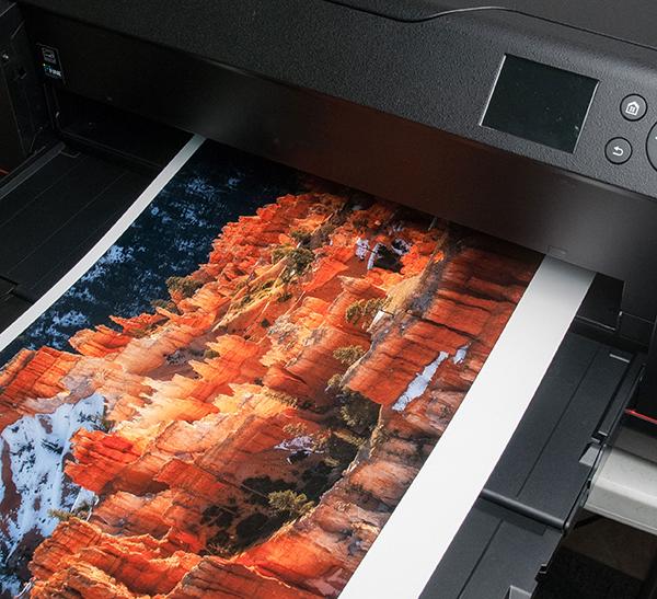
There’s no question that glossy and satin or pearl-type surfaces give an image more “pop,” but on the other hand you might want to use a matte surface to enhance the look and feel of certain images that rely less on pop than a quieter mood. It could be boiled down to a simple rule of thumb: for rich, high-saturation images you might use a glossy or semigloss; for more subtle colors it might be better to use a matte or satin. In the black-and-white realm it’s more of a toss-up but I think the same general rule applies. For example, for architectural images of adobe or stucco wall buildings I use matte; for glass and steel skyscrapers I choose glossy. Notice that I always modify the recommendations with “might”: if you really get into papers for printing you’ll make your own judgments. But there’s no denying that surface decisions play a role in overall effectiveness of the image.


George Schaub  |  May 20, 2014  |  First Published: Apr 01, 2014  |  0 comments

Choosing the right paper for your prints is often a matter of surface texture and tone, but there’s more to it than that when printing for exhibition or display. It’s what the paper is made of, and the inks it can handle, that make the difference between a “warrantied” saleable print and one that might be used for quick display or repro. While there are no industry standards for print longevity as of yet, working with papers that could be dubbed “archival” by their very makeup is a good place to start.

George Schaub  |  Aug 01, 2007  |  0 comments

As many of you know a dear friend and colleague left us not too long ago. The passing of someone close to us always gives us pause to consider how precious, and fragile, life is. Monte Zucker was one of the most talented photographers and educators I ever had the pleasure to know.

His energy, enthusiasm, and sense of sharing his craft was amazing, and inspirational.

George Schaub  |  Jan 01, 2005  |  0 comments

In this issue we bring you our photokina report, a series of articles from our reporters who covered the huge photo show held this past fall in Cologne, Germany. Exhibitors from over 150 countries covering every aspect of the photo and imaging trade were there, and we spent five days trekking the massive halls, speaking to engineers, designers, and marketing folk about the new...

George Schaub  |  Feb 01, 2011  |  0 comments

Every digital image starts out as a color image, an RGB that, when shot in Raw format and loaded as a 16-bit file, contains millions of color and brightness codes. These codes, or pixel addresses, can be manipulated in many ways using presets or “manual” adjustments to create looks that range from “true” to highly stylistic interpretations of the content within the image.

George Schaub  |  Nov 16, 2011  |  0 comments

On-board image processors have become more powerful and diverse in their functions, and cameras like the Ricoh GR Digital IV ($649) offer more than just point and shoot still and video recording. Indeed, the Ricoh seems designed to appeal to those who would rather have their special effects in hand than take the time to apply them later. But the camera offers more than just tricks, though there are plenty of those, and its portability, ease of use and flexibility might appeal to those who want to go beyond cell phone snapshots and effects. Its fast, fixed focus lens, aperture- and shutter-priority exposure modes and a host of Scene modes that go beyond the norm make it a fascinating study in the state of photography today.

George Schaub  |  Jul 01, 2001  |  0 comments

Point-and-shoot zoom ranges keep getting more impressive. Not long ago the 35-105mm was the king; now, with Samsung's Maxima Elite 170QD we have a 4.4x zoom that stretches out to a rather incredible 170mm. Of course, point-and-shoot...

George Schaub  |  Jan 05, 2011  |  0 comments

The Samsung NX100 is the compact version of Samsung’s new NX-CSC-system. The camera has a retro design that looks like a classical view finder camera but is a modern digital system with a large LCD screen on the back. The superb AMOLED screen uses 614,000 RGB dots and displays a very brilliant image. The camera offers a standard accessory shoe on the top and a special digital interface right below the shoe. Samsung offers a lot of accessories for the N100: The most important attachment are the optional electronic view finder ED-EVF10, the GPS-tracker ED-GPS10 and two flash systems.

...

Pages

X