George Schaub

Sort By: Post Date | Title | Publish Date
George Schaub  |  Jan 01, 2002  |  1 comments

Weighing in at just under 12 oz with a size of 5x3.4x2.4", the compact Minolta Maxxum 5 could be considered a downsized 35mm SLR, at least when compared to some of the bulkier pro models. But this size and weight belies the...

George Schaub  |  Feb 15, 2005  |  0 comments

Handcolorists have been doing it for years. They began with a black and white
image and using photo oils, chiefly from the Marshall Company (distributed by
BKA Group) added selective color or entirely covered a monochrome image with
color. This was often practiced with portraits, but began to find followers
in the "fine arts" arena as well. We've seen this so-called
mixed-media trend come and go, and I don't think hand-coloring will ever
go out of style. Digital has opened up many new doors for creativity, and because
you can manipulate images with ease it allows you to emulate any look, style
or technique that you might admire. In this lesson we'll take a look at
"colorizing" an image and mixing color with black and white.

...

George Schaub  |  Jun 02, 2015  |  0 comments

Moab’s Juniper Baryta Rag 305 is a double-weight, 100% cotton inkjet paper with a “true baryta base,” which refers build-wise to the inclusion of barium sulfate in the mix but aesthetics-wise to having the look and feel of traditional silver-based darkroom printing papers. While that descriptive reference might be more poetic than experiential for many folks these days, it is a good thing. Its weight, richness and tonal depth separate it from many RC-type inkjet papers, plus it has one more laudable characteristic: lack of OBAs (optical brightening agents), those brighteners used in many papers that help give them a stark, cold white base coat.

George Schaub  |  Oct 27, 2011  |  First Published: Sep 01, 2011  |  0 comments

Let’s face it—some images just look better on a glossy surface. Yet, some folks spurn gloss for its “commercial” cachet and snapshot aesthetic. For those who prefer a “crisp” look to their prints but eschew gloss for practical and aesthetic reasons, a paper like the new Lasal Exhibition Luster could do the trick. Replacing Moab’s former Lasal Photo Luster (a 270 gsm paper vs. this one’s 300 gsm), this Resin-Coated (RC) paper has a bright white base, is flexible yet strong, and touts a new coating technology that the company claims yields improved scratch resistance and enhanced “opacity.” The paper is affordable for its class, with letter-size paper well below $1 per sheet (in 50-sheet packs), 13x19” at slightly under $2 a sheet, and a 17”x100’ roll at $143, all quoted from the company’s website.
 

Being an RC paper, the company says you can print using either dye or pigment-ink printers, although it says pigment is preferred. Lacking a dye printer our print runs were done using an Epson 3800 (pigment) printer using Epson (Premium Luster) and Moab ICC profiles, and both Photoshop and Epson printer controls. Color and black-and-white images of landscapes, people, and graphics were chosen for the tests. Prints were left overnight to cure, although we note that prints were instant dry and the paper showed no signs of ink “wetness” sometimes seen with fiber-based papers right off the press, and there was no dry down effect perceived. Prints were made with Photo Black ink settings.

George Schaub  |  Jul 07, 2011  |  First Published: Jun 01, 2011  |  0 comments

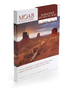
Inkjet printmakers have nothing to complain about when it comes to paper choices. There are glossy, semigloss, and matte surface papers galore, each with their own charm and cachet. Regarding the latter aspect, Somerset is no slouch, having established a reputation in both inkjet and other art papers many years back.

Their latest entry into the inkjet market is Somerset Museum Rag, distributed by Moab. This 100 percent cotton, 300 gsm paper displays a smooth matte surface, a considerable, but not yellowish warm tone, and while strong and fairly thick, is actually quite supple. The paper is single-sided, which means the tooth is on one side only, and telling the printable from the backing side is not something that will be immediately apparent. For that reason the packaging comes with a stick-on label that says “printable THIS SIDE.” You would do well to keep the original cellophane packaging until you get a good feel for the surfaces. I found that if you rub your thumb along the surface the differences become clear, with the printable surface evoking somewhat of a higher pitch.

George Schaub  |  Jul 31, 2012  |  First Published: Jun 01, 2012  |  0 comments

Having worked with numerous types and brands of “metallic” surface papers I have some expectations as to what they can deliver. Metallic is a bit of a misnomer as these papers have a glossy surface on a paper (here acid-free) base with an opalescent sheen diffused throughout the emulsion coating. This gives a spark and edge to a print that glossy shares, but there is an extra kick in the paper surface that works quite well with some images, and not so well with others. It is a particular choice, one that should be part of your printing arsenal but hardly dominated by it.
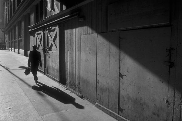
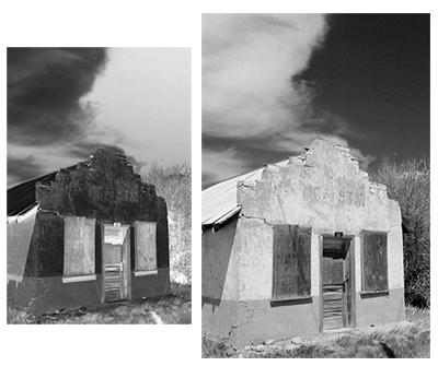
 

I generally feel it is best to ignore marketing copy, but sometimes it’s fun to see how folks spin their yarn. Moab’s has always been somewhat transcendent, here telling us that the surface is “reminiscent of the ultra-smooth and slick sandstone surface of the famous bike trail that loops through the desert plains of Moab…” Well, never having done the loop that may well be so, but if so the bike’s tires better have crampons, since this surface is quite slick. What is more to the point is that the copy makes a more straightforward claim that “black-and-white images shine on this new paper producing deep blacks and ultra-bright highlights.” That, and other matters, was the subject of my printing tests.

George Schaub  |  Dec 11, 2012  |  3 comments

When a photographer deals with the emotions generated by black-and-white prints, and the methodology of creating and defining those emotions and how they are generated, he or she begins to deal with developing a sense of the aesthetics of the monochrome image.

George Schaub  |  Dec 24, 2012  |  0 comments
While black and white digital photography is based on the conversion of a color (RGB) image to monochrome via software, those who remain adherents of film photography have an entirely different route to obtaining a black and white image.
George Schaub  |  Dec 26, 2012  |  16 comments

While black and white digital photography is based on the conversion of a color (RGB) image to monochrome via software, those who remain adherents of film photography have an entirely different route to obtaining a black and white image.

George Schaub  |  Dec 16, 2012  |  4 comments

The reaction to a human face is inherently stronger than to any inanimate object or arrangement. The expression, body language, placement and lighting often overcome the processing and/or printing technique, or at the least dictate much of the approach.

Pages

X