- REVIEWS
Camera Reviews 
More Reviews Mobile Reviews Photography Reviews - GALLERIES
- VIDEOS
- BUYER'S GUIDES
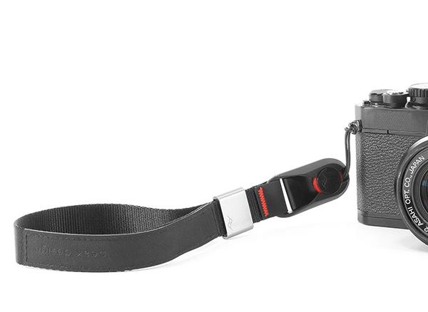
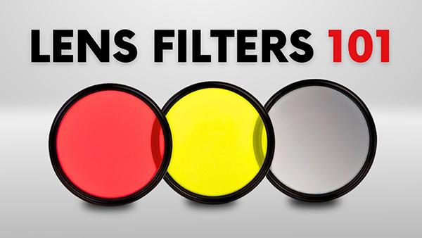
Photo Accessory Reviews
Sort By: Post DateTitle Publish Date
|
Sep 19, 2013

|
Sep 14, 2017
|
Jan 03, 2025

|
Jun 14, 2024

|
Dec 16, 2022


|
Jul 31, 2015

|
Oct 02, 2020
|
Sep 06, 2012 |
First Published: Aug 01, 2012
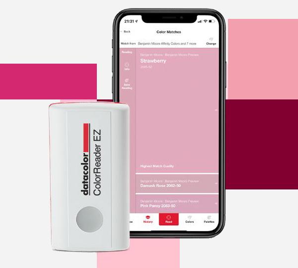
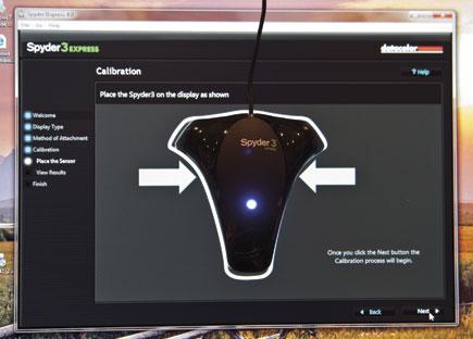
 One of the most common complaints about digital imaging is the lack of consistency when going from one device to another—most commonly screen to print. Dark prints are the typical complaint, but color shifts are also a contributor to choice language and lack of hair. Yes, we tweak the image until the sky is that perfect hue of blue, or the skin tones have just the right amount of warmth and vibrancy. When it’s all done, the image is posted online or printed and it looks nothing like what we expected. The image is too dark, skin tones are too red, any number of problems. Where did it go wrong?
|
Oct 10, 2019

|
Oct 01, 2010

Pages
PHOTO OF THE DAY

Today’s photo is Shake Out by Linn Smith
eNEWSLETTER SIGNUP
![]()
Get the Latest Photo Tips, News & Reviews from Shutterbug!
| Camera Reviews Other Reviews | Mobile Reviews Photography Reviews Columns | News | Features | How-To | Resources |
 © 2026 Shutterbug
AVTech Media Americas Inc., USA
All rights reserved