- REVIEWS
Camera Reviews 
More Reviews Mobile Reviews Photography Reviews - GALLERIES
- VIDEOS
- BUYER'S GUIDES
Easy Infrared; Create Your Own From Any Color Image File
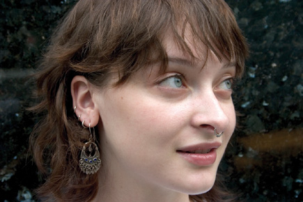
You can start with a scan of any color slide, print, or negative you've shot with your film camera or, even easier, with a color file from your digital camera. If you're starting with a print, negative, or slide, scan it in RGB color mode. Once you've got the digital file, open it in Adobe Photoshop CS (or some earlier versions) to follow the steps outlined here. You can also achieve the effect with Adobe Elements 2 or other advanced image-editing programs, but the names of some tools or dialog boxes may be slightly different. Always work on a copy to preserve your original scan. In fact, with this technique, it is a good idea to make two or three copies in order to try different settings in search of the effect you like best. Just follow these steps and you'll be on your way to easy IR.
 |
|
|
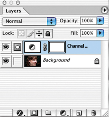
1) Open a copy of your color file in Photoshop #1. First, we'll convert it to black and white. By doing this with an Adjustment Layer, we never change the original pixels and can go back and make further changes as desired at any time. To add an Adjustment Layer, from the menu bar choose Layer>New Adjustment Layer>Channel Mixer, #2. A dialog box appears naming the new layer Channel Mixer 1. Click OK and you'll bring up the Channel Mixer dialog box, #3. This is a powerful tool to make black and white conversions (among other uses).
 |
|
|
First, check the Monochrome box at the lower left of the Channel Mixer. This will change the Output Channel at the top to "Gray" ("Black" in Photoshop 5), indicating that you are outputting a gray scale black and white image. The Channel Mixer allows you to decide which amounts of the red, green, and blue channels will be used to create a black and white image. Begin with a high setting for red. Don't worry if your screen goes totally white or black during these operations--as you move the other sliders, you'll regain more normal tonalities.
 |
|
|
Try setting the red all the way
to +200, then take the blue down to --60 or --75. The green middle
slider might go from --40 to +30, all depending on the image. Experiment
with many different mixes, and try the sliders throughout their full range.
However, you'll probably want to keep the red at least +100 to +120 minimum.
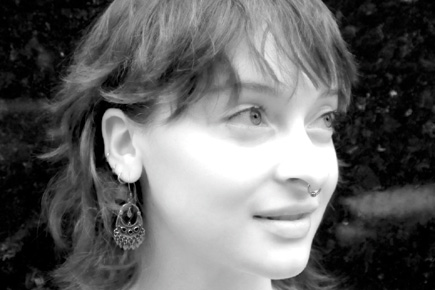
2) For this portrait, I set the red to +200, the green to --38,
and the blue to --60, #4. For a different portrait, +120 red, +32 green,
and --75 blue worked best. As you make the adjustments, you'll begin
to see the IR effect: In theory, you should adjust the percentages so that their
total equals 100 percent. This is not a hard and fast rule, though, and I often
find settings outside this range work well. The Constant slider near the bottom
of the Channel Mixer dialog box changes brightness. While I usually prefer to
leave it at 0, you may find it useful when the final mix of percentages is more
or less than 100 percent.
 |
|
|
Here's a tip:
If you have adjusted the sliders for a look you like, but the image is a bit
dull or low in contrast, try adding a Levels or Curves Adjustment Layer, then
using it to pump up the contrast.
3) Images made with Kodak High Speed IR film often have an
eerie glow, partially caused by film halation. Now it's time to add that
IR glow effect to this portrait. Flatten the file by choosing Layer>Flatten
Image. Next, blur the image with Filter>Blur>Gaussian Blur, #5. The radius
amount will vary with the size of your file, so experiment. As a starting point,
try 5-20 pixels for a 25MB size image and 2-10 pixels for a 5MB image. In this
example, which is an 18MB size file, I found that a Gaussian Blur radius setting
of 5 worked well. Your screen image will now become totally blurred, but don't
worry.
 |
|
|
Choose Edit>Fade Gaussian Blur, #6 (Filter>Fade in Photoshop 5). Click the Preview box and change the Mode of the blurred channel to Screen or Overlay. This is the blend mode which controls how each layer will interact or blend with the layers below it. Since the default blend mode is Normal, this is what you should first see in the Mode window in the Fade dialog box. Click on the double arrows and then select "Screen" or another mode from the Mode pop-up menu. You'll probably want to re-adjust the Opacity slider according to the mode setting you've chosen. Try Screen first, then Overlay. Sometimes, Overlay provides better contrast and richer blacks, but may make the image too dark. Again, you have to experiment. Try other mode settings, too, like Hard Light or Soft Light.
 |
|
|
While you're still in the
Fade dialog box, drag the Opacity slider to the left to reduce the effect of
the blur. The amount varies with each image and with the amount of blur you
applied originally, so try a number of different settings. In some images, 5-25
percent works well, in others, 80 percent. In the example shown here, I found
that a fade to 30 percent worked well with the Screen blend mode, #7. But I
also liked the look with it cranked up to 60 percent, although a lot of detail
was blown out at this higher setting. Again, you can fine-tune the tonalities
and contrast with a Curves or Levels Adjustment Layer.
(Remember at the outset I suggested that you make several copies of your original.
Now is when you might want to haul some of those out and repeat the earlier
steps trying totally different Gaussian Blur, Mode, and Opacity settings.)
 |
|
|
4) IR film exhibits
pronounced, gritty grain, all part of the IR aesthetic. If you want to add a
grain effect to your digital IR image, make a duplicate of your Background Layer
by choosing Layer>Duplicate Layer. Now, with the Duplicate Layer active (highlighted
in the Layers palette), choose Filter>Noise>Add Noise. The Distribution-Gaussian
setting usually works best while the Amount varies according to the size of
your image. Play with the slider until you see the look you like. Be sure to
check the Monochromatic box at the bottom. When this is on, noise is applied
the same to all color channels. When off, the effect is random for each channel
and can introduce unwanted color in your monochromatic image. As with the Gaussian
Blur, you can experiment with different blend modes for this grain layer. Try
Edit>Fade Noise and try different blend modes such as Multiply and Darken.
If the image with added grain is too low in contrast or too dark, flatten the
image and apply Levels or Curves to adjust the tonality and contrast if you're
working with Elements 2. With Photoshop CS, add a Curves or Levels Adjustment
Layer and group it with the background copy. Then in CS, to compare the last
IR effect to the one with grain, simply go to the Layers palette and click the
eye icon for the noise (grain) layer on and off. You may prefer not to add grain
for some subjects. I tried it with this example and decided that I preferred
the smooth sculptural skin tone without grain.
5) Yet another filter to experiment with that enhances the
IR effect is Filter>Distort>Diffuse Glow. You can try it instead of Gaussian
Blur as described earlier. Or add it after you've applied a Gaussian Blur.
Finally, for the richest results from a desktop ink jet printer, keep your file
in the RGB color mode and print in your printer's color mode. Your print
will still be black and white, but you'll be using all the inks instead
of just black for a smoother, deeper print. For striking black and white portraits
such as this, I prefer to print on a heavy art paper such as Luminos Classic
Velour. A matte or slightly textured paper enhances the fine art feel of IR
imagery.
These operations take much longer to describe than to actually perform. So open
up one of your favorite color portraits and take it in to the eerie and dramatic
world of IR.
Contact
Adobe Systems Inc.
(800) 833-6687
www.adobe.com


![]()
Get the Latest Photo Tips, News & Reviews from Shutterbug!
| Camera Reviews Other Reviews | Mobile Reviews Photography Reviews Columns | News | Features | How-To | Resources |
 © 2026 Shutterbug
AVTech Media Americas Inc., USA
All rights reserved