- REVIEWS
Camera Reviews 
More Reviews Mobile Reviews Photography Reviews - GALLERIES
- VIDEOS
- BUYER'S GUIDES
Create A Virtual Sunset: Software Tools For Image Enhancement: A Case Study
Three years after taking this picture I took a second look—and came up with a solution. Working with the Raw image, I used the Graduated filter in Adobe Photoshop Lightroom 4 (www.adobe.com) to establish a warm color palette. Then I employed Nik Software’s Viveza 2 plug-in (www.niksoftware.com) from within Lightroom—specifically making use of Control points (which operate similar to Lightroom’s Adjustment brush, but in a more defined fashion) to target areas that needed further tonal adjustments. I also refined the composition a bit working with the horizon line. And voila! My virtual sunset became a visual reality. Here’s how I did it.
Step 1
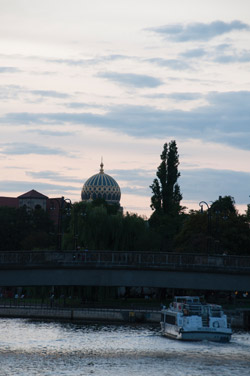
I started with a Raw file (#1), in this case a NEF file captured with my Nikon D300 and 18-200mm VR Nikkor lens. The original image lacked the color palette often associated with a sunset plus showed the result of biasing exposure toward the brighter sky. It looks like a lost shot, but image processing can always help you find a way.
All Photos ©Jack Neubart. All rights reserved
Step 2
I proceeded to work on selectively toning the shot (#2). In this instance, Lightroom’s Graduated filter did the trick. I began by introducing a Graduated warm tone from the bottom, leaving some sky minimally affected at the top. I updated the filter with some needed changes to Highlights, Shadows, Clarity, Saturation and Sharpness after adjusting the position of the filter to cover a larger area, which also ensured a more natural blending of tones. (Note: A pushpin denotes the point beyond which the effect grows gradually weaker, when starting from below, as in this case. When starting from above, the gradient drops off below the pushpin. Play around with the “boundary lines” to define how the effect falls off and where it’s most intense/weakest. Be sure to adjust the parameters as needed, paying particular attention to the Exposure slider, while not neglecting other settings. Knowing I’d be using the Grad filter, and except for setting Daylight WB, I did not make any global tonal/exposure adjustments at this time.)

Step 3
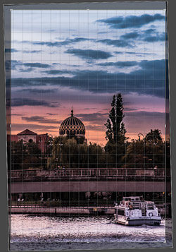
I introduced a second, cooler Graduated filter, also from the bottom (#3). I wanted to tone down the warmth on the bridge and in the river. The effect was subtle, but after consideration I realized the sky also needed some magenta. So I added one more Grad filter for this tone (the black-core pushpin in the middle of the highlighted area—see the settings in the right-side panel, below the histogram).

Step 4
By rotating the image slightly with the aid of a grid overlay (#4), I applied a horizon line correction. This step also resulted in some cropping. This could have been a problem if it had cropped into the boat, but it didn’t.
Step 5
I was now happy with the range of tones and colors in Lightroom, (#5). Next stop: Viveza. I preferred to wait until I was done in Viveza before making any global tonal changes.
Step 6
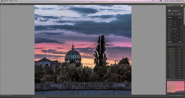
I next opened the image in Viveza using the Edit In Menu command under “Photo”. I felt I would have tighter control with Viveza than with Lightroom’s Adjustment brush. This is where I extensively modified the tone of the image top to bottom, employing numerous Control points. (Each Control point targets a user-defined range of tones/colors.) First I focused on intensifying the warm color in the sky, while adding Structure (for a more substantive feel). As I moved closer to the horizon, I added a golden orange glow, giving the appearance of the sun just below the horizon. Next, I targeted the shadows, opening them up a bit, while restoring some of the cool blues—again with Control points. It was also important to address the dome and give it the sense that it was reflecting both cool and warm colors—with more Control points. I then exported a TIFF back to Lightroom. As you can see the control points and their “spheres of influence” can be very carefully set, allowable for very particular adjustments to be made throughout the image. This is a highly customized approach that can be taken as far as your needs require and disposition allows (#6A and #6B).

Step 7
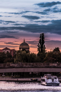
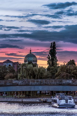
This is my Virtual Sunset after all the Lightroom and Viveza adjustments (#7). I added some finishing touches, eliminating some gaps that distractingly spilled light on that large tree. I also added a little more Vibrance and Saturation to intensify the sunset colors, while opening the shadows up a bit more globally. Compare it to the starting point in image (#1) and you can see why the combination of Lightroom and Viveza makes for a powerful image-editing tool.


![]()
Get the Latest Photo Tips, News & Reviews from Shutterbug!
| Camera Reviews Other Reviews | Mobile Reviews Photography Reviews Columns | News | Features | How-To | Resources |
 © 2026 Shutterbug
AVTech Media Americas Inc., USA
All rights reserved