Mr. Fantastic: Hugh Kretschmer Blends Fine Art with Commerce to Create Mind-Bending Imagery

The story behind this image is based on Kretschmer’s original sketch and reflects the mindset of Harvard Business School graduates, featured in the issue, who were movers and shakers in the fashion industry. The shot features a model poking his head through a hole, with the shirt fitted around him, and the gears and Masonite discs added. Kretschmer digitally superimposed images of the shirt onto the discs. The model was seated in a chair, with the camera coming in on the set from overhead.
All Photos © Hugh Kretschmer
What defines fine art rests as much in the eye of the artist—be that a painter, sculptor, or photographer—as in the eye of the beholder who finds beauty and meaning in that work. The work can be something the artist discovers and captures or creates from scratch. In the case of photographer Hugh Kretschmer’s imagery, it is a tapestry interwoven with elements from disparate sources: a collage, if you will, forming a coherent whole and thereby conveying a message.
Sometimes the message may be vague and the intent may have no purpose other than artistic expression. At other times, the message may have a commercial slant, selling a product or service but in a uniquely metaphysical way. Whatever that message, Kretschmer’s method of blending both art and commerce to create fantastic, mind-bending images evolved over time.
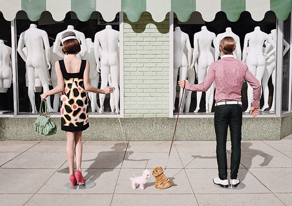
The issue focused on spring fashions. “I fashioned a story in which two mannequins (actually hired talent) unwittingly meet and fall in love while out walking their dogs (stuffed toys).” This was shot on location in L.A.’s fashion district, in front of an actual mannequin supply display window, which Kretschmer digitally modified by adding the awning and brickwork separating the windows.

The focus of this issue was on hair; the editor wanted a circus theme so Kretschmer devised the concept. “I worked with a hairstylist who created the curtain of hair. I laminated the hair onto cardboard and constructed a marionette set. I left the two points closest to her face open so that we could use the pink braids as ropes to pull the ‘curtains’ away, and the model just stuck her face through it. We lit the set with a focusing spot.”
Changing His Mindset
“When I first got out of school,” Kretschmer recalls, “art directors would see my portfolio and say, Oh, you went to Art Center College of Design (Pasadena, California). The influences there showed in my work. I was struggling to get work because my portfolio looked like everyone else’s, and all those other people already had working relationships with these art directors and photo editors.
“So, when I went into the studio and started working on that new body of work, what I decided was not to approach this with the mindset of, I’m doing this to get jobs, but rather because this is what I want to do. You might say, it’s work that comes from the heart. It had to be purely based on what I’d been exposed to in my lifetime. That mindset and the body of work resulting from it launched my career.”
As with any form of artistic expression, Kretschmer’s sensibilities were bound to change over time. “When I first moved to New York, I knew that the type of work I was doing had a short lifespan,” Kretschmer says. “It was no longer working for me. So I regrouped and did a lot of soul-searching. Slowly but surely I was able to segue out of that old style into a style that dominated my work throughout the Nineties and early 2000s. The obvious difference was, I was now coming up with visual solutions that involved people instead of the still life constructions that pervaded my photography to this point. All of my work derives from my love of 20th century painting and sculpture, so surrealism is part of that grouping of art movements, along with Russian Constructivism, Dadaism, and others.
“My work has been considered by some as riding the cusp between art and commerce,” Kretschmer notes. “I’ve always strived to do as much in camera, relying very little on Photoshop. The last three years, the reason clients have chosen to work with me is because they say my work has a certain tactile quality, that it feels like it’s all there.”
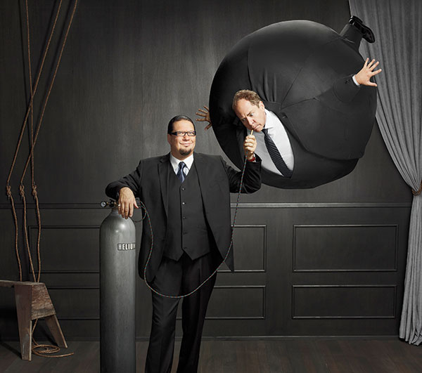
This dynamic duo performs a nightly show at the Rio All-Suites Hotel and Casino, Las Vegas, and this was part of a promotional campaign for that show. The AD came up with this concept. The idea was for Teller to appear as a helium balloon being inflated by Penn. “My prop maker created Teller’s inflated body from foam and had a suit tailored to fit over it. When we shot them, Teller was standing on a ladder next to Penn, who appears to be feeding him the helium. We next brought in the fake body and positioned it in place of Teller. This was a fun shoot.” The shots were captured digitally and composited in post. This image greets you on the entertainers’ homepage (www.pennandteller.net).
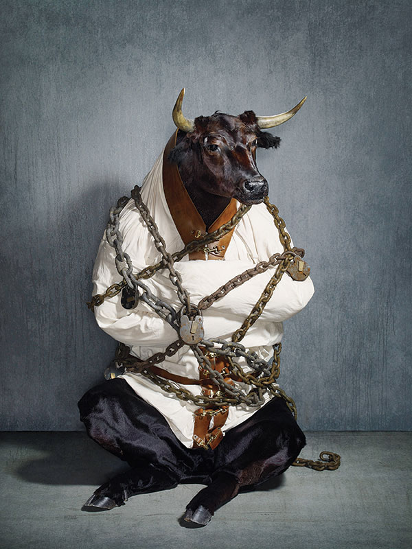
Conceived by Kretschmer, this shot represents constraints on the bull market. The article asked the question, why can’t Washington turn the economy around? “This was shot during the recent recession, entirely in camera. We’d started with the head, acquired from a taxidermist. A special effects prop maker sculpted the body of the bull out of foam, then covered it in cowhide and a straitjacket that he made, and added real hooves that he’d found. The bull sits six-feet tall and was positioned against a painted flat.”
Working In Three Dimensions
We can add that what further defines Kretschmer’s work is that it’s not a two-dimensional digital composite. Everything has light, shadow, and form before it sees a piece of film or a digital sensor. It actually exists in the real world. What’s at the heart of Kretschmer’s latest work is the collage that tells a story.
“I’ve been doing a lot of constructions, such as the shoot for the American Egg Board." That had a storybook character. This was also true of a Huggies campaign, which Kretschmer proudly adds “was a complete adaptation of a personal project.”
In fact, many, though certainly not all, assignments are concepts the photographer proposed and sketched out. His Twitter blog is filled with such sketches. “The look was very whimsical. That’s what I’ve been seeing lately—that style and sensibility is what they want.
“Lately I’ve been shooting 4x5 film again. Sometimes I can capture something digitally that I can’t do on film and I’ll mix the two together. But that’s rare.”
One trademark of Kretschmer’s work is its quirky and offbeat flavor. “I know that I strive to create work that’s different from what’s out there,” he observes, “especially when we’re talking about the commercial arena. I’ve always strived to have a conceptual bent to my work. I like messages that underlie a pretty image. As far as the quirkiness is concerned, it’s probably influenced simply by my love for humor and things that are strange or peculiar.”
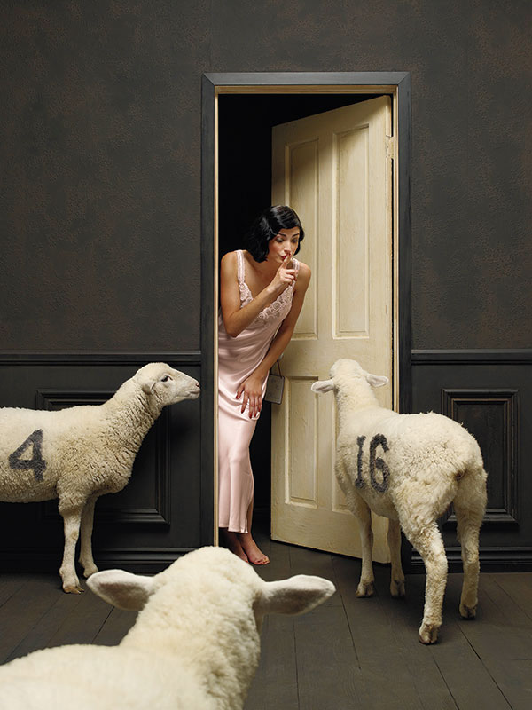
The story focused on getting a good night’s sleep. “There was one sheep that fit into our budget, so we shot it in various positions. The stylist created the numbers on real shearling and we photographed each of them separately, placed in the correct angle matching the position of each sheep capture. The door frame is part of a set we built.” This was shot and composited digitally.
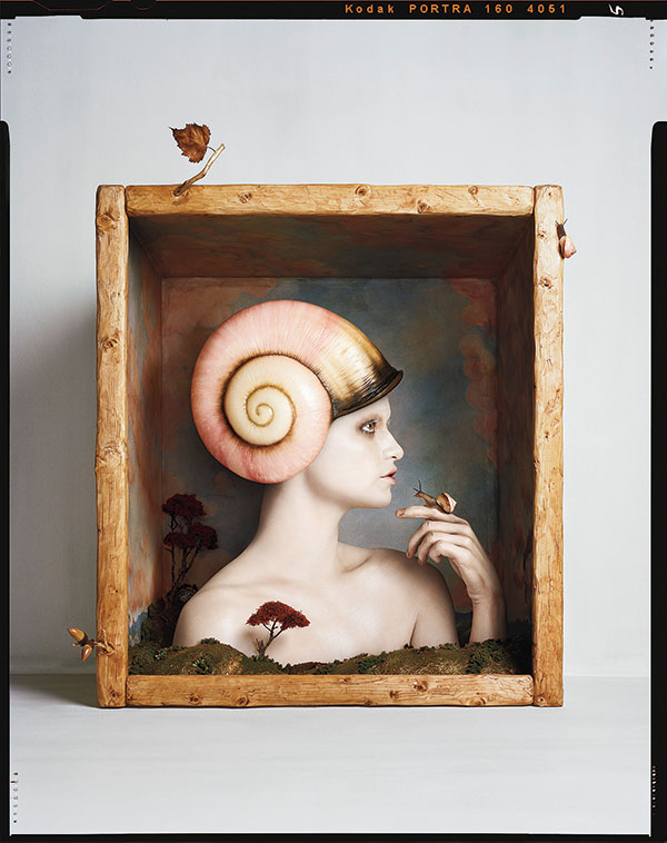
“This is the first in a new series involving shadow boxes, each a fantasy world in microcosm. I constructed the box out of panels of gessoed canvases laminated on particleboard, and made the 3D scenic elements from sculpted foam and scenic supplies I found at a hobby shop. Our stalwart model held a live snail on her finger.” The box’s interior was painted by Ratna Pappert, with the helmet made by prop maker Tim Martin and makeup by Trista Metz. “I’m going back to using 4x5 film for this series, primarily because I view the boxes as architectural elements.”
Influenced By Art and Science
“My father introduced me to photography,” Kretschmer notes. “He was a scientific photographer for McDonnell Douglas. He had an incredible darkroom in a bomb shelter in our house in Los Angeles. As a right of passage, at age 13, he introduced each of his seven children to photography, giving each of us a camera and film, and showed us how to develop and print. When I saw my very first picture in the developer, I knew this was what I wanted to do.”
Most recently Kretschmer was inspired by the shadow box work of Joseph Cornell. Another influential artist was Maxfield Parrish. “A lot of people create shadow boxes that mimic Cornell, but I wanted to do something a little different,” Kretschmer explains when discussing his own shadow box project.
“I like the idea of creating a self-contained microcosm. I started small. The next ones are going to be maybe 10- or 12-feet tall. I create mood boards (collages of ideas), and this is kind of a culmination of all that. The theme for each will be its own story, rather than a continuing storyline.”
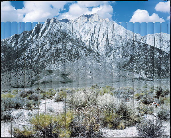
“This is part of an ongoing project. I went to Lone Pine Mountain in the Sierras with a section of fence six-foot wide by five-foot tall. I supported the fence on C-stands between camera position and the backdrop. After shooting the fence in place on 4x5 film, I removed the fence, but first I outlined where everything stood in relation to each other and the backdrop. I also noted camera settings and time of day so that I could return with the fence for the next phase. Then I photographed the scene itself sans fence, using the exact same settings and focus. I scanned the film and made a mural-size print (on matte vinyl) of the backdrop, and laminated that print in sections onto the fence itself. I then took this assemblage and returned to the exact same spot, set up the fence as before, and re-photographed the scene. The clouds are the only variable in the follow-up shot.”
To see more of Hugh Kretschmer’s work, visit www.hughkretschmer.net.
- Log in or register to post comments


