- REVIEWS
Camera Reviews 
More Reviews Mobile Reviews Photography Reviews - GALLERIES
- VIDEOS
- BUYER'S GUIDES
Output Options; “Soft” Proofing; See How The Print Will Look, Before Printing Page 2
Earlier, I suggested leaving the Preview option turned off. Here's why: I prefer to work on the image to optimize it for the best possible quality without regard to the intended output. I may use the image for multiple purposes, such as print, web, or projection. If I leave the Preview turned on, I immediately see a color shift that throws my perception off. So, I set the options as I want them and then use the View>Proof Colors command to toggle back and forth as I'm working on the image. When you are working with Proof Colors, you'll see the new color space listed in the title of the image window, shown in #4, so it's easy to tell what state your image is in.
 |
|
|
It's here with Proof Colors that you'll find another useful command
in the color optimization game, Gamut Warning.
When used with the Proof Colors command, Gamut Warning can quickly show you
what areas of your image are outside the range of your selected output device.
By default, Gamut Warning displays everything that cannot be printed accurately
in a gray color. You can modify this to something easier to see by selecting
File>Preferences>Transparency & Gamut (Photoshop>Preferences on
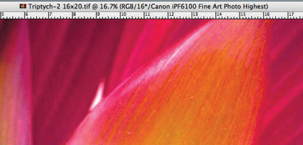
the Mac). In #5, I have an image that shows the out of gamut areas in a bright
pink--something that doesn't exist in the image naturally, so it's
easy to pick out.
 |
|
|
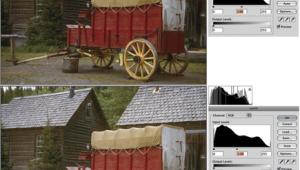
To fix gamut issues, you have a couple of good options. The first and easiest is by adjusting the saturation of your image. It's best to work with adjustment layers when doing this type of work as it's specific to each paper you'd print on. This allows you to turn off the adjustment if it isn't needed. So, select Layer>New Adjustment Layer>Hue/Saturation. In the example shown in #6, I'm able to eliminate the out of gamut colors by reducing the saturation by 19 points.
 |
|
|
The other option is to use the Color Picker to replace out of gamut colors with the closest in-gamut color available. To do this, open the Color Picker and then use the eyedropper to select an out of gamut color. By clicking the box below the warning triangle, the closest match is automatically used and replaces the out of gamut color as in #7.
 |
|
|
Although they take a bit of time to master, the soft proofing options available
in Photoshop are a worthwhile addition to your digital imaging workflow, and
can save you a significant amount of time and energy when you want to print
the highest quality image possible. And, since your images reflect your vision,
isn't that what you want?
Jon Canfield is the author of several books on digital imaging and printing.
A popular instructor at BetterPhoto.com,
Canfield also teaches workshops for the Panasonic Digital Photo Academy (www.digitalphotoacademy.com).
You can reach Canfield via e-mail at: jon@joncanfield.com.
|
| |||||||||
- Log in or register to post comments


![]()
Get the Latest Photo Tips, News & Reviews from Shutterbug!
| Camera Reviews Other Reviews | Mobile Reviews Photography Reviews Columns | News | Features | How-To | Resources |
 © 2025 Shutterbug
AVTech Media Americas Inc., USA
All rights reserved