- REVIEWS
Camera Reviews 
More Reviews Mobile Reviews Photography Reviews - GALLERIES
- VIDEOS
- BUYER'S GUIDES
Getting It Right; Using Hue And Saturation To Correct Skin Tones Page 2
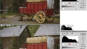
4. Click on the areas of skin that you want to adjust. As
you do so, the preview window will start to show more selected areas as seen
here:
After clicking on the areas we want to modify, the preview looks a bit like
a film negative. Once you have your selection right, clicking OK will close
the dialog and your selection will be active in the image window, ready for
adjustment.
 |
|
|
Once you've selected the range of color values to adjust, click OK and your image will display the selection guides.
5. Next, create a new adjustment layer--Layer>New Adjustment Layer>Hue/Saturation. This will put all your adjustments on a new layer and prevent changes to the original source image. Since different output choices, such as web and print, require different amounts of adjustment, keeping these adjustments on separate layers allows you to make modifications as needed without keeping multiple copies of the file.
 |
|
|
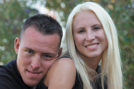
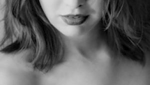
Depending on the color shift, you may need to make adjustments to the Master
channel. I normally don't make Saturation adjustments to Master, but will
make very slight (in the range of +1 to +5) adjustments to the Hue. In my sample
image, the red tones are too strong, so I select the Red channel and start lowering
the saturation level until it looks more neutral:
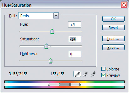
By selecting the Reds channel, I can affect only the red values within my selection.
Since I had too much red, I've lowered the saturation here. Typically,
a range of -5 to -15 is appropriate. After lowering the saturation, I felt that
I needed a slight boost to the hue so I raised it +5.
In this sample, I've lowered Saturation by -14. Once the reds were more
on target, the Hue seemed to need a boost and I raised it to +5. I find that
most Caucasian skin tones work best when lowering Saturation by -5 to -15. This
particular example had a very strong cast and needed more adjustment.
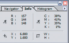
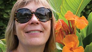
6. After making the saturation adjustments, the Info palette
shows a much closer balance in color. I've left the red a bit higher,
since my daughter would be unhappy without a bit of color in her cheeks:
After making the adjustments to the red channel, my color values are much closer
to correct with Cyan and Yellow values being nearly the same, and Magenta brought
down significantly.
 |
|
|
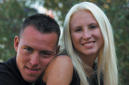
7. When finished, the image is much more neutral in the skin
tones, while leaving the other colors untouched.
The skin tones are much more accurate now that I've removed the color
cast. From this point, I'll do my general contrast and levels adjustments
to finish up the image and prepare it for print.
 |
|
|
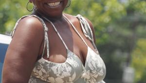
While there are no hard and fast rules as to color mixing, in general darker
skin tones, such as Asian or Hispanic, will have a higher percentage of yellow.
African American or Black is perhaps the hardest to correct since there is such
a wide range of skin tones that can be considered "correct." Lighter
skin tones here will be similar in range to the Hispanic samples, while darker
tones will be very close to equal in magenta and yellow, with cyan and black
increasing. Caucasian has the widest range, but in general yellow will be close
in value to cyan, with magenta the most prominent, which in this example you
can see holds true--Cyan is 38 percent, Yellow 35 percent, and Magenta
prominent at 41 percent.
8. In some cases, "perfectly accurate" may not
be the desired goal. Many women in particular want a more tanned look. In this
case, you'll want to keep the reds a bit higher, and adjusting Saturation
in the Master channel will achieve this:
Boosting the overall saturation to the image adds a little more pop. Since the
change is done in the Master channel this time, the entire image is affected
equally.
 |
|
|
In this example, I raised the saturation on the Master channel to +9. I do
this edit after getting the color balance to what I feel is the correct tone
to avoid problems balancing out individual colors.
If you have a group of images that all need the same correction, you can simply
drag-and-drop your Hue/Saturation adjustment layer onto each image to quickly
apply the changes to each image.
Jon Canfield has been involved with digital imaging from its infancy. He has worked on software products for Microsoft such as Picture It and Digital Image Pro. Canfield has taught classes on digital workflow, and is currently co-authoring a book for Sybex "Photo Finish: The Digital Photographer's Guide to Printing, Showing and Selling Images" with Tim Grey. He can be reached at jon@joncanfield.com.
|
| |||||||||
- Log in or register to post comments


![]()
Get the Latest Photo Tips, News & Reviews from Shutterbug!
| Camera Reviews Other Reviews | Mobile Reviews Photography Reviews Columns | News | Features | How-To | Resources |
 © 2025 Shutterbug
AVTech Media Americas Inc., USA
All rights reserved