- REVIEWS
Camera Reviews 
More Reviews Mobile Reviews Photography Reviews - GALLERIES
- VIDEOS
- BUYER'S GUIDES
“Toning” And Colorizing Monochrome Images: Expanding The Monochrome Palette
The image color of even a conventional black and white silver print is rarely black, white and grayscale shades. It may be warm (golden) or cold (blue) neutral or toned (sepia, magenta). Over many years print makers and chemists developed paper and developer combinations, as well as after-printing toners, to add additional color to monochrome silver prints. For example, using a warm-tone paper such as Agfa Portriga and a warm-tone enhancing developer, such as Selectol Soft, could alter image color. This yielded brownish blacks and creamy whites. A cold-tone paper could be developed in Dektol and after fixing toned in a mild dilution of rapid selenium toner for added “snap”, resulting in a “harder” bright white/deep black effect.
Early photographs, like this nineteenth century ambrotype (#1), were given a touch of color through toning or the mixing of certain emulsion/developer combinations. It is almost rare to find a neutral-toned black and white in old prints like this.

All Photos © George Schaub
Silver papers were and are toned sepia, brown and even blue for various image effects, as well as for archival reasons. The image color of a monochrome print is one of the keys to its beauty, one that a discerning eye will always appreciate. If you ever wondered where all the terminology around black and white prints in the digital realm stems from you need not look further than the black and white chemical darkroom. In fact, it seems the prime aim of many manufacturers, and indeed many print makers, is to make a digital inkjet print look as close to a silver paper print as possible. Ironic.
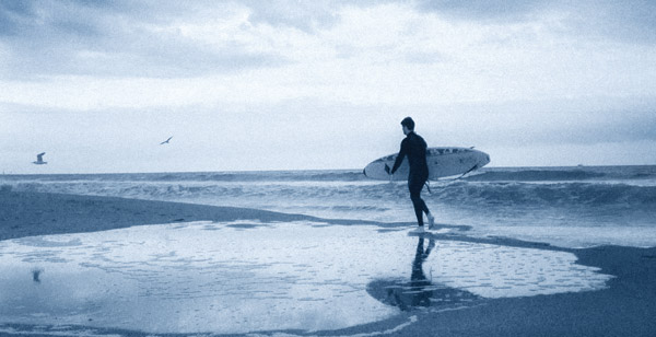
There is a long tradition of “toning” or colorizing black and white photos. Now that all digital images start as color, options are greater than ever before as color and saturation can be easily manipulated in programs. This beach scene (#2) was “toned” blue using the hue/saturation controls on a “desaturated” image.
There’s something about toning that adds a timeless, or at least nostalgic touch to an image, particularly if the subject matter lends itself to that kind of interpretation. Here a scan from a film photo made in 1984 is given a cyanotype treatment (#3 and #4).


Yet, given the irony, the ability to emulate and even expand on potential image color possibilities in the digital darkroom is very wide. Anyone who has struggled to maintain consistent image color throughout an edition or portfolio, or who has tried a variety of toner dilutions to get an image just right will especially appreciate it. The ink and paper options and the processing potential available today are one of the most exciting elements in expressive digital printing.
Digital allows you to emulate virtually any photographic and graphic medium, new and old. This twilight view of the Empire State Building (#5) started as a “straight” shot that was manipulated to emulate a tinted photogravure.

A study of prints made by photomechanical means other than conventional darkroom methods also reveals the amazing image color possibilities of the photographic image. Platinum, palladium, cyanotype, Van Dyke Brown and even photogravure show very seductive image color effects. Some of these arcane processes are kept alive by a dedicated core of artists, and are often referred to as alternative or personal processes. While digital ink mixing cannot hope to obtain the patina of these images (the surface characteristics) they certainly can emulate the look and visual feel. They do this without mixing often-dangerous chemicals.
The Cynaotype process goes back to the beginnings of photography itself and was in fact invented by the man who discovered hypo, Sir John Herschel. It is still used today by fans of alternative processes. Here’s a cyanotype emulation that started as a digital file that was desaturated with color added using the hue and saturation controls (#6).

In addition, there are options for adding a dash of color to a black and white print for visual interest, or even applying color to make a print look like an old hand colored postcard or portrait. Handcoloring, first used to add color to photographs before color film and paper was readily available, is a fun way to make your own color interpretation on a black and white scene.
This red rhinoceros in the Pompidou Museum in Paris (#7) sits in a monochrome room thanks to first selecting the red object and then inverting the selection and treating the room with a black and white NAL.

There are two choices when working with black and white images. One is to use the Grayscale mode and the other RGB, or Color mode. For our purposes here we want the image to be in RGB mode. If you scanned or converted into Grayscale mode simply go to Image>Mode>RGB or similar command to convert it to a form that will “take” the color you are going to give it. Even though your foundation image looks like monochrome or black and white on the screen, you are now working with a color-ready file.
Easy Options
There are a number of ways to add overall color tone to a “neutral” black and white image. You can do this in camera, where an option in Monochrome mode is to add a sepia, blue or green cast. This is a fairly heavy-handed approach as you have no real control over the degree of the effect. The best bet is to do this in processing on a duplicate Layer of the image. You can then fade or drop the opacity of the effect as you see fit.
You can use Photoshop, Lightroom or Aperture or any other image processing program that allows you to add a quick color cast. Simply use the HSL (Hue/Saturation/Luminance) controls and choose “colorize” as you find the tint, opacity and saturation of the desired tone to match each image. There are also numerous plug-ins that can give you “toned” images with push button ease.
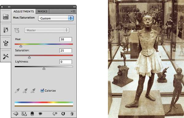
This began as a color photo made inside the Musee d’Orsay in Paris. The main adjustment was in hue/saturation (#8), with a sepia tone chosen and a drop in saturation with the colorize box checked. After this main step I added some noise and played with the overall Levels to emulate an old sepia print (#9).
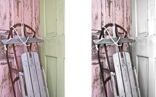
Nik Software’s Color Efex Pro (www.niksoftware.com) is a plug-in that allows you to first make conversions to black and white or desaturated color and then you can override and change the effect easily as it creates a layer in Photoshop. That’s what I did here using the Monday Morning Nik filter on a shot of an old sled in the shade of a doorway (#10). I then desaturated the result and added a slight sepia wash through hue/saturation and Layer Mask brush strokes (#11 and #12).

There are numerous programs and plug-ins that make toning a very simple task. Here the Nik plug-in, Color Efex Pro, shows a blue and brown tone work screen. Note the sliders on the right that allow for customization of the effects (#13 and #14).


Duotones And Split Tones
If you’re feeling that color cast toning does not offer the refinement you are seeking, or you just want to make it more interesting, you can work in the duotone realm. Duotones are really for reproduction printing, but you can modify and play with them for your home or studio printing as well. A close relation to duotones is the split toning technique, the easier option of the two. The duotone option is only available in Photoshop, while split-toning is available in numerous programs and plug-ins.
In Photoshop, in order to work on duotones you have to first change the mode from RGB into Grayscale and then go to Duotone. Follow this path in the Image>Mode menu. When you do this you will be presented with the Duotone dialog box. You can access different inks for the mix by clicking on the box at the top and choose duotone (two inks), tritone (three inks) or for the truly brave, quadtones (four inks).
Let’s say you choose tritones. Three boxes show up where you get to select the color inks you are going to use. Click on one of the boxes and the Color Picker shows up. You can use the field of color or custom colors, which is more of a slider bar through the spectrum. This is where you set colors for your mix.
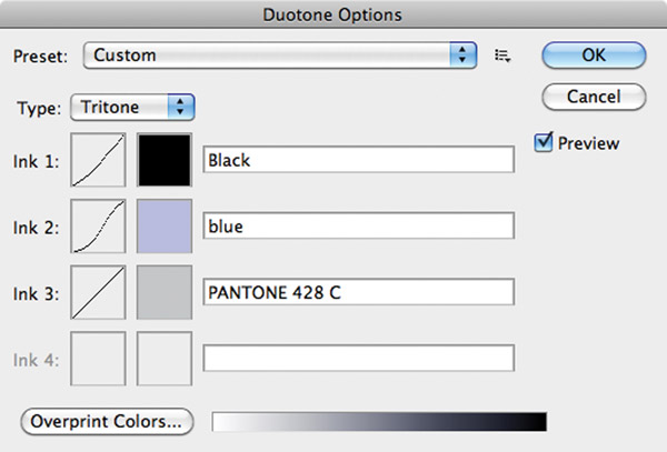
This photo was first converted to grayscale and then to duotone (#15). Once duotone was selected the Duotone dialog box appeared and I chose the ink mix for a Tritone (three inks), with black, blue and a neutral gray (#16). The changes happen right on the screen as you work so it’s easy to get just the look you want when working (#17).

If you want to try out some presets, or “canned” duotone, tritone and quadtone combos click on the “Load” button in the dialog box and you’ll get a set of folders with presets you can try out. You might want to rename them so you can identify them next time you visit the folders.
If that were all there was to these nearly infinite combinations of color in duotone you could just stick with Variations or Hue/Saturation but, as with many of the image-editing programs, it’s just the start. After you have selected colors you can then change the “curve” of the color, or how it is laid down in all the tonal areas of the image. Click on the curve box next to the color and you can manipulate the curve at will, changing how ink goes into the various tonal areas. This multiplies the infinite, if you will. And, if you do this on a duplicate layer you can modify it with all the Layers tools at your disposal.
This is very complex, very rewarding and a bit of a Pandora’s box.
Split toning is available in many programs, including Adobe Camera Raw. You can choose different toning effects for highlights and shadows, blue for highlights and sepia for shadows (#18).

“Split toning” is different, though a variant on duotoning, and this involves applying two different color tones to the image, one to the highlight and the other to the shadow areas in the image. This is an old darkroom technique and actually one that comes closest to emulating what chemical toning looks like, since toning involved the attachment of sulphides from the toning bath to silver molecules in the print, with the more silver (more density) getting more colorization than areas of less density.
Split toning is available in Adobe Camera Raw, Lightroom and various plug-ins, such as Nik Software’s Silver Efex Pro.
Colorizing Techniques
“Colorization” is a wide field of techniques that can involve using a very light wash of color, a patch of color or even a hand-colored oil look to images.
Hand coloring technique removes the original color from the scene then works with a few colors and various size, feathered and opacity-strength brushes in a freehand style. Working with a pen and tablet makes it easier. Here I used green, yellow and magenta only for this colorization, working with various levels of saturation and brush strength as I applied the color wash (#19).

There are numerous programs that allow you to “paint” a monochrome image. Here’s how I do it in Photoshop.
If you are aiming for a hand painted look the first step is to create a color “wash” or foundation that will serve as the undercoating of the image. Usually warm brown, lightly applied, works best. To do this open the monochrome (though RGB mode) image and work in the Hue/Saturation Layer, clicking on “colorize” to have the color applied. Drop or raise the effect using the Opacity slider in the Layers palette to adjust to your liking.
Now choose a few colors from the Color Picker and place one in the foreground color box and then toggle to the background color box. This way you always have two colors on your palette. Start to paint, adjusting the opacity of the color between 10 and 20 percent for each stroke. This creates transparent colors just as if you are applying photo oils to a traditional print. If you need to switch colors just double click one of the color boxes and move on to the next set of colors. If you want to create a duplicate layer for each color set then you can work more carefully throughout.
Low-Sat
Low-sat, or low saturation color is a technique that flirts with color but is essentially a black and white image. I find it particularly effective with landscapes, nature and even portraiture. It’s very simple to do. Just open the image in color and then use the HSL (Hue/Saturation/Luminance) adjustments and drop the saturation way down low. If you do this on a layer you can work with opacity and have even more control over the effect.
Florals are particularly beautiful when given the low-sat treatment (#20). You can control the degree of color and which colors will be shown by working with the Hue/Saturation controls found in pretty much every image-editing program.
This coastal scene (#21) was opened in Adobe Camera Raw and then saturation was dropped to about 10 percent. Clarity was also reduced giving it an ethereal look.


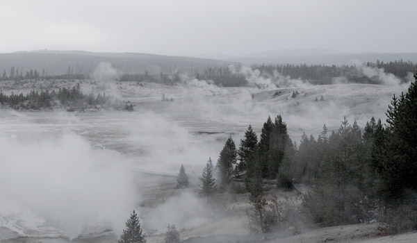
This field of geysers was photographed on an overcast day (#22). The two steps performed on this image could be done with almost any image processing program—desaturation, added brightness and reduced contrast.
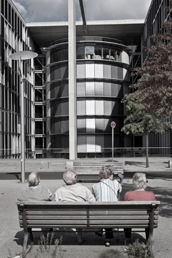
When used with the right image low-sat has a look that is quite unique and for me is somehow more satisfying than HDR, but that’s a personal opinion of course. This photo has a very small touch of color but the architectural elements do not demand color to be effective (#23).
The wall here was off-white, but when I desaturated the image to about 10 percent the wall became neutral white while the implements retained a brown tone, looking like I had toned only the tools (#24).

Touch O’ Color
Using layers it’s easy to mix color and black and white in the same image. Start with a color shot and create a layer on which you either reduce saturation or turn it into black and white entirely. Then use a Layer Mask to paint down through the top layer to reveal what is underneath.
This color image was desaturated on a duplicate layer, then I used a Layer Mask and brushed back to reveal the yellow signs (#25).

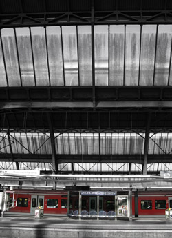
I was attracted to the light coming through the dirty windows in this train station and decided to remove color from everywhere in the frame except the train and platform kiosk (#26). To me, desaturation works great with architecture, but a touch of color in the frame can add to the visual appeal.
While images of fall foliage often are tempting subjects for increased saturation, here all the color was removed on a duplicate layer, and then a Layer Mask brush was used at very low intensity to bring back a touch of color to what in the original are brilliant fall leaves (#27).


![]()
Get the Latest Photo Tips, News & Reviews from Shutterbug!
| Camera Reviews Other Reviews | Mobile Reviews Photography Reviews Columns | News | Features | How-To | Resources |
 © 2025 Shutterbug
AVTech Media Americas Inc., USA
All rights reserved