- REVIEWS
Camera Reviews 
More Reviews Mobile Reviews Photography Reviews - GALLERIES
- VIDEOS
- BUYER'S GUIDES
The Darkroom
Making Picture Frames
| If you think that Photoshop is simply a program to re-size pictures, adjust color balance, and tweak the density, you're missing out on a whole ton of stuff that you could use to make your work exciting and unique. This article is all about a few of the tools found in Photoshop Version 7.0 that can help you be more creative and produce exciting works of art that are unique to your individual taste. It took me about 30 minutes to complete this project. Keep in mind that I am not an artist, and even with a ruler I have trouble drawing a straight line! That's why I use Photoshop. It does all the real work for me. Due to space limitations, I cannot show you all of the screen captures and go into all of the detail that I'd like to. If you'd like all of that detail, I've put it all on a CD-ROM that you can have for $3.00. Just send an e-mail to me care of the magazine at: editorial@shutterbug.net and ask for the CD-ROM on Making Picture Frames. While I made this piece with certain colors and shapes, you can easily substitute your own choices for what I have used. Here are the main steps in this project: First, decide on how big you want the finished piece. In this case, I wanted something that I could print on a sheet of 8.5x11" paper. In Photoshop V7.0, go to File to New and create a Blank Canvas that is 8x9.25"x300ppi with the Contents set to Transparent. Set the Mode to RGB Color. Then go to Layer to New and add a transparent layer to it. |
|
The next step is to lay in a circular gradient on the top layer. I thought
a gradient that would go from white in the center to dark blue in the
corners would look nice. So, I selected Blue (Red=0, Green=24, Blue=70...or,
0, 24, 70). That is a nice, dark, blue. Set that for the background color
and select White (255, 255, 255) for the foreground color. Then, get the
Gradient Tool and select the Circular Gradient option. Place the cursor
at approximately the center of the canvas and drag a line to one of the
corners. That will produce a circular gradient with white in the center
and dark blue on the corners. Next, go to Filter to Blur to Gaussian Blue
and set it to about 20 pixels. You want to do a good, strong, blur on
the gradient in order to be sure that it will later print smoothly and
not show any banding. Name your work WORK_1 and save it at this point
in case you mess up and crash the computer. Then perform a Save frequently
as you continue with this project. |
|
|
|
Go to the Layers Palette and create a duplicate layer of the dark gold triangle. Go to the Color Palette and set in the following color: 246, 200, 78. That is a light shade of gold. Go to Edit to Fill and fill the triangle selection (top layer) with the light gold color. Now, you should have two layers: light gold in the top-layer triangle, and dark gold in the bottom-layer triangle. With the top layer highlighted (made active) go to Edit to Transform to Flip Horizontal. Then go to Edit to Transform to Flip Vertical. Go to Select and Deselect. Then go to the Layers Palette and Flatten the image. |
|
Next we need to cut out the center portion so that only the frame will
remain. Go to Image to Duplicate and create a duplicate of the canvas
with the two gold triangles. With the duplicate canvas made active, go
to Select to All. Then select white as the foreground color and go to
Edit to Fill. This will fill the duplicate canvas with white. Go to Image
to Image Size and with Constrain Proportions checked, change 5"
to 4.25". The 6.25" dimension should automatically change
to 5.313". Go to Select to All. Go to Edit to Copy. Now, make the
canvas with the two gold triangles active by clicking on it and go to
Edit to Paste. The white canvas should then be pasted directly in the
exact center of the two gold triangles leaving a perfectly formed gold
border all around. Go to the Layers Palette and Flatten the image. |
|
Go to the Layers Palette and Flatten the image. Go to Select to All. Go to Edit to Copy. Activate the file called WORK_1 to full size. You had previously minimized it. With WORK_1 set to the active window, go to Edit to Paste. This will paste the gold frame that you just created into the exact center of the blue gradient of WORK_1. Get the Magic Wand and place it in the middle of the white area inside the gold frame and click. This will make a selection of the white area. Go to Edit to Cut. This will cut out the white area allowing you to see the blue gradient that is beneath the gold frame. Go to Layer to New to Layer and create a new layer. It will come in on top of the gold-frame layer. Now, it is time to decorate the piece by placing the green leaves around the two opposite corners of the gold frame using this new layer that you just created. In this example, I used several shades of green (leaves) for a "summertime" look. However, you could use several shades of red, yellow, and brown (leaves) for a "fall" look. Get the Brush tool, and select brush #74 (part of the default brush set
in Photoshop V7.0) which is called Scattered Maple Leaves. Set the brush
size to 180. Go to the Color Palette and select a dark shade of green
(0, 72, 27) as the Foreground Color. Then, place the leaf brush in the
area of one of the corners and click two or three times. You'll
notice that each time you click several leaves of random size are created.
Click several times in each of the opposite corners to lay down several
random leaves of dark green. Next, go back to the Color Palette and get
a lighter shade of green as the Foreground Color (129, 190, 39). |
|
If you want to add some text as I did, you can now go to the Color Palette and set a dark shade of gold in as the Foreground Color (164, 130, 44). Then get the Text Tool and select a font that you like. I used Dom Casual Font since it is a bold, brush-stroke type of font. The font called Brush Script would also work nicely, and there are many others such as Old English, etc. I used an 18 point type size. After typing in Photography By, I highlighted the text and went to Layer to Layer Style to Drop Shadow. In the Drop Shadow dialog box make the following settings: Blend Mode: Multiply; Opacity: 100 percent; Distance: 20 px; Spread: 30 percent; Size: 15 px. Next, click and highlight the Bevel & Emboss option. In the Bevel & Emboss dialog box make the following settings: Depth: 180 percent; Size: 5 px; Soften: 0 px. Leave everything else to the default settings. The above settings should give your text a nice, gold finish with a raised, rounded, look, and a glint of highlight on the upper, rounded edges. In my example, I used our company logo, ColorBAT, to follow the words, "Photography By," but you could put your name in there or use your own logo if you have one. |
|
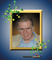
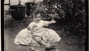
The last step is adding in the actual photograph. You can use any photograph that you might want to put in this frame. Simply open your photograph in Photoshop and re-size it to about 5x7"x300ppi. Then go to Select to All. Next go to Edit to Copy. Then, highlight your newly created frame and go to Edit to Paste. That will bring your picture in on a layer. You will have to drag the layer down the list in the Layers Palette so that the picture layer will be under the layer with the gold frame and above the layer with the blue gradient. If the picture is too big or too snall to fit nicely behind the gold frame, with the picture layer highlighted in the Layers Palette, go to Edit to Transform to Scale. Then hold down the Shift key and drag one corner of the picture layer to re-size it larger or smaller. If, as you re-size it, you discover that it is the wrong proportion and a little of it sticks out from behind the frame, you can use the Marquee Tool to make a rectangle selection on the excess portion, then go to Edit to Cut to cut off the excess area of the picture. Or, you can use the Erasure Tool to erase the excess portions that stick out from behind the frame. The portrait is me, on my 63rd birthday. I'm sorry. That's as good as it gets! |


![]()
Get the Latest Photo Tips, News & Reviews from Shutterbug!
| Camera Reviews Other Reviews | Mobile Reviews Photography Reviews Columns | News | Features | How-To | Resources |
 © 2026 Shutterbug
AVTech Media Americas Inc., USA
All rights reserved