The Darkroom
An Enhanced Multicontrast Printing Technique; Using Multiple VC Filters Without Masking

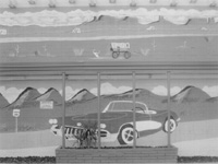
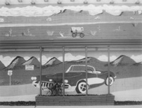
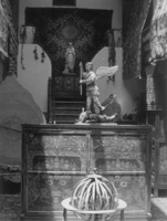
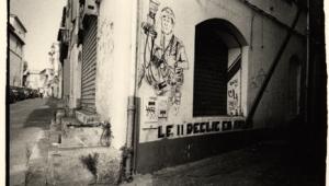
Barstow Mural: This image was made on Kodak Portra chromogenic black and white film, which gives good tones but has weak overall contrast with black and white papers. Print (above) was made with a Grade 3 filter exposed for 85 seconds. Print (below) was made "only" with Grade 5 and Grade 00 filters, resulting in more vibrant tones. Exposure through the Grade 5 was 150 seconds while exposure through the Grade 0 was 35 seconds. (All prints made on Ilford Warmtone RC paper.)
Photos © 2003, Bill Davis, All Rights Reserved

There's no denying the greater convenience variable contrast printing paper affords. With only one box of paper and using appropriate filtration you can get virtually any contrast rendition you desire. But another benefit of multicontrast papers is that you can evoke different contrast renditions within the same print. Known as multi- or split-contrast printing, it allows you to burn in sky, for example, without having to battle the perhaps higher contrast grade you had selected for the ground. Today's variable contrast papers are a far cry from their predecessors, which could exhibit rather harsh tones or have inconsistent contrast ranges. True, different papers might have slightly different ranges, but for the most part their contrasts are consistently spaced. Also, there are a staggering 12 grades of contrast to play with at present, all the way from extra-extra-soft (00) to extra-hard (5) with five half-steps in between--all this in a single sheet of paper.

So, with such a cornucopia available to us, you'd think we would all be jumping with joy. Not so. Prior to the availability of variable contrast the big question was whether our negative would print best on a Grade 2 or a Grade 3. Now we spend our time plotting strategies for burning in the sky with one contrast, the clouds with another, and the shadows with yet another. We might find ourselves immersed in a combination of filters that can barely be remembered, and takes forever to print through.

Some VC Background
During my years of teaching photography at the University of New Mexico-Taos, I've developed a method of working with variable contrast filters and paper that simply does the job, with a gain in quality to boot. This technique assumes, of course, that you have a halfway decent negative to work with, one with reasonable shadow detail and densities in the highlights that aren't the consistency of cast iron. But first, some background.

Multicontrast papers are basically made up of a high contrast layer and a low contrast layer, each sensitive to a different color of light, principally blue and green. Today the layering is more complex than this, but it essentially still works the same way. Early on, printers of an independent mind determined that it was possible to create a multitude of contrasts by printing with two exposures. Since a green filter would activate the low contrast layer and a blue filter would activate the high contrast layer, they proposed obtaining a range of contrast exceeding the regular 1, 2, 3, etc. simply by creating a mix of the two layers by varying the length of two exposures made through a blue and a green filter.


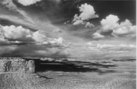
Utah Landscape: Kodak's Technical Pan film has extremely fine grain and is very sharp, but can display too much contrast for subjects with extreme contrast range. The first print I made had blocked up highlights and lost details; it was made with a Grade 1 filter in an attempt to control highlights. This much superior result was exposed for 100 seconds through a Grade 2 filter, an 80 second exposure through a Grade 00, and an 18 second exposure through Grade 5, which yielded a very tonally rich yet controlled highlight print.

Unfortunately, such a method had one frustrating drawback: an extensive amount of trial and error might be needed in order to arrive at the correct exposures to achieve the desired contrast. Nevertheless, the basic idea was sound, and this is really what the standard contrast printing filters do, except they do it by using mixtures of yellow and magenta. Blue/green filtration is simply an additive color system while yellow/magenta is a subtractive system, but both achieve the same end: they allow the printer to control contrast.

Multicontrast filters do have the advantage, however, of having been mixed to achieve standardized levels of contrast (the usual 1, 2, 3, etc.) and consistent densities that do not require extensive re-testing of exposures with each change of contrast. All this sets the stage for making it fairly simple to obtain the tonal range one prefers. After an initial exposure test the resulting print can be re-evaluated to see if it needs additional work.

Highlight And Shadow Filters
The technique I use borrows from the two-filter concept by using only two filters from the standard pack, the Grade 00 and the Grade 5, for additional work after the initial exposure time has been made using whatever filter matches the "base" contrast needs of the negative. This technique also eliminates the need for careful masking or holding back exposure, the bane of conventional split-contrast printing, relying instead on the fact that these filters each act upon different tonal values or densities within the print.


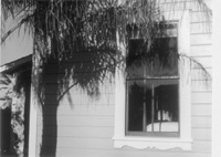
Tonal Differentiation: To better render and separate the light gray of the wall from the window sill and deepen the palm shadow, I used a Grade 1 filter overall for 50 seconds and then added a Grade 00 for 27 seconds and a Grade 5 for 7 seconds.

The Grade 00 primarily affects the lightest values in the print while leaving the mid and lower ones virtually unchanged. The Grade 5 does the opposite, affecting the mid and lower values but having almost no affect on the lightest. By making additional exposures with these two filters, a print can be made to yield sparkling highlights with delicate detail while still having robust lower mid tones and maintaining whatever level of detail is desired in the darker values. Given that these filters create such mutually exclusive effects, it is also easy to use them in burning in without creating too much crossover into adjacent areas. Fringing effects can be subtly feathered and kept totally unobtrusive with only a modicum of effort.

Indeed, I have found that by using this simple technique, it is possible to create prints with values that are extremely subtle, often pushing the eye to its limits of perception. Such printing is black and white at its highest and finest level and is a hallmark of the well-crafted silver print. There may not be a lot of interest among the public in the subtleties of the black and white print, but that should not deter printers from making them.

I hasten to add that none of this is inviolate, and encourage the reader to make whatever substitutions you think are warranted, though I would remind you this is an exercise in simplicity, so do not get carried away lest things become unduly complicated again. I admit to using filters other than Grade 00 and Grade 5 where I feel the print warrants it, either in exchange for or in addition to them. Just be sure you have thoroughly explored the basic concept I've outlined here before you start trading Grade 1 for Grade 00, and so on.

To yield more highlight "pop" and open shadows the basic exposure with a Grade 1 filter was 45 seconds, augmented by a 30 second exposure using Grade 00 and 9 second exposure with a Grade 5.

Exposure Adjustments
The Grade 00 filter will require a considerable exposure time to be effective, often 60-80 percent as long as the original exposure. The Grade 5, on the other hand, can affect the darkness of the mid and lower values quite dramatically, and thus should be used very judiciously. Fortunately, exposure times with the Grade 4, 41/2, and 5 filters have only half the effect of those made with the Grade 3, 31/2, etc. Even so, use short times with them (say 10-20 percent of the initial or base tested exposure) until you become familiar with the corresponding effect.

While all multicontrast papers will work with the concept I've put forward, I currently enjoy printing on the warmtone papers that have become so popular in recent years, principally Ilford's Warmtone Multi-Grade and Agfa's Multicontrast Classic, which gives a bit more contrast and is the bargain of the group. The Agfa Classic does not tone as dramatically as the Ilford, but if you do not use toners other than selenium for a protective effect this is not a real concern.

So give the technique a try. Start by determining your base exposure and contrast suitable for the negative and then use these "extreme" filters to further modify tonal values as required. This way you'll be working with a truly variable contrast printing technique that greatly simplifies the complexities of split-contrast printing.

Bill Davis is a fine art photographer and printmaker who for the last 30 years has been based in Taos, New Mexico, where he's represented by the Fenix Gallery (www.fenixgallery.com). His works are in the collection of Yale University and several New Mexico museums. Last year, 2003, marked his 40th year in photography.

COMMENTS
vlaugher's picture

Hi,
The info I found by Frances E. Shultz on Shutterbug seems to contradict what you say about being able to "lay down" the highlights separately from the shadows:
Is it a fact that your method simply allows for more precise filter "decimals", such as 2.2, 4.3, 3.7 etc? Is 10 seconds at #0 and 10 seconds at #5 equivalent to 20 seconds at 2.5?
Thanks.

X