- REVIEWS
Camera Reviews 
More Reviews Mobile Reviews Photography Reviews - GALLERIES
- VIDEOS
- BUYER'S GUIDES
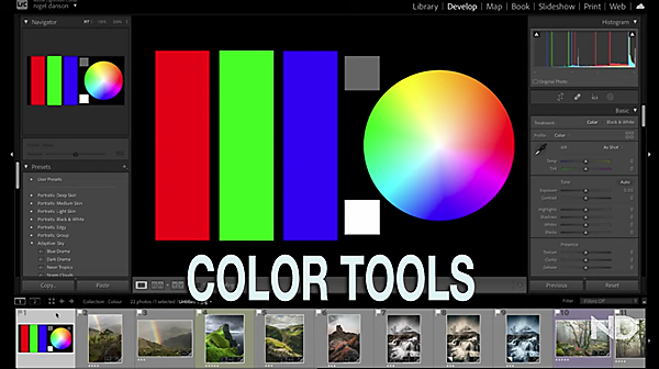
BASIC Tools for Photos with Dazzling COLOR in Lightroom (VIDEO)
A common mistake made by beginning Lightroom users is going a bit overboard when processing images. Sometime this involves over-sharpening, while other times it’s a heavy-handed approach to enhancing color.
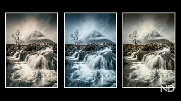
As you’ll see in the basic guide below, “great color” doesn’t necessarily mean maximum intensity—especially if your goal is a natural-looking photo. In the basic guide below one of our favorite outdoor photographers demonstrates how he edits color in Lightroom for pleasing and precise results.
If you follow the tutorials we post from British pro Nigel Danson, you know he prefers an editing technique that delivers realistic-looking photos. In this episode he demonstrates a variety of straightforward Lightroom tools for doing just that, while producing images with impact.
What makes this episode different than color processing videos we’ve posted in the past is that it’s about more than just the tools. That’s because Danson’s advice is also geared toward helping you create images with a unique and recognizable style.
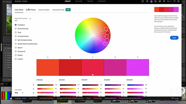
As Danson explains, White Balance tends to be the most commonly used color tool. But as you’ll see, Lightroom offers numerous other color grading tools that are simple to use and often deliver more precise results. That’s because White Balance adjustments affect all tones in an image except the whites. The Tint tool works in a similarly global manner.
Conversely, some tools like Hue, Saturation, Luminance, and others enable you to make refined color adjustments that are more discreet and accurate by selectively targeting specific tones while leaving others untouched. Danson covers all the specifics in 20 minutes, and we suggest you take a few notes for future reference.
You can find more helpful shooting and editing tips on Danson’s YouTube channel, so be sure and take a look.
And for another basic editing tutorial check out our earlier post, explaining how to use Photoshop’s powerful selection tools.


![]()
Get the Latest Photo Tips, News & Reviews from Shutterbug!
| Camera Reviews Other Reviews | Mobile Reviews Photography Reviews Columns | News | Features | How-To | Resources |
 © 2026 Shutterbug
AVTech Media Americas Inc., USA
All rights reserved