- REVIEWS
Camera Reviews 
More Reviews Mobile Reviews Photography Reviews - GALLERIES
- VIDEOS
- BUYER'S GUIDES
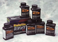
Palette Toners
There are those who say that
there really isn't any reason, anymore, to go into the darkroom
to tone prints. After all, you can sit in front of the computer and
change color balance, alter brightness and contrast, and bend curves
to get all kinds of weird and wonderful effects. But they aren't
like the weird and wonderful effects you can get with "real"
toners like the Palette kit from Fotospeed/Luminos. Nor, to my mind,
can a computer deliver the kind of satisfaction that you can get from
making a proper print, watching the toning take place, and pulling it
out of the toner at just the right moment. Also, there's an element
of chance in "real" toning, which I have never seen in computer
toning. Sometimes, the results are a disappointment, but other times
you get results that are better than you could have dreamed. |
|||
Mix each color and put it in
a clean tray. That requires four trays. The fifth tray is for a saline
solution, which is used for clearing the highlights. The proportion is
not awfully critical, about two full tablespoons to a liter of water.
It is more important to keep this solution fresh, changing it every few
prints. The sixth tray, which is optional, is used for a 20 percent hypo
solution (200 gm hypo in 1 liter of water--1 liter of water weighs 1kg).
You don't have to use hypo for all of your toned prints, but it
can be used instead of the salt solution to clear highlights and also
to manipulate some of the effects, especially with the red toner. We will
come back to that later. |
|||
Vanadium yellow, when used
alone, gives you a bright, butter yellow. Like titanium yellow, it tends
to bleach the print somewhat, though not as much. Vanadium yellow is also
hard to judge, at least initially, because the toned portion of the print
doesn't actually turn bright yellow until it is washed. After a
few prints you can judge it pretty accurately though, just by what has
happened to the density of the print. |


![]()
Get the Latest Photo Tips, News & Reviews from Shutterbug!
| Camera Reviews Other Reviews | Mobile Reviews Photography Reviews Columns | News | Features | How-To | Resources |
 © 2026 Shutterbug
AVTech Media Americas Inc., USA
All rights reserved