- REVIEWS
Camera Reviews 
More Reviews Mobile Reviews Photography Reviews - GALLERIES
- VIDEOS
- BUYER'S GUIDES
Make Landscape Photos POP: Add Contrast & Color in Lightroom (VIDEO)

Do your landscape photos lack impact and fail to appear as impressive on the computer as they did through the viewfinder? If so you’re not alone, and in the video below you’ll learn two simple Lightroom tricks for achieving the compelling look you expected.
This episode from German pro Christian Mohrle will help you transform good nature photos into great ones with simple Lightroom adjustments. Tip #1 explains an effective “light-shaping“ technique that involves pumping up contrast, while in Tip #2 you’ll see how to achieve rich and fresh-looking colors.
Along the way you’ll pick up a few other color grading secrets for creating eye-popping landscape photos. As always, Mohrle provides a link to the demonstration image in the link beneath the video so you can follow along and make the changes yourself.
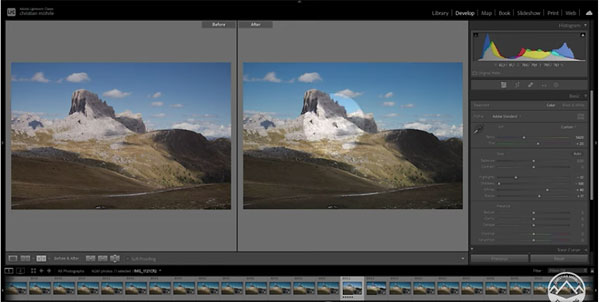
Mohrle’s goal for this particular shot is to enhance contrast by creating dark shadows and bright highlights, while slightly adjusting colors to make grass in the foreground look fresh instead of dry. He begins by changing the Profile to Adobe Standard and adjusting White Balance for a more natural look.
Next come a few basic adjusts to the overall scene—adding texture, dropping shadows and highlights, and pumping up vibrance and saturation. The image looks better already and Mohrle improves the look further with three simple masks over selected portions of the scene.
All that’s left is the judicious use of color adjustments to the foreground of the shot. He first raises the yellow hue which immediately makes a difference. Then he raises saturation of both green and yellow tones. Finally, he increases green and yellow luminance for a bit more contrast, and the job is complete in barely nine minutes.
There’s an abundance of very helpful landscape photography lessons on Mohrle’s YouTube channel, so don’t forget to take a look.
We also encourage you to check out a tutorial we posted earlier from another expert, explaining when to use Photoshop’s Vibrance tool instead of the more frequently employed Saturation tool.


![]()
Get the Latest Photo Tips, News & Reviews from Shutterbug!
| Camera Reviews Other Reviews | Mobile Reviews Photography Reviews Columns | News | Features | How-To | Resources |
 © 2026 Shutterbug
AVTech Media Americas Inc., USA
All rights reserved