- REVIEWS
Camera Reviews 
More Reviews Mobile Reviews Photography Reviews - GALLERIES
- VIDEOS
- BUYER'S GUIDES
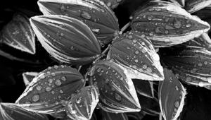
Depth Cues: Add Dimension To Your Images
One of the primary differences between a photograph and the real world is that reality has three dimensions: height, width, and depth. Your photos, of course, only have two—height and width. Any depth that exists in a photograph is purely an optical illusion. Even if you were able to create a print that was the exact same size as the scene (and wouldn’t that be fun) it would still pale beside the real thing because of the lack of that third dimension.
Painters and artists have wrestled with this illusion as far back as the ancient Greeks and came up with various visual slight-of-hand tricks that we’ll call “depth cues” to help sell the viewer that there is indeed a third dimension in the work. When carefully exploited and combined, the sense of depth and distance they create can be quite convincing. In this article we’ll take a quick look at some primary depth cues and how you can put them to work in your photos.
Linear Perspective
Until 1435, when an Italian artist named Leon Battista Alberti wrote about it in his book On Painting, the idea of using linear perspective as a depth cue had never been defined. His theory changed the course of painting and visual perception and among those who quickly adopted it was one of his young apprentices—Leonardo da Vinci.
The concept of linear perspective is simple: whenever parallel lines recede into the distance and converge to a single vanishing point (called one-point perspective) they create the illusion of distance. The vanishing point is the place where the lines seem to join. For example, in the shot of the railroad tracks (#1) your brain knows that the rails don’t really get narrower as they go toward the horizon, but because the width appears to be shrinking, the brain interprets this as depth or distance. The longer the parallel lines are and the more distant the vanishing point, the more depth the scene appears to possess.

A photograph can have more than one vanishing point (two-point perspective, three-point perspective, etc.), but the illusion is most intense when there is one dominant set of parallel lines. If you were photographing a city street, for instance, the street disappearing into the distance might be the primary depth indicator, but the converging sidewalk lines and even the rooflines of the buildings might converge to additional vanishing points. The trick to exploiting linear perspective effectively is to use a combination of viewpoint and lens choice to exaggerate the perspective. In most cases a wide-angle lens combined with a slightly high or quite low vantage point dramatically increases the illusion.
Tip: It’s also important to maximize depth of field (by using a narrow aperture) so that you maintain sharpness from near to far.
Leading Lines
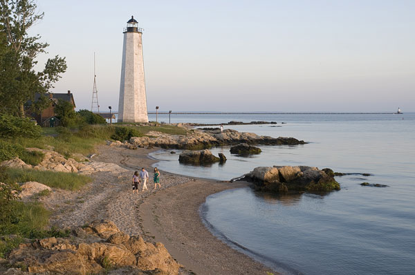
Another simple way to enhance space in your photos is to use a leading line to guide the eye into and through your compositions. You can use almost anything as a leading line—a road, a stream, the curve of the shore, etc. By arranging this line carefully, you can take the viewer on a journey from the foreground into the distance and you can even lure them to points of interest along the way. In the shot of the lighthouse (#2), for instance, the curve of the shore leads the viewer to the group of people and then eventually to the lighthouse. Leading lines are like a siren call to the eye and if they are strong enough, their allure is almost impossible to resist.
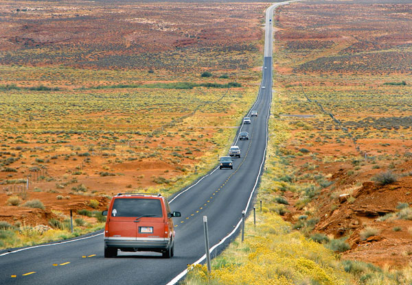
The best way to enhance the strength of a leading line is to use a wide-angle lens to exaggerate the spatial relationships and start the line as close to the bottom of the frame as possible. In the photo of the Utah highway (#3), for example, I carefully composed the shot so that the highway goes from the left corner of the foreground to the far horizon. I manipulated the effect even more in editing by cropping the scene tightly.
Diminishing Size
Including objects of diminishing sizes is another powerful sense of depth tool. Generally you can utilize this when you have objects of similar size that get smaller as they get farther from the lens. If you include a row of telephone poles in a landscape shot, for instance, they will appear to be decreasing in size as they get further from the camera; the mind perceives that shrinking size as distance. Your brain knows the poles are probably very similar (or even exactly the same) in size, but because they seem to be shrinking, the brain translates this into depth.
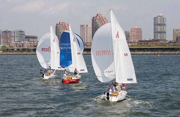
Interestingly, the objects only have to be perceived as being similar in size for the effect to work. In the shot of the sailboats (#4), for example, we really wouldn’t have any way to know they are exactly the same size. Because the boats seem to be smaller from right to left, however, your brain will interpret the smaller boats as being more distant.
The shrinking size illusion works well even when the objects that you know are actually smaller in reality appear to be larger in the image. In fact, this incongruity is often the very source of the depth perception. For instance, because your brain knows that a small child closer to the lens is, in reality, much smaller than a horse in the distance, even if the child appears much larger in the frame, the mind simply corrects this false bit of information by interpreting it as distance: child/big, horse/small = distance. You can exaggerate the apparent mismatch to further enhance depth by using a wide-angle lens and putting the smaller object closer to the camera.
Atmospheric Perspective
If you’ve ever stood in front of a mist-shrouded mountain range you have probably noticed that the peaks get lighter in tone as they recede from you—a depth cue called atmospheric perspective and sometimes called aerial perspective (#5). This effect happens because as the distance between you and the peaks increases, the atmosphere reduces the amount of contrast in the scene and reduces the color saturation and the degree of detail you can see. Your mind perceives these lighter tones and the decreased detail and contrast as distance.
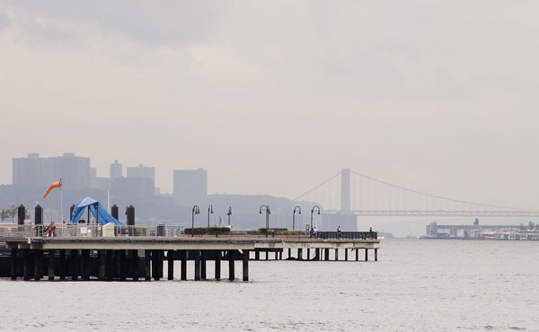
The effect happens any time that there is a significant amount of haze, fog, or even air pollution in a scene. In the New Jersey harbor scene (#6) the wharf in the foreground is much closer to the camera and has well-defined colors and plenty of contrast. The bridge and buildings in the distance, however, are shrouded in mist and are much lighter and have far less tonal contrast and so we perceive them as more distant.
Interestingly, while using a telephoto lens normally compresses space and reduces the perception of space, with atmospheric perspective these lenses also increase the effect of the fog or haze. The result is that even though you are compressing different planes of a scene (the peaks in a mountain range, for instance) because the effects of the aerial perspective are exaggerated, the sense of distance is often increased.
Upward Dislocation
Any time that you place the horizon or an object high in the frame, your mind perceives the objects at the top of the frame as being more distant than those lower in the frame. This depth cue is called upward dislocation and it works because any time that you’re out looking at the world your brain knows that those things that are farthest away are usually at the top of your field of vision.
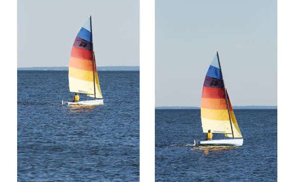
The same is true in a photograph: if your eye has to scan from the bottom to the top to look at the scene, it perceives those elements at the top of the frame as being more distant. In landscape photography you can exploit this cue very easily by simply shifting the horizon higher in the frame. Compare the two shots of the same sailboat (#7 and #8) and you can see that by simply moving the sailboat higher in the frame, the sense of distance is greatly increased, even though the photo was made from the same spot and the boat sizes are equal within the frame.
Once you become aware of each of these devices it’s fun to try and work them into your photos; train your eye to see them and you’ll no doubt find these depth cues in almost every scene.


![]()
Get the Latest Photo Tips, News & Reviews from Shutterbug!
| Camera Reviews Other Reviews | Mobile Reviews Photography Reviews Columns | News | Features | How-To | Resources |
 © 2025 Shutterbug
AVTech Media Americas Inc., USA
All rights reserved