- REVIEWS
Camera Reviews 
More Reviews Mobile Reviews Photography Reviews - GALLERIES
- VIDEOS
- BUYER'S GUIDES
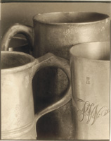
Fine Printing
Recipes For Great Print Quality
Most printers strive to make
fine prints. Some succeed while others fail. The road to success does
not start in the darkroom; it starts before you ever press the shutter
release. Film And Exposure |
|||
Film Developer Paper And Paper Developer |
|||
Selective Bleaching Image Toning |
|||
Look At Fine Prints...Live Once you are reasonably confident that you know what a fine print looks like, the best way to learn to make fine prints is to refine your shooting and printing technique. Don't try to run before you can walk. Just keep working until you are consistently producing really good prints. Some of them will be fine prints. |
|||
Farmer's Reducer Sulfide Toner |


![]()
Get the Latest Photo Tips, News & Reviews from Shutterbug!
| Camera Reviews Other Reviews | Mobile Reviews Photography Reviews Columns | News | Features | How-To | Resources |
 © 2025 Shutterbug
AVTech Media Americas Inc., USA
All rights reserved