- REVIEWS
Camera Reviews 
More Reviews Mobile Reviews Photography Reviews - GALLERIES
- VIDEOS
- BUYER'S GUIDES
|
Feb 19, 2016

|
Sep 16, 2015
|
May 26, 2015
|
Nov 19, 2013 |
First Published: Oct 01, 2013

|
Jun 07, 2013 |
First Published: May 01, 2013
|
Nov 20, 2012 |
First Published: Oct 01, 2012

|
Sep 06, 2012 |
First Published: Aug 01, 2012
 One of the most common complaints about digital imaging is the lack of consistency when going from one device to another—most commonly screen to print. Dark prints are the typical complaint, but color shifts are also a contributor to choice language and lack of hair. Yes, we tweak the image until the sky is that perfect hue of blue, or the skin tones have just the right amount of warmth and vibrancy. When it’s all done, the image is posted online or printed and it looks nothing like what we expected. The image is too dark, skin tones are too red, any number of problems. Where did it go wrong?
|
Jul 13, 2012 |
First Published: Jun 01, 2012
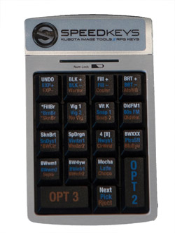 Photographers, especially those dealing with large numbers of images, are always looking for ways to speed up the workflow and spend less time in front of a computer and more time behind a camera. Applications like Lightroom have improved the process tremendously, making cataloging and image adjustments easier and faster than before. If you have adjustments that you apply frequently, you can use presets to make it a single-click process, applying a number of adjustments in one operation.
|
Mar 28, 2012 |
First Published: Feb 01, 2012

|
Nov 01, 2011 |
First Published: Sep 01, 2011

Pages
PHOTO OF THE DAY

Today’s photo is Shake Out by Linn Smith
eNEWSLETTER SIGNUP
![]()
Get the Latest Photo Tips, News & Reviews from Shutterbug!
| Camera Reviews Other Reviews | Mobile Reviews Photography Reviews Columns | News | Features | How-To | Resources |
 © 2026 Shutterbug
AVTech Media Americas Inc., USA
All rights reserved