Photographing The World Around Us: Fine Art Photography Websites
One of the main purposes of having a website is to market you and your photography, right? Yet, based on my experience writing this column you would never know it. Almost half the people I contact requesting permission to feature their sites don’t respond or say “no.” Their sites may be freely available to anybody in the world but they prefer to limit the number of people seeing their work. I always honor their requests but don’t understand this approach to marketing. If you want as many people as possible to see your site, send me an e-mail through the Contact page on my website (www.joefarace.com). I can’t promise that I’ll feature the site but can assure you it will be given full consideration. I plan to do an all-reader’s Web Profiles sometime this year, hopefully with your site in it.
www.gallowayimages.com
Santa Fe’s Woody Galloway tells me, Shutterbug “helped me many times in the past,” which is gratifying considering the quality of the photography on his website. After a short browse it becomes obvious that Galloway is a poet with a camera. And it’s not just the sensitivity and creativity shown in his nature and wildlife photography. After viewing some of the images, look in Stories to read what he describes was going through his mind when making a given photograph, then go back and look at an image, like “Snow Horse,” and you’ll have a deeper appreciation of it and insight into what it means.
Galloway has collected his images into six galleries, the first being The Bird Gallery, featuring many images of small birds photographed in the snow, all providing a technical challenge, but Galloway takes it further by making them aesthetically pleasing at the same time. Similarly, his image “Catch Me If You Can” of a horse running in the snow shows that not only can Galloway create poetic photographs, but he’s also willing to work in challenging environmental conditions to capture them. To see what I mean, look at “Snow Deer.” It’s a fairy-tale moment and you almost expect to see Snow White wrapped in a black cape stepping out of the woods. Alas, there is no story behind “Snow Deer” so you’ll have to make up your own. Woody Galloway says, “These images have become messages of hope in this life”; he calls them “Images of Hope.” Take a look at his quietly inspiring text in “Messages of Hope” and you’ll understand what he means.

www.herbsmithphotos.com
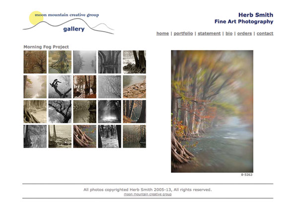
Behind the understated design of Herb Smith’s website lie eight galleries of powerful images that underline the photographer’s goal to “inspire others to recognize the value of the natural world around us.” His portfolio contains eight collections, many of which depict the beauty of the Texas Hill Country where he lives. Categories include Abstracts, Blanco River, Cypress Creek, Cypress Roots, Flora & Fauna, Morning Fog, Travels, and Trees that feature black-and-white photography as well as images created using infrared, Lensbaby, and pinhole techniques.
Clicking the collection’s icon brings up small thumbnails and medium-sized images that make you want to press your nose against the screen to appreciate the nuance of Smith’s craft. There are no captions beyond a catalog number that can be used to order archival quality prints. Photographs in the Blanco River collection run the gamut from hard-edged color images made in a subtle contemporary style to his black-and-white images, which drift into impressionism. In Morning Fog the color images move center stage with Smith using nature’s own soft focus filter to capture radiantly beautiful moments. Yet some of the monochrome photographs in this collection (notably “8-1936”) are remarkable for their use of light, tone, and composition. You’ll find impressive infrared images in Trees, such as “3625-IR,” that embody the stylistic touches that are the hallmark of Smith’s work while adding the mystery of infrared. Herb Smith’s website is a mini-class in nature photography, showing the power and beauty of nature surrounding us.
www.burtonpritzker.com
Burton Pritzker is an architect turned photographer and his former occupation shows in the precise structure of his website but also in his work, which consists of 14 image collections. They include the Picasso-like abstract, mixed media imagery of Different Perspectives to the Zen-like minimalist aesthetic of Under the Shadow of Baja, shot during a road trip down the Baja Peninsula. These grainy black-and-white images use a Mies van der Rohe Less is More style but he takes it further where the aesthetics and stark renderings vary from the “Baja XV,” which takes you on a journey à la The Prisoner, to the architectural fragments and shapes epitomized in “Baja XIX.” This last one blurs the line between drawing and photography, yet remains intrinsically photographic.
He’s not afraid of photographing people and Emotions is a series of images of a male actor that he interprets in a crisp, often harsh black-and-white study. Cityscapes is often used to describe a genre of pictures of buildings, but Pritzker uses his training and talent to make it uniquely his own. His series of fragments capture the essentials of design and shape that make up cities, not just of this century but with a timelessness for which black and white seems well suited. Burton Pritzker’s work was an inspiration to me and will perhaps be to you as well to help you truly think outside the box.

mikedooleyphotography.com
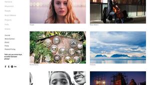
Mike Dooley is a Rhode Island-based photographer whose cleanly designed website uses a blog-like format to display his images in a straightforward manner, allowing you to appreciate the subtlety and complexity of a palette covering many genres. Dooley’s landscape photographs eschew the dramatic to produce graceful images such as “Trees on the Hill” but he turns it up to 11 with photographs like “Sunflowers Under Stormy Sky” that employ the Dooley touch, making you want to stop and count each of the hundreds (thousands!) of sunflowers so you can immerse yourself in the scene for as long as possible. His night photography focuses mainly on industrial subjects, yet images such as “Milky Way on Cape Cod” include a tiny building in the background that adds a miniscule detail, bringing the entire image full circle.
In Places & Things, Dooley takes us on a journey from the beautifully realized detail of the “USS Lionfish Torpedo Room” to the juxtaposition of HDR and photojournalism in “Iggy’s Doughboys and Chowder House.” Dooley is clearly comfortable photographing people, as can be seen in a gallery that features everything from traditional headshots and pictures of babies to a series of classically elegant portraits of ballerinas that knocked my socks off. Before leaving the site, stop and peruse Mike Dooley’s blog, which features images of New England along with text illuminating his thought process when making these amazing images.

