- REVIEWS
Camera Reviews 
More Reviews Mobile Reviews Photography Reviews - GALLERIES
- VIDEOS
- BUYER'S GUIDES
Photo Basics: Learn Why the Colors in Your Photos Have a Big Impact on How They’re Perceived (VIDEO)
Some experts call it “Color Theory,” while others refer to “Color Psychology,” but the point is that the colors of objects around us have a significant impact upon our moods, attitudes, and perception. In the video below, you’ll see how this concept applies to the photographs we make and how they are viewed by others.

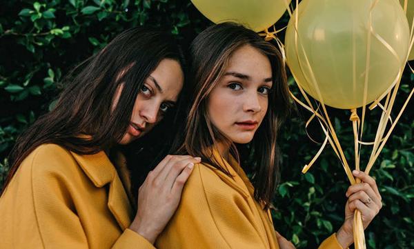
The idea is by understanding color theory we have control over the impact of our photographs by choosing what colors to include and which ones to avoid. In an outdoor scene, this may just involve an adjustment to the composition. With portraiture, the concept applies to the wardrobe we choose for our models and any props we may include in the shot.

The folks at Mango Street conducted an interesting experiment in this video: They used two models in two different locations, with the only difference being the color of the outfits (yellow and pink) to demonstrate the impact color has on how the portraits are perceived.
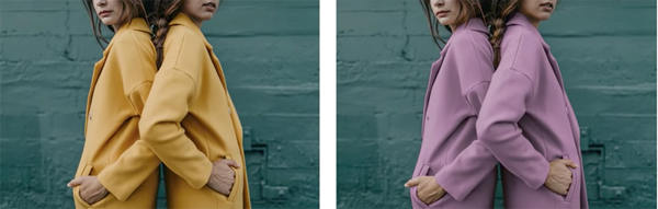
Watch the video and see if you agree that the dominant color in these images affects how you feel about the photos. With a bit of creative thinking, this principle can be applied to all sorts of photography.
You can find more interesting tips on the Mango Street YouTube channel, and be sure to look at another tutorial of theirs we posted earlier with helpful advice on improving your travel photography.


![]()
Get the Latest Photo Tips, News & Reviews from Shutterbug!
| Camera Reviews Other Reviews | Mobile Reviews Photography Reviews Columns | News | Features | How-To | Resources |
 © 2026 Shutterbug
AVTech Media Americas Inc., USA
All rights reserved