- REVIEWS
Camera Reviews 
More Reviews Mobile Reviews Photography Reviews - GALLERIES
- VIDEOS
- BUYER'S GUIDES
Give Landscape Photos Soft Pastel Tones with This Photoshop Edit (VIDEO)
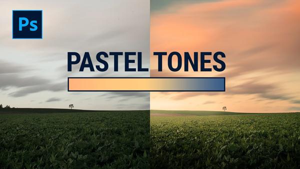
Many photographers strive for images with bright vibrant colors that are saturated to the max. But taking a more subtle approach can deliver beautiful results, with soft pastel colors that stand out from the crowd.
The tutorial below from The Phlog Photography YouTube channel demonstrates the appeal of images edited with a Photoshop color-grading technique you may have not tried. And we think you’re likely to fall in love with the warm and inviting pastel look.
In this episode German landscape pro Christian Mohrle begins with a rather flat landscape image that definitely needs work. But instead going bright and vivid, he decides to restore the warmth of the sunset and take the pastel route,
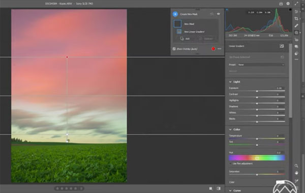
Mohrle’s basic adjustments include increasing color temperature to warm up the shot. Because the image is rather dark, he brings up the overall exposure and drops the highlights. He also adds a bit of saturation and vibrance for more discernable color in the bland photograph.
Masking comes next, with a linear gradient over the sky to reveal more details in the clouds, and a second linear gradient over the foreground for a vignetting effect. He also employs two radial gradients to add glow entering the scene from the left.
Now it’s time for the meat of the edit, namely, the pastel color grading method. As you’ll see, he drops orange, yellow, green, and blue tones while slightly increasing the reds. The final touch is a split toning effect that works really nice.
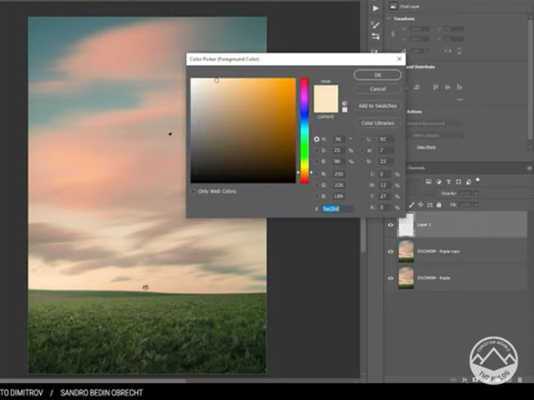
All that remains is a bit of cleanup with Photoshop’s Spot Healing and Clone Stamp tools, and the edit is complete.
You can find more shooting and editing tips on Mohrle’s YouTube channel, so be sure to pay a visit.
If you want to take your processing in the opposite direction check out the tutorial we posted recently, explaining how to create bold b&w photos with a simple Lightroom technique.


![]()
Get the Latest Photo Tips, News & Reviews from Shutterbug!
| Camera Reviews Other Reviews | Mobile Reviews Photography Reviews Columns | News | Features | How-To | Resources |
 © 2026 Shutterbug
AVTech Media Americas Inc., USA
All rights reserved