- REVIEWS
Camera Reviews 
More Reviews Mobile Reviews Photography Reviews - GALLERIES
- VIDEOS
- BUYER'S GUIDES
5 Portrait Editing MISTAKES You Should Avoid (VIDEO)
Everybody wants to avoid mistakes when it comes to photography and one of the best places to start is in the editing room. There's a tendency by beginner editors to overdo it when they are retouching their portraits and that can be the biggest mistake of all.
In the below video, Francisco Hernandez of FJH Photography shares his "top 5 more portrait retouching mistakes to avoid." As the title suggests, this is a follow-up to a previous tutorial where he gave his initial top 5 portrait editing mistakes to avoid. And in the new video like the old one, Hernandez not only points out the retouching errors, he shows you a better way to do the same edits.
"Every single thing that I'm going to be talking about in this video and in the other video are all things that I have done myself," Hernandez says. "So, if you do any of these mistakes right now, don't feel bad, just learn from it and continue."
#1 Dynamic Range Overload
"The very first retouching mistake that I want to talk about today is creating max dynamic range in a photo," he says. "And what I mean by this is when people take a great photo and they just increase the shadows to the max and decrease the highlights to the lowest possible point and create a very, very dull and not so good-looking image."
#2 Obvious Clone Stamping
"This is using the clone stamp in a very obvious way in Photoshop. A lot of people do this for different reasons but what I've seen in the off-camera flash community is that people leave a flash in the shot, maybe even a whole light setup in the shot and they don’t do a very good job removing it using the clone stamp."
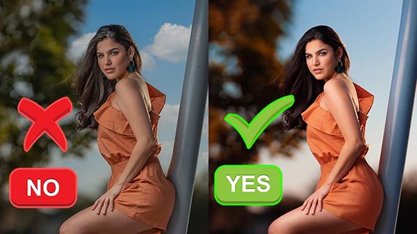
#3 Bad Sky Replacement
"Not just sky replacement in general but bad sky replacement. And I'll show you guys exactly what I mean right now in Photoshop."
#4 Selective Color
"Selective color is making something specifically one color, the only thing in that photo that has color and everything else is black and white. Again, I'm not saying that you can never do selective color and make it look good but just for the most part it kind of gives it an outdated look."
#5 Obvious Liquifying
"Liquifying in a not-so-realistic way or in a very obvious way doesn't look good. If you guys do this, make sure you do it in a realistic way or in subtle way so it's not so apparent."


![]()
Get the Latest Photo Tips, News & Reviews from Shutterbug!
| Camera Reviews Other Reviews | Mobile Reviews Photography Reviews Columns | News | Features | How-To | Resources |
 © 2026 Shutterbug
AVTech Media Americas Inc., USA
All rights reserved