- REVIEWS
Camera Reviews 
More Reviews Mobile Reviews Photography Reviews - GALLERIES
- VIDEOS
- BUYER'S GUIDES
Digital Photography In Black And White
Digital Photography In Black And White
Seeing In Grayscale Tones
by George Schaub
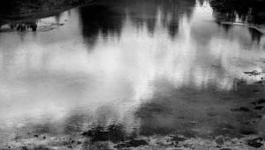
Somehow, we accept black and white as quite natural, as a fair and reasonable representation of what we have photographed. But it is hardly that—the world is filled with color in all its hue and shades, from the brilliant azure blue of the tropical sea to the rich red of a rose. Yet, a black and white photo can be more evocative and emotional than the same scene in color. It can reveal the detail, design and texture of a subject or scene in a more powerful way, as if color is a distraction from what really stands before our lens.
 |
|
|
“Seeing” in black and white seems to come naturally to some photographers; for others the translation of light and color to black and white, or more properly grayscale values, can be more difficult. Fortunately, seeing how a scene might translate to black and white can be an acquired skill, something that comes with practice. Digital cameras make it easy with their “Monochrome” mode and its variations, especially when the camera allows us to view the scene prior to exposure via Live View. Even for those without this feature it’s a simple matter to set the camera to Monochrome, make the picture then hit the Review button as you stand there in front of the scene.
The Panchromatic Illusion
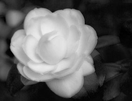
Keep in mind that every image you take is an RGB (color) image, and that the black and white version generated by the camera is an emulation of how black and white panchromatic film would see those colors. It is quite arbitrary as the image processor can be programmed to see colors in any fashion the camera engineers desire (and in fact you can change the way the camera “sees” in black and white yourself through alteration of tone curves and selecting “Filter” effects; more on that in the Camera Settings section). In general, panchromatic film “sees” red as fairly dark, blue as fairly light, green as dark and yellow as bright. Keep in mind that this is a vast generalization subject to the intensity of light striking the subject and the subject’s surfaces—the way they absorb and reflect light.
 A |
|
 B |
|
 C |
|
 D |
|
 E |
|
 F |
|
|
In short, black and white film responds to the brightness value with density and the color with tone. In digital black and white the signals and code produced by the sensor and image processor respectively emulate how the image would look if it were exposed on positive black and white film. A red color records with a different grayscale value depending on whether it is deep red or pink; deep red might record as close to black while pink might be closer to a middle gray. The panchromatic response (a black and white film that responds to all colors) is often, in fact, heightened in digital because every image you expose is in fact composed of color components, or channels. This changes much of what you might have learned about black and white photography if you began with film, even though it seems as if everything acts the same. It also means that certain ways of manipulating contrast and grayscale rendition of certain colors in black and white film have become moot.
 G |
 H |
|
 I |
||
|
||
For example, when photographing with film you would change the “contrast” of a particular color, or the way in which it records as a grayscale value, by using color filters over the lens. This would block and pass certain colors depending upon the color of the filter; like colors would pass (and create more density, thus print lighter) and opposite colors would be blocked (thus create less exposure/density, and print darker). Placing these color filters over your digital camera would have an effect on the character of your image, but there is no need to do so because all you need do is program the processor to emulate the effect you desire and you’re done.
Light’s Character And Direction
One of the best and most enjoyable (and inexpensive) ways to become a better photographer is to study light. Take the time to consider the direction and intensity of the light as it enters the scene. Move around and place yourself in relation to the light source so it strikes the scene from various angles. Make the same image at various times during the day. Learn how to use the light to enhance contrast, to raise texture and to highlight certain important parts of the scene before you.
 |
|
|
Take the time to look at how light falls; how it defines form; and how an interplay of light and shadow create volume, scale, and space. Consider how to make light an ally to your expression. Once you have made a habit of looking at light the process of using your camera to fully capture what you see will unfold. You will begin to understand how your camera sensor and processor work together, how the camera “sees” and how it sees differently than you. This will yield exposures that bring the optimum potential out of every subject and scene.
 |
|
|
The study of light pays back in other ways. It can open your eyes to the picture possibilities that occur throughout the day. Every moment is unique; light is always particular to the time of day, weather and environment. The idea is not to put light in a box and respond automatically to whatever that box is labeled. There are no set rules on interpretation, but there are “rules” and guidelines on how to record information that will afford you the most creative freedom later in processing and printing.
 |
|
|
Light Types
There are numerous subjective descriptions of light, most of which are inadequate to describe and encompass all the variables. But we have to start somewhere. Hard light might be the light at high altitudes, unimpeded by haze or dust. It can also be very high in UV (ultraviolet) content. In some cases the ground is brighter than the sky, the inverse of what occurs at more moderate altitudes. Soft light is that which comes through cloud cover; the clouds act as a soft box that breaks up, or diffuses the direct beams of light into a softer glow.
 |
 |
|
|
||
High key light refers to a scene dominated by bright values. It can be ethereal or blazing with light. Generally there are few deep or large shadows to define form. It can also be used to define an interpretation of an image in image processing. Low key means a composition without much contrast between the lighter and darker subjects, often from shooting in the shade, under overcast sky or other diffused, low light conditions.
 |
|
|
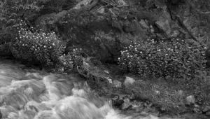
Contrast
The value or brightness of light reflected from various subjects within the scene is rarely if ever the same. The direction and intensity of light create shadows, form, and dimension. The relationship of the numerous levels of brightness is called “scene contrast.” Contrast is the creative juice in the tonal play, but it can, if excessive, create a harsh, unattractive scene where some details in the bright or dark areas are lost. Conversely, too little contrast can make an image appear flat and lifeless, dulling the sense of presence and liveliness in a scene.
In short, contrast is what gives an image richness but it can also cause problems.
 #1 |
You can’t always predict how you will interpret an image. There are so many variables and courses to follow that you can, to an extent, simply concentrate on the photograph and concern yourself with tonal play, contrast, toning etc., later. There are times, however, when you know just how you want to work with an image, such as a set of images I made while snow shoeing in the Adirondacks. If I was shooting film I might have chosen a high contrast lith film to attain the “pen and ink” rendition of the branches and twigs I was aiming for here. But with digital I photographed to simply keep the highlights in range (#1) and then created the high contrast derivation in software later (#2).
 #2 |
Interpretations
In film photography the term “previsualization” was used to describe seeing the final print when you made the picture, and using exposure and processing techniques to make it happen. Both the techniques, and how far you could take them, were often defined by characteristics that were etched in the film emulsion and chemicals used to develop it. These could be modified to a certain extent by choice of development and later printing techniques. What’s changed in digital is that the character of that “film”, or recording material, is up for grabs. There is no character per se, although there are some boundaries, but not a lot. In general, just about every facet of the image can be manipulated on each and every frame. That means we have all become film designers and can create recordings that enhance a subject or scene in any way we might desire.
 |
This photograph (above) was made on an overcast day with diffuse lighting illuminating the scene. There was very little cast shadow, although there was a slight difference shown in the area between the two tree limbs. The heightened contrast, textural play, and deep shadows of this rendition are all results of post exposure processing. My job in the field was recording all the values possible under the circumstances. Once I had the image in the computer later I could get down to the work of image enhancement without the restraint of prior contrast or exposure decisions.
That control continues through the processing of the image, which now can include exposure correction, digital emulation of color contrast filtration, and even grain and sharpness qualities. And it extends to the print, where toning and other image effects are much, much less difficult, and certainly less malodorous, than they had been in the past.
 |
 |
|
|
||
These variables can result in some amazing images. The main task is putting your mind around what digital previsualization might mean to you. It has been my experience with digital that it is next to impossible to predict just how the image might end up looking after all is said and done. It’s not that you lose control of it somehow; it’s just that it allows you to follow many, many paths. This can be disquieting, at first. Previsualization is no longer limited by what chemistry film and silver paper can produce. It can include decisions about the light sensitivity of the sensor, the tone curve of the recording (the contrast) and even the panchromatic response of the various colors in the image—both in the global (overall image) and local (areas within the image) sense. Yes, it is still about seeing the light, reading and recording it to maximize its potential, and then re-interpreting, or refining that vision later. The range of tools might seem overwhelming at first, but dealing with each as you work in the field and later process and print your images will soon reveal how much has changed in the creation of black and white images, and how your expressive abilities have expanded in ways only dreamed of in the film days.
 |
This article has been excerpted from “Digital Photographer’s Guide to Black and White Landscape Photography” (Lark Books, 2009, ISBN 978-1-60059-390-1) by George Schaub, available at Barnes & Noble, other booksellers, and online.


![]()
Get the Latest Photo Tips, News & Reviews from Shutterbug!
| Camera Reviews Other Reviews | Mobile Reviews Photography Reviews Columns | News | Features | How-To | Resources |
 © 2026 Shutterbug
AVTech Media Americas Inc., USA
All rights reserved