|
Recent Additions
Cameras
Other Digital Darkroom Portraiture Sports/Action Lighting Outdoor/Travel Wildlife Film & Processing Photo Allies Blog Co-Op Forums Galleries Photo News Past eNewsletters David B. Brooks Jon Sienkiewicz Turn Your Hobby Into Cash Industry Voice Glossary Trade Shows Workshops Photo Links Shutterbug Radio Manufacturers Contact Us Outdoor Tips Travel Tips Portrait Tips Sports Tips Lens Tips Software Tips Family Tips Instant Links Editor's Notes Talking Pictures Picture This! Features Book Reviews Student Union Point of View Web Profiles Exhibits Photo Clubs News & Notes Help Digital Help Business Trends Digital Innovations Globetrotter Master Class Passport The Darkroom Catalog Showcase Shutterbug Shopper Photo Lab Showcase Service Directory Free Product Info Classifieds Photography Lighting Digital Photography Equipment Film Processing Lexar Media Camera Lenses |
Color the Way You Want It Text and Photography by George Schaub Color is a subjective experience. Yes, there are defined color spaces, and gamuts and color meters that define, measure and make suggestions for balancing color to be as “true” and accurate as anyone could desire. But for photographers color is what they see and want to communicate, not always what objective measurement might indicate. For film photographers, especially those who shoot slide film, the color “profile” is determined by how the film emulsion is structured and how one exposes and develops the film. Push a film a stop and color will change; underexpose slide film and the color will shift accordingly. For color print shooters, the color is initially described by the film structure, but very much interpreted by who is making the print and on what paper they might be printing. Digital photographers have a wider choice about how color is seen and recorded. There are no dyes or emulsion to determine the color, just codes that can be changed with ease. Want a blue apple? No problem, just select the red or green and replace that color with ease. Want rich, vibrant color that any Velvia shooter would love? Just move the saturation and contrast up in the camera menu or later in software. Want super-accurate color? Just place a gray card in the scene, click on it later with the middle gray eyedropper in Curves or other software control and all the other colors line up like you read it with a color meter and lit it with perfectly balanced lights. There are so many color controls in image manipulation software that any expressive use of color can easily be obtained. You can get as elaborate or as simple as you like with these controls. In camera you have color choices as well, although they are not as nuanced as those found in software. And if you shoot in Raw mode you can start with one color interpretation and very easily move onto many, many more later. The point of all this is not to confuse you with too many choices but to give you a sense of the freedom of expression now available. To give a brief glimpse into this colorful world, here’s two examples of how color is easily manipulated in camera. This carousel horse was photographed first at the ‘default” mode with a Nikon D200. The ride was closed for the winter and wrapped in sheathing, thus the hazy look.
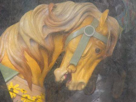
I liked the look and nostalgic feel, but wanted to enhance the colorful paint. I simply set the next shot at +2 color saturation (Optimize in the Nikon menu.)
Color can be enhanced in camera with Contrast and Sharpness settings as well. Contrast plays an important role in color rendition, and can be used to heighten the feeling of saturation even more. In general, the more the contrast the deeper the color rendition, much like the effect slide film shooters sought when they worked with underexposure. Sharpness settings also have an effect on color. Sharpness does not make a focused shot out of a blurry one; it increases the edge contrast of the pixels, and can be used to add contrast to tonal (and color) borders. This offset of color tones can be quite effective when you want a more graphic feel in your shots. This wall in Montreal is quite color rich as it is, but I wanted to add even more “snap” to the image.
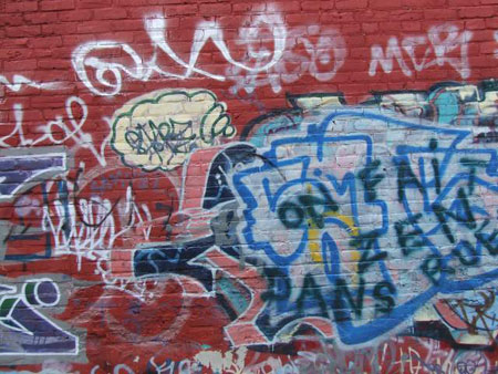
To do this I raised Saturation to +1, Contrast to +1 and Sharpness to +1 in the image menu. The image processor simply applied these instructions and made the wall look like it was painted the morning before I photographed it.
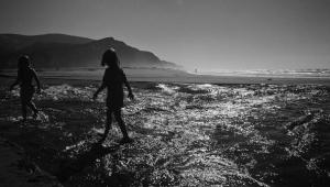
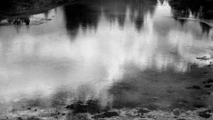
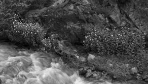
So keep these colorful tips in mind next time you go out shooting, and play with color in each shot to get just the right combination for what you see and want to say with your images.
|


