- REVIEWS
Camera Reviews 
More Reviews Mobile Reviews Photography Reviews - GALLERIES
- VIDEOS
- BUYER'S GUIDES
Lighting For Black And White Portraits
The Black And White Thing
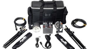
I get a whole new way of seeing things when I put black and white film in the camera. It seems like I have a little Photoshop Desaturate command that goes off in the back of my head and suddenly I see everything in shades of gray. Anyone who's been shooting for a few years and who uses black and white film knows just what I mean. Being a good photographer means being able to previsualize what your final image will look like, so this is an absolute requirement. Black and white images are by their very nature abstractions since we see everything in color and are faced with a photo where color is absent. Armed with that glaringly obvious fact, what can you, the photographer, do to assure that the gray scale images you create will be satisfactory? Going to a John Sexton workshop may be one answer, but short of that, here are some guidelines about producing quality black and white portraits, with a special emphasis placed on lighting. As is usually the case in my articles, I place more stock in what's between your ears than on what equipment is in your bag, so "gear challenged" readers please continue with the rest of us. One of the great assets of black and white film is the amazing amount of information it can hold, from deep shadows to brilliant highlights. Couple that with the fact that you also have the ability to control exposure and development to render a given look you're after, and you can see that black and white photography, even in this digital age, remains a remarkably rewarding and challenging experience. |
||||
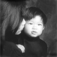
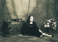
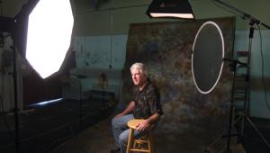
Beautifully crafted black and white prints often command the most respect from viewers and the highest auction prices in the fine art market. Maybe your prints won't sell for hundreds of thousands of dollars, but emulating the work of previous masters is not altogether a bad thing. So let's go. Lighting Considerations You bet I would if I was being commissioned to create a nice portrait instead of a newspaper publicity shot. Then I'd take all the time I needed. If I was going for a very soft look, I may keep my lighting very even and maintain a rather low ratio of main to fill light with the main light with twice the power of the fill light. Knowing that black and white film can handle a greater range, I may choose a much higher lighting ratio, with maybe a three stop power difference between my fill and main light for dramatic effect. Look at the powerful effect George Hurrell created with his dramatic portraits of some of Hollywood's biggest stars. He combined "hard" lighting with high ratios to create his memorable work. |
||||
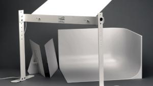
Light's Aspects Quality is a whole different story. I like to call it the "shape" of the light. It means whether the light is hard or soft. It's relative to the size of the light source in relation to the subject and the shape of the light or light modifier, e.g., softbox or umbrella. Other factors that will have an impact on the final result include the size of the room you're in and the color of the walls and ceilings. Color is a factor here because we're talking about the amount of reflectance. A white wall close to the subject will reflect more light than a dark wall far from the subject. Experience and testing are your best friends in this situation, which seems to be true in just about all photographic endeavors. |
||||
Hard And Soft Light Again, it depends upon the effect you're after. I'm not big on hard and fast rules. The same applies to natural light, one of my favorite options. Even though the sun is a pretty large light source, being 93 million miles away makes it a relatively small hard light. Use it directly and it's hard as nails. Bounce it off an open sky and that becomes your light source, much bigger and much softer. |
||||
Rules Of The Road I hope to continue producing
"real" black and white portraits for my clients for some time. There is
a timeless appeal to their classic beauty. |
||||


![]()
Get the Latest Photo Tips, News & Reviews from Shutterbug!
| Camera Reviews Other Reviews | Mobile Reviews Photography Reviews Columns | News | Features | How-To | Resources |
 © 2026 Shutterbug
AVTech Media Americas Inc., USA
All rights reserved