- REVIEWS
Camera Reviews 
More Reviews Mobile Reviews Photography Reviews - GALLERIES
- VIDEOS
- BUYER'S GUIDES
Five Steps For Optimizing Your Photos
We all strive to produce photos that are perfect right out of the camera. Unfortunately, sometimes what comes out of the camera doesn't quite match what we envisioned when we pressed the shutter button. Here are some easy things you can do to improve your photos after the fact.
STEP 1: Crop The Image
It's best to get the framing right in camera, but often we don't. So examine your photo and check that it is properly aligned (i.e., the horizon is horizontal) and framed. If not, use the image-editing software's Rotate feature to align it, then crop as necessary. It's best to crop the image before doing the following steps, because it will give you a smaller image file to work with, and that will require less computer resources so things will go faster.
 |
|
 |
|
 |
|
|
STEP 2: Level The Field
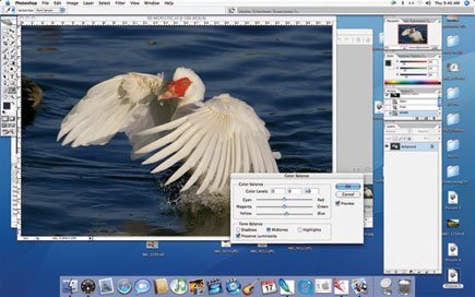
It's tough to judge color rendition when the image is too dark or too light, so adjust image brightness and contrast carefully. The image-editing program's Brightness/Contrast control is seldom the best way to do it. The Levels control provides you with much more control. Go to Image>Adjust>Levels, and you'll get a window similar to the one shown (I use Photoshop, but other image-editing programs have similar capabilities).
The Levels window displays a histogram--a graph of the tones in the image. With Photoshop, dark tones are on the left, light ones on the right (some image-editing programs may reverse that). Below the histogram are three arrows. Moving the left one to the left edge of the histogram will make the darkest tone in the image pure black. Moving the right arrow to the right edge of the histogram will make the lightest tone in the image pure white. (You won't always want pure black and pure white--go by what looks right to you on the screen.) Move the middle arrow to adjust the mid tones--moving it left makes them lighter, moving it right makes them darker.
Levels adjusts the entire image. If specific portions of the image are too light or too dark, use the Dodge and Burn tools. The Dodge tool makes the area to which it is applied lighter, the Burn tool makes the area darker. Working on a Duplicate Layer rather than an Adjustment Layer will keep the dodging and burning separate from previously corrections.
 |
|
 |
|
|
STEP 3: Color Adjustments
Once the image looks good tone-wise, adjust the colors if necessary. The easiest way to do this is via the Color Balance sliders. Go to Image>Adjust>Color Balance, and adjust the red/cyan, green/magenta and blue/yellow sliders until the colors look right. If the image has a neutral tone, you can often adjust the color balance by clicking the middle eyedropper in the Levels window, then clicking on the neutral area to neutralize the clicked area.
When the colors look right, go to Image>Adjust>Hue/Saturation, and adjust the saturation slider for optimal effect. With Photoshop, moving the slider left reduces saturation, moving it right increases saturation.
 |
|
 |
|
|
|
| |||||||||
- Log in or register to post comments


![]()
Get the Latest Photo Tips, News & Reviews from Shutterbug!
| Camera Reviews Other Reviews | Mobile Reviews Photography Reviews Columns | News | Features | How-To | Resources |
 © 2024 Shutterbug
AVTech Media Americas Inc., USA
All rights reserved