Still Using A Lab For B And W Prints
For Best Results, Do It Yourself

Still Using A Lab For B&W Prints
Civil war re-enactor.
Photos © 2002, Frances E. Schultz, All Rights Reserved

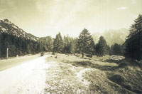
In the years BC (Before Color), black and white labs for amateurs were taken for granted. After that, black and white became the province of professionals or keen hobbyists. Today, though, your local minilab can process chromogenic (C-41 compatible) black and white films and make reference prints. Then you can print them traditionally; or print them digitally; or order reprints. There are at least five reasons to print them yourself: printing full frame, contrast control, cropping, local exposure control (dodging and burning), and toning.

The important thing, though, is this: black and white has never been simpler. It's fun, and it produces great pictures. If you haven't tried doing it yourself yet--what are you waiting for?

Full Frame
Most labs mask your negatives and lose some of the image area. Compare the lab print of the Civil war re-enactor with my all-in print on Ilford Multigrade IV, toned slightly with selenium toner. I used a filed-out negative carrier to create a black frame: the fence is complete, and the sky doesn't "leak" into the border.

"All-in" prints are easy to do digitally--if your scanner can handle the full frame (many can't). You also need an "effects" file to recreate the "filed-out neg carrier." In order to print full frame, obviously you need to scan the whole neg, but for all applications, you'll do best to work from a negative scanned at high resolution (2000dpi or above). Scanning prints is likely to prove a great disappointment.

Monument Park; near Budapest.

Contrast Control
Chromogenic film is often "soft" (lacking in contrast): many lab prints lack "sparkle." For example, I printed the Hungarian memorial sculpture on Ilford Multigrade Warmtone paper at the hardest grade available (5) before toning it with sulfide toner. Digitally, contrast control is even easier, and every bit as convincing.

Toning
Getting a good, consistent image tone on color paper demands a special printing channel for black and white and good quality control: even then, strictly, the pictures are monochrome ("one color"), not true black and white. Chromogenic films printed on color paper can however look greenish, sepia, magenta, yellow, blue, or even purple, all on the same roll. Kodak has gone a long way to sort this out, and Kodak chromogenic film processed in a good Kodak lab should give you consistently neutral to warm image tones. Labs can get true (but still chromogenic) black and white paper for their machines, but few bother.

In the traditional "wet" darkroom, though, you can choose a paper that suits you: warm, neutral, or cool. Then you can tone it: selenium for extra warmth, gold for a cooler image, sulfide for sepia, even iron for blue, copper for red, and uranium (!) for orange. Selenium, gold, and sulfide have the additional advantage of increasing archival permanence.

If you are a glutton for punishment you can use color paper and play endless games on your enlarger's filters, but dye images (including chromogenic black and white, which cannot be toned) are not as permanent as silver or archivally toned images.

Digitally, image color can be changed very easily, but a constant problem is metamerism (color shift under different light sources). Few ink jet prints that look right under tungsten light will look right under daylight, and vice versa.


Cart, Descartes.

Dodging And Burning
This is where printing your own pictures really comes into its own. For example, in the picture of the cart the left-hand side of the lab print is very light. So is the grass in front. The right-hand side has a processing fault (which is not on the neg), and the rebate on two sides is very distracting: apparently the lab's enlarger was out of adjustment. But on the negative there was plenty of sky detail, and I liked the pattern of sunlight on the grass.

The optimum exposure and contrast grade for the cart would mean that the dark trees "blocked up" to a featureless black, so I shaded them for a part of the exposure so that they would not go so dark ("dodging"). I then gave the foreground extra exposure to get detail there ("burning"), using the same contrast grade. Finally, I switched contrast grades (about 1/2 grade softer) and "burned" the sky to get detail there. The print is on untoned Ilford Multigrade Warmtone.

The "dodge" and "burn" tools in all electronic manipulation programs that I have tried are next to worthless: blotchy and muddy. A far better approach is to open two or even three files of the same image at different contrasts, then use the "clone" control from one to the other (with reduced opacity, if you like) to get the image the way you want it.

Motorcyclist, Julian Alps, Slovenia.

Cropping
Use two L-shaped pieces of black card to see if your prints would look better cropped. For example, to emphasize the motorcyclist in the Slovenian landscape I cropped the foreground, adjusted the contrast and did some localized dodging and burning. The picture is printed on Ilford Multigrade Cooltone with a touch of gold toner to accentuate the bluish tone of the paper. Again, any digital program makes cropping very easy.

X