- REVIEWS
Camera Reviews 
More Reviews Mobile Reviews Photography Reviews - GALLERIES
- VIDEOS
- BUYER'S GUIDES
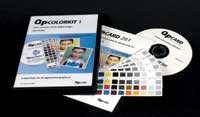
QPcard's QPcolorkit 1
Custom Color Profile Creation For All Digital Cameras
As more and more photographers
are going partially or even totally digital, we're all starting
to learn the elements that make for a great image. At first we're
all wrapped up in pixel count, lens sharpness, zoom range, and battery
life. After a few dozen ho-hum images it becomes painfully obvious that
a great color photograph is often more about contrast and color balance
than anything else. Customized Camera
Profiles |
|||
Manual White Balance Repeatable Results |
|||
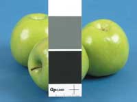
There are any number of very elaborate and expensive ways to create a calibration file at the beginning of each session, the best conceived one being Kodak's brilliant calibration routine for the DCS Pro Back series of camera backs. Shoot a standard Macbeth ColorChecker, open the file in Kodak's Camera Manager software, create a calibration file and you're all set. There is nothing as simple and elegant as that available for non-Kodak cameras, but I recently learned that QPcard has released a very nice and inexpensive method to create a repeatable color correction profile. The QPcolorkit 1 |
|||
I have to say that I love this size, and I love the fact that the $150 kit includes five of them. Since I have a mini version of another color chart (that had no software with it) that set me back $80, it's sort of a bargain. (And QPcard sells replacement packs of five cards.) I have mounted one card to a like-sized piece of black cardboard, and I keep it wrapped in an old lens tissue sleeve. This card is always in my camera bag. I keep another one around the studio, where it sticks easily to tabletop product shots and is easily hand holdable by models. Check The CD For The
PDF |
|||
Some Extra Steps Needed |
|||
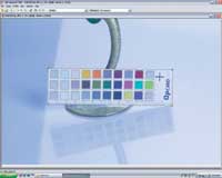
Once you have the card accurately
outlined, it's simply a matter of clicking on "Create Profile."
You then name your profile and save it to a folder of your choice. Once
you create a profile the image on screen is converted by clicking "Convert
Image." The color conversion, once the profile is applied, is certainly
radical enough to a poorly balanced uncorrected image, but is it really
more accurate than just using "Auto" in Photoshop Levels or
clicking on a neutral gray patch? |
|||
Batch Processing |
- Log in or register to post comments


![]()
Get the Latest Photo Tips, News & Reviews from Shutterbug!
| Camera Reviews Other Reviews | Mobile Reviews Photography Reviews Columns | News | Features | How-To | Resources |
 © 2024 Shutterbug
AVTech Media Americas Inc., USA
All rights reserved