- REVIEWS
Camera Reviews 
More Reviews Mobile Reviews Photography Reviews - GALLERIES
- VIDEOS
- BUYER'S GUIDES
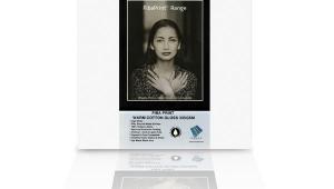
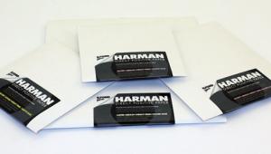
Paterson Acugrade Warmtone
A Variable Contrast RC Paper
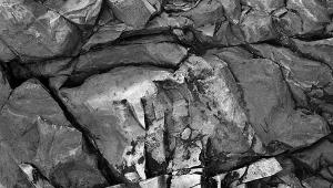
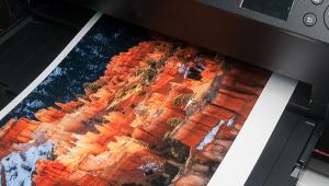
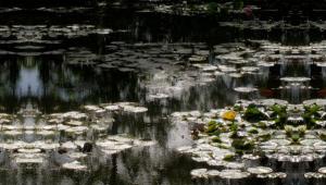
It's always fun to try out a new photographic printing paper, especially when it turns out to be as versatile as the new Paterson Acugrade Warmtone. It is a medium weight, Variable Contrast (VC), Resin-Coated (RC) paper with a semimatte, pearl finish. The base tone is a light creamy-white, which does not look particularly warm until you compare it with a cool-tone or neutral-tone paper. "Pearl" is a very apt description of the surface texture. It has a very nice tactile quality, which although different from fiber based, compares very well with it. Change Tone Via Developer |
|||
Paper Speed Contrast Variations |
|||
Dry-Down Effect Toning Tips |
|||
Gold toner on its own tends to cool a warm image tone. Gold on sepia gives a reddish color. As this test was of the paper and not the toners, I stopped at just selenium, gold, and sepia. You can ring the changes in all sorts of ways, including partial, split, and sequential toning, so you need to experiment. When you try out a new paper, keep your scrap prints or washed test strips so you can play around with the various combinations. The "Lith" Technique |
|||
There are several kinds of lith developers on the market. They are generally two-part, and to get the best results, you use them very diluted, at about half strength. If at all possible, follow the manufacturer's instructions for the developer you choose (not all give adequate instructions). Evaluation |


![]()
Get the Latest Photo Tips, News & Reviews from Shutterbug!
| Camera Reviews Other Reviews | Mobile Reviews Photography Reviews Columns | News | Features | How-To | Resources |
 © 2025 Shutterbug
AVTech Media Americas Inc., USA
All rights reserved