- REVIEWS
Camera Reviews 
More Reviews Mobile Reviews Photography Reviews - GALLERIES
- VIDEOS
- BUYER'S GUIDES
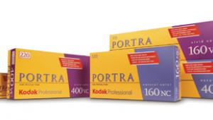
Kodak’s Professional Portra 160 & 400 VC And NC; Four New Films For The Working Pro
It is interesting that as digital imaging began its ascendancy film reached an all-time high in quality: hue, saturation, and sharpness, all of which meant digital had to try harder to be better. One of the films that stood out were the Kodak Professional Portra color negative emulsions, which in the last 10 years have become a favorite for photographers worldwide.
 |
So, I was surprised to hear Kodak had been working behind the scenes to improve the Portra emulsions. According to Kodak, the new Portra emulsions are not just a makeover of the current emulsions, they have been re-engineered from the ground up for improved scanning performance and greater enlarging capabilities. Having made this claim, it is interesting to note that the "improved scanning capabilities" were the result of removing the retouching surface on the current film several years ago.
Kodak also claims that there are not one, but two, speed-enhancing improvements in their T-Grain emulsion technology which have been incorporated into these films.
VC & NC
The four new emulsions that I was sent to test are designated 160NC and VC, and 400NC and VC. The "NC" stands for Natural Color, the "VC" stands for Vivid Color. NC films are engineered to provide pleasing skin tones, natural color, and low to moderate contrast. VC films are meant to be punchier, being modified for increased contrast and saturation (as opposed to natural). According to Kodak, the new VC emulsion has 10 percent less contrast than the older version.
NC would be the film you would choose to photograph material swatches for a fashion or interior designer--anything where you want to replicate the color of the subject as precisely as possible. They would also be a good choice for formal wedding photographs, where you want natural skin tones. Using the 160NC for the formal images and switching to the 400NC for the wedding candids might be a good choice in order to maintain consistent skin tone quality.
VC would be a good choice for increased contrast and saturation. This film would be a good choice for a party, street photography, travel photos, or color landscapes. However, my tests show that with the reduced contrast the difference between the NC and VC emulsions appears to be negligible, though on balance, the VC emulsion does appear a little punchier in a good way.
Color Tests
When testing color film I always look for exposure latitude, hue and saturation, sharpness and grain, and flesh tones. A final consideration is whether the film is better than the one it is meant to replace.
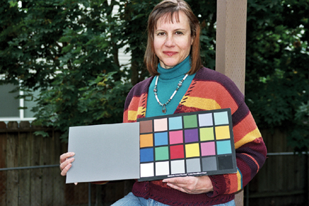
I prefer to photograph subjects rather than color charts. However, there are so many variables in printing color negatives that without a standard, such as a color chart, there is no way to accurately test color negative films. For that reason, I always include one on each test roll so that the lab may standardize on color and density. This is especially helpful in judging skin tones. After that, I use my eye and instinct to determine how far I can expose, both over and under, and still find the results acceptable.
 |
|
|
Speed & Exposure Latitude
Modern color emulsions tend to be close to their published ISO, in this case 160 and 400. If there is any deviation it is usually 1/3 of a stop or less, which with the extreme latitude of modern color negative emulsions is not enough for concern. So, I always consider the published ISO as the normal exposure. With this in mind, I found that all four of the emulsions have a great tolerance for overexposure, easily producing a printable negative at +5 stops. The ability to tolerate gross overexposure is perhaps the most important argument in favor of film. Even though the extreme high values will be blown you will still have a printable image. With digital, as you approach two stops of overexposure any subject greater than a three-contrast range can't be used.
 |
|
|
As far as underexposure the two 400 emulsions appear to have the greatest latitude, though only 400NC was able to record anything printable at -5. As far as usable negatives, even though there is printable density, I would not want to print any of these emulsions that were more than two stops underexposed.
 |
|
|
Color Rendition
Hue and saturation are next. By hue is meant overall color. This is a word used quite extensively by color photographers working in digital, and is more accurate when referring to the overall color characteristics of a film. Saturation and hue are very much related and one affects the other. The more saturation, the deeper the hue. This does not mean the colors are more brilliant, nor does it always mean that a more saturated image is a better image.


![]()
Get the Latest Photo Tips, News & Reviews from Shutterbug!
| Camera Reviews Other Reviews | Mobile Reviews Photography Reviews Columns | News | Features | How-To | Resources |
 © 2026 Shutterbug
AVTech Media Americas Inc., USA
All rights reserved