- REVIEWS
Camera Reviews 
More Reviews Mobile Reviews Photography Reviews - GALLERIES
- VIDEOS
- BUYER'S GUIDES
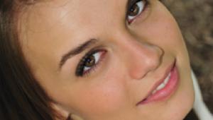
Getting Skin Tones Right
Digital Portrait Techniques
While it's clear to every serious photographer that digital cameras will eventually replace film as we know it, there's still cause for concern with the skin tone of digital portraits. Unless you use the $23,900 Foveon II camera, with its three independent 4 megapixel monochrome sensors, you're shooting portraits with a "Bayer Pattern Array" sensor. In other words, you're sampling small areas of the image in a dyed pattern of blue, red, and green. (Look closely at your TV set and you'll see a similar array.) Technology right now must live with monochrome pixels that only see varying levels of brightness, not changes in color. Why does this matter? Mainly because the processing firmware in your camera goes through an elaborate set of calculations to try and "guess" what color was really on each space. Different schemes are used by different manufacturers, but in general all manufacturers must wrestle with issues like color aliasing, background noise, and overall color fidelity. Most images from modern digital cameras look pretty good, but a constant complaint from digicam shooters is the color balance of skin tones. Skin Tone Reference |
|||
Among the pro-level SLR digital cameras, photographers report mixed results with Nikon, Canon, Kodak, and Fuji cameras. While the Kodak and Fuji have been heralded for their lifelike skin tones, Nikon and Canon owners have adopted workflows that allow them to produce skin tones that rival film. Many pro portrait shooters I speak with claim that their Nikon D1X and Canon 1D and D30 images rival the results they used to get on 120 color negative film. What About Point-And-Shoot? "Good" Color |
|||
All of that stuff is a great way to get your digital imaging system tuned up, but I'm more from the old-fashioned trial and error school. To get your new technology to replicate the results you got from your old technology, you sometimes have to go backward. Color Tests Now that I knew that I had some sort of reasonable "seat of the pants" color management system, I had to train my own eye to work digitally. While the best digital cameras produce results that rival the best film scans, the old-fashioned way of shooting color negative film and optically producing a type "C" print with an enlarger (remember those?) still reigns as the best way to take the expanded dynamic range of real life and put it on paper. |
|||
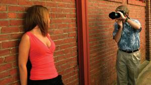
Lighting Considerations In cases where I might have chosen a punchy silver umbrella I'll instead shoot through a big 42" white umbrella. Where I might have chosen a focusing spotlight for a hairlight now I'll choose a Chimera strip light. I try and keep everything punchy, but softer than I might have with film. You guys with fancy digicams and no real lighting might want to think about a small invesment. I've corresponded with dozens of Nikon D1, Canon D30, and Olympus E-10 and 20 owners who rely exclusively on the sun and a dedicated on-camera flash for their lighting. You'd be surprised at how many Canon D30 owners think a 550EX on-camera flash unit is a studio flash system! In fact, a surprising number of pro portrait photographers use mostly on-camera flash with a couple of small monolights in the studio. I think that any serious photographer needs a lighting setup, one that is efficient enough to get a decent f/stop and versatile enough to handle reflectors, barn doors, umbrellas, and softboxes. (Strobes, in other words.) Since these cameras use very small chips and have adjustable ISO settings you don't need a big bear of a lighting system. I've been using a couple of sub-$200 AlienBees B400 monolights with umbrellas with my Nikon 995 and have gotten really outstanding results. In fact, my bigger and fancier Balcar studio strobes just plain pack too much power. |
|||
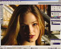
Image Tonality Here's how I do it. I have about one dozen images that I have found to exhibit really excellent color. You know, those pictures where the people really seem to leap off the print at you. I took each of these large 9-20MB files and downsampled them in Photoshop to very small 100k JPEG files. This way I can store 10 on a simple floppy disk and always have my reference skin tones with me. When I begin to work on a new image and my intention is to create a print either on an Epson printer or via an online photo printer, I'll try to figure out which of my reference images has similar lighting and contrast. I'll open the test image along with the new one and keep it open on the screen. First thing I'll do is to use the eyedropper tool in Photoshop to sample a range of skin tones on the test image, then sample similar areas on the new image. This should give me a pretty good idea. Get Info |
|||
My technique for pale images starts with a shift toward warm. I'll dial the Hue control -5. This shifts everything toward magenta. While it may make my skin tones too pink, it gets me started in the right direction. Next I'll go to color balance and dial in a touch of red in the shadows, a little bit more in the mid tones and a bunch in the highlights. I'll then add some yellow--usually mid tones only. This will shift the skin back toward the orangish/peach-colored Caucasian skin. My next trick is to saturate the Red channel only about 10 percent, then saturate the entire image another 8-10 percent. Lastly I have increased the blue of the sky to create more contrast. The results are quite startling! The original file that looked halfway decent (and would have probably be printed as-is by many) looks incredibly pale, with a blue/green overall color balance. The corrected file has that rich, warm "Velvia" look with warm and balanced skin tones. The key element here is the existence of a known reference file. Without something to "calibrate" your eye before every image-editing session you'll invariably create results that are terribly inconsistent. I have not found any automated image correction system that can rival the results I get from using my own artistic eye, a good monitor, and some patience. Using the test image really makes small things like monitor color shift less of an issue, since you're matching a file that is also displayed using the same device. The image I corrected here was output to both an Epson ink jet and to a Lightjet 5000 photo printer. Both prints look really smooth and absolutely "film-like," which is the whole idea, right? Manufacturers/Distributors |


![]()
Get the Latest Photo Tips, News & Reviews from Shutterbug!
| Camera Reviews Other Reviews | Mobile Reviews Photography Reviews Columns | News | Features | How-To | Resources |
 © 2025 Shutterbug
AVTech Media Americas Inc., USA
All rights reserved