
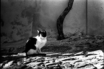
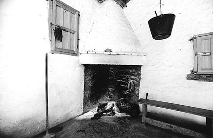
These are an amazing example of a good work on the black-and-whites. The pics look really fascinating and beautiful.
- REVIEWS
Camera Reviews 
More Reviews Mobile Reviews Photography Reviews - GALLERIES
- VIDEOS
- BUYER'S GUIDES
The Darkroom
Working With Imperfection Page 2
Do not be afraid to use extreme grades, if that is what it takes. If you need
softer than 1, go to 0. If you need softer than 0, go to 00. Zeus will not strike
you with thunderbolts. The same is true if you have to go to Grade 5 paper developed
in a high-contrast paper developer. Sometimes, using extreme grades can teach
you more about what makes a "good" print than all the Grade 2 and
3 in the world.
 |
|
|
Dodging And Burning
The brightest white in a print is at most about 180 times as bright as the darkest
black: the brightness range is 180:1. A negative can easily record a brightness
range of 1000:1 and with reduced development it can handle 10,000:1 and beyond.
Some people mistakenly believe that you should be able to compress the subject
brightness range, no matter what it is, onto the paper. This takes no account
of how we scan a scene, with the iris of the eye constantly adjusting to different
light levels. It is much more natural, with most subjects, to dodge or hold
back the shadows locally, while burning in or darkening the highlights. A "difficult"
negative may need no more than localized dodging or burning to get an excellent
print, even at a normal grade. Remember, too, that with VC papers you can use
different grades in different parts of the print.
Pre-Flashing
If there is a lot of detail in the lightest tones of a picture, but you still
need plenty of detail in the other tones, a useful trick is often "pre-flashing."
This involves giving a very weak uniform exposure to the paper before printing
it, to overcome its "inertia": I use a second enlarger, with no
negative in the carrier, raised high on the column and well stopped down.
Determine the intensity of the uniform exposure by making a test strip across
a range that runs from no tone at all to the faintest of grays: typically 1-2-3-4-5
seconds at f/16. The last exposure that gives no tone at all, or the one before
it, is the one to use for a pre-flash.
 |
|
|
Tonality
All right: you have a print with pure whites, good blacks, and a full range
of tones in between--and you still don't like it. What went wrong?
Here, we are in the most nebulous area of print quality: tonality. Good tonality
is easy to recognize, but hard to describe. To be brutal, bad tonality is even
easier to recognize.
The main reasons for bad tonality are poor exposure; poor development; and a
bad negative-paper match. This is an article about printing what you have, so
there is not much point in saying a great deal about the first two. On the other
hand, it is worth remembering that underexposure leads to far more problems
than overexposure, while at the development stage, overdevelopment is the most
common problem. It is also true that some developers suit some films much better
than others. If your chosen film-developer combination doesn't give you
tonality you like, try something else. Again, it's a question of knowing
when to quit. The aim of photography is to get good pictures, not to purify
the soul through suffering.
Back to the paper. If one paper won't give you the tonality you like,
try another: another make entirely, or another kind of paper from the same manufacturer.
Each paper has its own characteristic curve, its own way of rendering shadows,
mid tones, and highlights, and it can be astonishing how much difference this
can make. Some film-paper combinations "sing"; others may also sing,
but out of tune and flat. Even if you standardize on one paper, keep another--as
different as possible--for those negatives where you don't like the
tonality on your regular paper.
With less-than-perfect negatives, it is often a question of compromise, experimenting,
and perhaps settling for a print that is "good enough" rather than
absolutely right. But you may also find, in the course of your experiments,
that some of your prints from "hard-to-print" negatives are actually
better than you used to get from your "good" negatives. At the very
least, you'll be learning to print better, and to be more critical, and
that will stand you in better stead even with your most perfect negatives.
|
| |||||||||
- Log in or register to post comments


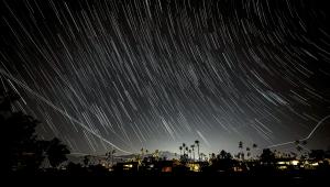


PHOTO OF THE DAY
Today’s photo is Starry Starry Night by Jeff Van Scoyk
eNEWSLETTER SIGNUP
![]()
Get the Latest Photo Tips, News & Reviews from Shutterbug!
| Camera Reviews Other Reviews | Mobile Reviews Photography Reviews Columns | News | Features | How-To | Resources |
 © 2024 Shutterbug
AVTech Media Americas Inc., USA
All rights reserved