Toward The Perfect Print
How To Get The Best Quality From An Ink Jet Printer

Toward The Perfect Print

To make a print open the File menu and click on Print, or if your application has a Print icon, click on it. Typically a simple dialog will appear on screen with a Properties button #1. Click on the button to open the main printer driver control dialog. With many of the latest printers like Epson's Stylus C62 an easy "Photo" option #2 is offered, which sets the resolution and provides automatic image file adjustment to produce good photo print characteristics. Be sure the paper type selection is the same as the paper you are using, as well as the correct paper size. Now you can click OK and expect an acceptable or somewhat better photo print from your printer. If you want the best your printer can reproduce in a photographic print you may select #3, Advanced, and follow the recommendations in this article.

No doubt many of you found a digital camera and printer under your tree this year. If it's the first time you've made a digital photo print, the chances are you'll obtain a quite satisfactory result, unless of course you don't read the basic instructions to obtain an "easy" result. In the recent past that was less of a sure thing and might have taken some trial, error, and adjustment to obtain reasonable satisfaction. But, is that all there is to it? In fact, the potential of producing quite astounding image print quality today from even modest-cost ink jet printers is usually considerably greater if you go beyond the first layer of control options. In addition, by assigning print attributes that are more favorable to different kinds of subjects like portraits and landscapes you'll improve your chances of getting great prints. So, besides going the trial-and-error route and making countless prints that waste expensive paper and ink, how can you master all of the dozens of printer driver options and make the right choices to produce that perfect print?

Photoshop, Elements, PHOTO-PAINT, PhotoImpact, and a few more image editor applications contain utilities that include a histogram display that graphically charts the image data content of a digital photo file. The PS Histogram dialog on the left is of a raw image data file that has not been adjusted (optimized) and color corrected. The blank space on either side of the data content will, if printed, result in a dull, flat, washed-out image. The Histogram on the right reflects the optimized data content of an image that will print utilizing the full range of tones and colors the printer can reproduce.

Ansel Adams, considered by many America's greatest photographer, who was also a musician, likened a film negative to a musical score and the printing process as the performance of that composition. That assumes the printing process as one performed by a skilled craftsmanship and supported by talent and practice. Digital has changed that requirement. Computers and photo ink jet printers are actually dumb machines, but they are incredibly consistent. If you give the computer and printer the right instructions it will do the right thing every time; if you tell it the wrong thing it will repeat the error over and over and produce identically bad prints. So this how-to article is about discovering the right "instructions" to provide your printer as methodically and efficiently as possible without wasting a fortune in paper and ink in an endless cycle of trial and error.

A composite image for testing and evaluating the options in a printer driver should contain photo examples that reflect a range of subjects you will typically reproduce. This one I use frequently also contains a Macbeth Color Checker and Kodak Q-60 IT-8 target images. They are only useful for evaluating how closely a printer reproduces color against a physical reference of the original.

In The Beginning
Your computer will do its part accurately if it is set up properly for digital photography, particularly if the monitor is calibrated and profiled. I addressed this part of the digital darkroom requirement in a recent how-to article: "Is Your Computer Set Up For Digital Photography?" on page 156 in the February 2003 issue. Your digital file has two basic requirements that are necessary to assure optimum print quality. First is what I call Gamut Optimization. This ensures that your image information fills the space of 256 levels a computer image file provides. If there is empty space at either end of the range of density values, and your image data only occupies a part of the space, the resulting print will be flat and dull compared to what it can and should be. You can check this in Photoshop, Elements, and many other image-editing applications using the Histogram tool that provides a graph with a visual indication of the space and how it is filled with image data. The other requirement is that the image, as you see it on screen, has the color balance, contrast, and brightness you want to see in your print.

Once a series of prints of a test image are made using each of the option selections available in the printer driver, the resulting prints can be evaluated side by side providing a perceptual basis for choosing the option setting that will reproduce your photo images most effectively. You may find that if your test image contains a range of subjects, a print made with one option selection produces the best print with one kind of subject, and another option works better with different subjects.

Once these requirements are met the completion of the printing process is in choosing from the available options in your printer's driver dialog. I would like to say that you can simply select this and this to produce a perfect print. But that is not possible because once a printer and its software is installed the computer/monitor and printer become a quite unique system, different from any other even though the printer is one of thousands just like it. So what I am going to suggest is a shortcut I use to test and evaluate printers. It is an easy and relatively inexpensive investment in time and materials that will provide an accurate visual guide to select the settings that will reliably produce the best printer performance to satisfy your vision and expectations.

The one printer dialog selection that is not a matter of personal choice is the Media Type, or paper selection. When you select a particular paper you are also selecting the color management profile which instructs the printer how to apply ink to the media, including how much and what balance of different colors of ink. If you print with the wrong selection for the paper you are using you are much less likely to obtain a print that matches the image on your monitor screen and displays optimum image qualities.

Your Personal Printer Test And Evaluation
First you will need a modest supply of a dozen sheets of 4x6 or 5x7" paper. If you will be printing on both glossy photo paper and matte paper, I suggest doing the test on both. Next you will need a test image. Although there are some composite test images available in some application packages and on the web, I would recommend making your own. You can make a simple composite image for testing yourself by choosing photos that represent the kinds of subjects you will be printing. Be sure those you select (three or four), each meets the Histogram test and looks the way you want it to print on screen. Using an image editor like Photoshop, make a New file in the size you want to print, such as 4x6" at 300dpi. Then open each image one at a time and re-size each to 2x3 at 300dpi, select it and copy it, and then paste the 2x3 into the "new" 4x6 your created. Do this three more times from your selection of representative images and you have an ideal test image that you should name appropriately and save. (I'll send you a JPEG copy of the 4x6 test image I made for this article if you will send me an e-mail request at fotografx@mindspring.com.)

Printer driver dialogs will vary in style and the arrangement of names of options between printers and used with different operating systems. If you compare this dialog with the previous one, both of which are for the Epson Stylus C62, there is a marked difference. However functionally there is considerable correspondence between even Windows XP, and this screen displayed in Apple Mac OS 10. And,
with the Epson C62, if you are printing on and select Premium Glossy Paper in default Automatic Mode the driver will automatically select best Photo Print Quality, which is in reality the printer
resolution setting.

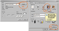
To perform the printer test open your test image in your usual photo image application, like Photoshop, and turn your printer on. Then in File/Page Setup, select the paper size, 4x6 or 5x7, and the orientation, landscape or portrait. You will now be ready to make a series of prints using the optional settings in your print driver. I would suggest the easy, basic, automatic "photo" setting first. Once this print is made, use a pen and print in the margin or at the edge on the back what the setting was to make the print. Now use the print command and select the other options from the main driver dialog screen, like PhotoEnhance, and when the print is done, again write the name of the setting on the print. Again, click on the Print command and go on and make one print using each of the Advanced print setting options (you can exclude special effects like textures and soft focus if they are of no interest to you), and with each resulting print record the setting on the print margin or back.

After you have made a full set of test prints using each setting option in the print driver (and another set if you are making one for both glossy and matte paper), lay them out so they can dry a few hours or overnight before making a visual evaluation. Then, when you do study them, place them where they will be evenly illuminated by the same kind of light under which you would normally view photo prints. In each sample print look at each different image in your test image composite. It is very likely you will find that a portrait image will look best at a different setting than the one that produces the best landscape image. For future reference you may want to mount these test prints all on a poster board, and even add notes next to some of the examples as a reminder and quick identification of what setting to use in the future for some kinds of images.

In Epson print drivers when you select Color Controls under Color Management, you have manual control of the printer's performance, including Gamma. Gamma affects print image brightness, with 1.5 producing light, 1.8 normal, and 2.2 a darker print. Also depending on the printer there is a mode selection, including Automatic, and often PhotoRealistic and Vivid, the latter being an appropriate setting for printing graphics but not photos. Personally I would not recommend using the six slider controls in Color Controls simply because there is no interactive visual image feedback of what changes are made by each setting. In other words, to use these manual adjustments is a trial-and-error process, and that can be wastefully expensive in ink and paper.

Note: The recommended print test evaluation procedure described was tested thoroughly before writing this article using five different printers: an Epson Stylus C62, an Epson Stylus Photo 960, an Epson Stylus Photo 2200, an Epson Stylus 1160, and an Epson Stylus Photo 1270. The test was also duplicated with some of these printers using two different computers and operating systems, a Sony Vaio RX790G with Windows XP, and an Apple Mac G4 with OS X and Classic OS 9.

Some Hints, Cautions, And Recommendations
1) There are two printer driver options that require special consideration: one is the ICM/Colorsync setting and the other is "No Color Adjustment." With the ICM/Colorsync setting the print output is adjusted entirely by the driver referencing the source profile (the image on screen) and the printer profile, which is selected when a particular paper selection like Glossy Photo is made in the driver dialog. However, these profiles are also in effect through your computer's color management system when all of the printer driver options are selected, whether it is Automatic, Color Control, or PhotoEnhance. The only instance when color management is turned off in the print driver function is when "No Color Adjustment" is selected. The purpose of No Color Adjustment is to reproduce color charts used in custom profiling the printer for particular papers and inks, and when a custom profile is used for printing.

With Epson printers the main print driver Properties dialog contains a PhotoEnhance option. Here, in the main driver window dialog for the Stylus Photo 2200, PhotoEnhance also offers five distinct settings, three of which provide variations in brightness/contrast and saturation, while Soft Focus and Sepia are special effects.

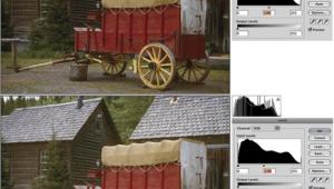
2) Because the printer profiles for specific papers are essential to translating the color of an image on screen to make a matched print output, it is essential that you use only papers and inks made for your make and model printer. The only exceptions are when you use a custom profile made for a third-party paper and a specific inkset.

The Epson PhotoEnhance feature is more elaborated and controllable if you access it from the Advanced option dialog. This provides sometimes a different set of Tone options like Monochrome and None; and also provides a separate Effect set of options including textures like Canvas and Parchment, as well as a slider to control the strength of the effect from Low to High.

3) Generally, with the exception of activating Epson Natural Color, which enhances blues and greens for landscape and similar images, the use of the many setting options like Enhanced, PhotoRealistic, Automatic, Best Photo, does not alter the color balance of the image in the prints produced. These options affect the brightness or gamma, contrast and saturation, and in one Advanced Enhanced option, image sharpness. Generally, the easiest to access options, like Photo or Automatic settings, produce the least print image contrast and saturation, and would seem to be most tolerant of poorly optimized image files, in essence providing an auto-adjusted image interpretation within the printer driver function.

If you are printing from an application that supports color management like Adobe Photoshop and Elements or Corel PHOTO-PAINT, printer dialog functions provide access to check and select different workflow options. This control with the latest versions of Photoshop and Elements is located at the bottom (Show More Options) of the Print Preview dialog. With Version 5.5 and 6.0 it is at the bottom of the main Print dialog window. To utilize the print driver options described in this article the Source Space should be Document and the PS workspace should be Adobe RGB (1998), the recommended Photoshop workspace profile. The Print Space should be Printer Color Management. If printing from applications that do not have their own color management, the print driver defaults to the monitor profile as the Source Space.

The most intense color and fullest density range in prints is with the Colorsync option with the printer installed on an Apple Mac computer. The corollary ICM setting option with the Sony Vaio Windows PC however, produced print image characteristics that were a closer match to prints made using the Automatic option setting. To obtain a print result that was close to the color intensity and print density range obtained with the Colorsync setting on the Mac with the Windows PC and any of the printers, the PhotoEnhanced/Nature option setting was required.

X