- REVIEWS
Camera Reviews 
More Reviews Mobile Reviews Photography Reviews - GALLERIES
- VIDEOS
- BUYER'S GUIDES
Six Kinds Of Contrast
How Each Affects Image Quality
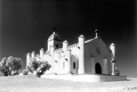
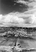
"Contrast" means a surprising number of things in photography: at least six. Made to do so many jobs, it is not surprising that confusion reigns, plenty of contrast is a Good Thing in some contexts, and a Bad Thing in others; so let's try to sort it out. Subject Contrast |
|||
Contrariwise, a misty day reduces
contrast. A faithful representation of the scene is easy enough, but often,
a faithful representation is not what you want: you want more contrast
than really existed. In this context, too little contrast is a Bad Thing.
You can, however, restore contrast in a subject that is "flat"
because of atmospheric haze by using a "sky" filter (yellow,
orange, or red, in ascending order of power). Print Contrast |
|||
Film & Paper Contrast If your films regularly require hard grades more often than soft, you are underdeveloping them, and you should increase your development times in one-minute or half-minute increments until you get films that print on average on 2 and 3. If your films regularly require soft grades more often than hard, you are overdeveloping them, and you should decrease your development times in one-minute or half-minute decrements until you get films that print on average on 2 and 3. |
|||
With color negatives, film
development times are fixed, which means that contrast is fixed. Also,
there are far fewer paper grades to choose from: often just "normal"
and "contrasty" and sometimes not even that. Even so, contrast
problems in conventional silver halide photography are rarer in color
than in black and white--not least because people are much more willing
simply to sacrifice the shadows in color, and let them block up to a featureless
black. Lens & Camera Effects |
|||
Some of this non-image forming
light is reflected back out of the front of the lens, reducing the amount
of light available to take the picture; some is absorbed by the various
light baffles; and some ends up on the film, where it "fills"
the shadows and reduces the contrast range. Acutance High Acutance Developer |


- Log in or register to post comments


![]()
Get the Latest Photo Tips, News & Reviews from Shutterbug!
| Camera Reviews Other Reviews | Mobile Reviews Photography Reviews Columns | News | Features | How-To | Resources |
 © 2024 Shutterbug
AVTech Media Americas Inc., USA
All rights reserved