- REVIEWS
Camera Reviews 
More Reviews Mobile Reviews Photography Reviews - GALLERIES
- VIDEOS
- BUYER'S GUIDES
Mood: Subtle Colors And Shades
The famous French castle Chambord (#1) was enshrouded in fog early one morning, and once the fog cleared the pictures I took weren’t nearly as striking as this. In dense fog, colors are especially desaturated. Last summer I got up early one morning to see my entire subdivision socked in (#2), and I raced outside to photograph the beautiful scenes until the fog lifted about a half hour later. Many times early morning fog lasts only a short time, and you have to photograph as quickly as possible to take advantage of the magical light and color.

All Photos © 2010, Jim Zuckerman, All Rights Reserved

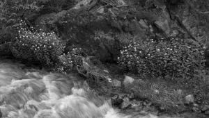
Even autumn foliage can look beautiful in this kind of moody weather. We normally associate blazing color combinations with deciduous forests in the fall, and it’s great to capture those scenes. On foggy days, though, or even in a light rain, the muted lighting can be exquisite. I shot a forest in fog (#3) in Vermont and a single tree in Tennessee (#4), and notice how the entire palette of colors can be seen, but it’s almost as if I had used the hue/saturation dialog box in Photoshop to reduce the intensity of the color. I didn’t, of course, and these images are straight out of the camera with no post-processing.

One of my favorite color schemes in nature is white on white. Snowstorms are certainly inconvenient for commuters, airline travelers, and businesses, but photographically I think they are fantastic to shoot. Good exposures can be a challenge, but there is a special beauty that is quite compelling.
The white-out conditions in (#5), for example, turned an ordinary tree into a work of art. Even if there are subtle earth-tones intermingled with the whiteness, such as in the picture I took early in the morning in Lone Pine, California (#6) when the trees were covered in hoarfrost, the results can still be stunning. I captured a similar effect with the earthy colors of a mountain lion juxtaposed with a white-out environment (#7). Notice how incredibly soft the lighting is. This kind of outdoor light is flattering for virtually any subject.


Thick fog or low clouds in combination with snow is one of the best types of lighting you can work with. The airborne moisture softens the overhead light while the snow acts as a reflector fill and bounces the light up into any shadow areas that may exist. The result is perfect lighting, and studio photographers spend thousands of dollars to simulate it in their studio work. The snow-covered trees in Yellowstone National Park (#8) offer another example of the magic of white on white.

There are two ways to correctly expose for white-out conditions. If you use a hand held light meter like the Sekonic L-758, you can use it on Ambient mode and take a light reading with the white dome on the meter pointing at the lens. If you rely on an in-camera meter that reads reflected light, take the light reading on something in the scene that is middle toned. You can use your jeans, a gray photo backpack, grayish tree bark, a rock, etc. Once you have this reading, push the Auto Exposure lock button on the camera to lock and retain that reading in place, and then re-compose the picture and shoot.
Shooting at dawn or twilight also creates mood. The high Kelvin temperature associated with ambient light at these times of day causes the images to take on a deep bluish cast. Sometimes photographers want to eliminate this color by altering the white balance, using warming filters (mostly in the past), or changing the color temperature in Adobe Camera Raw or Lightroom. I like the blue cast, however, and by using a daylight white balance I am assured of capturing it. I photographed the Rogue River in Oregon (#9) about 15 minutes before dark, and the dim light (I could hardly see the river) produced a picture with wonderful mood. I didn’t use any filters at all—the picture is completely unmanipulated. This is exactly what came out of the camera, and it happened because at twilight the ambient light photographs cobalt blue.

You can introduce this same kind of color by altering the white balance. In the photo of Brugge, Belgium (#10), the colors of night were changed because a tungsten white balance turns ambient daylight blue. If you shoot in Raw mode (as you should be doing), this can also be done using the color temperature slider in ACR or Lightroom. When you are in the field, though, it can be rewarding to see the results on the spot. If you include artificial light in the composition, the tungsten WB renders these lights correctly as our eyes see them. Therefore, the contrast between the lights and the cobalt environment is good but it’s not as pronounced as it can be.

By contrast, the dawn shot of the castle in San Marino (#11) was taken with a daylight white balance, and the scene has that bluish cast but the lights look golden because they were tungsten lights, and when a daylight WB is used this kind of lighting looks yellowish.

Opposite the moody blue tones of dawn and twilight are the golden tones you can capture with firelight and tungsten illumination when using a daylight white balance. The photograph I took of my niece, Andrea (#12) shows the beauty of this warm type of light. For skin tones, golden light is usually considered much more appealing than bluish tones. When I photographed a pub in Ireland (#13), I purposely used a daylight white balance to capture the golden colors that evoke the warmth of the environment. I think the mood makes the shot as does the use of a slow shutter speed to give an impression of being there rather than being very literal.


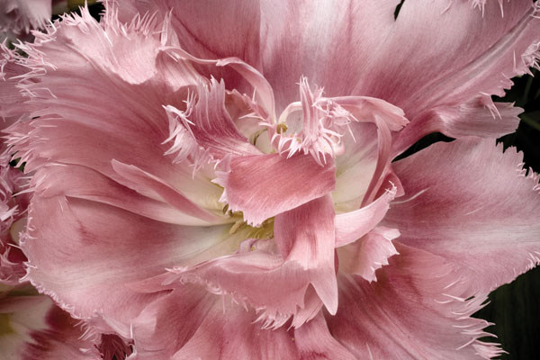
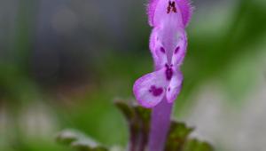
Mood can also be created in Photoshop by desaturating colors. The autumn foliage at the base of the Eastern Sierras (#14) has wonderful color and I like the image a lot, but compare it to (#15) where I used the pull-down command Image>Adjustments>Hue/Saturation and moved the middle slider to decrease saturation. The muted colors are beautiful in their own way. I did the same thing with an exotic tulip (#16), and while the original is beautiful in its intensity of color, the muted version (#17) seems, at least to me, more of a fine art picture that would look elegant if it were printed and framed.


- Log in or register to post comments


![]()
Get the Latest Photo Tips, News & Reviews from Shutterbug!
| Camera Reviews Other Reviews | Mobile Reviews Photography Reviews Columns | News | Features | How-To | Resources |
 © 2024 Shutterbug
AVTech Media Americas Inc., USA
All rights reserved