- REVIEWS
Camera Reviews 
More Reviews Mobile Reviews Photography Reviews - GALLERIES
- VIDEOS
- BUYER'S GUIDES
Master Class
Why Black And White? In A Word—DRAMA!
There's something about a good black and white image that makes it jump
off the page. It should be simple, direct, and hit you right between the eyes.
It stands on its own. It doesn't even need color to make it stand out.
It has a full range of tones from a true, deep black all the way to a clear
white...with detail throughout.
What kind of photographs best lend themselves to black and white? Almost anything.
There seems to be no special subject matter that really works in black and white
better than in color. To illustrate that point I've selected a variety
of my images--all shot in color and then changed to black and white.
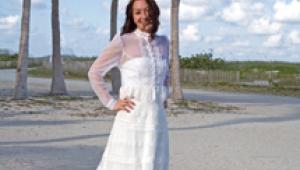
The Black And White Portrait
Portraits can be very effective in color. I always liked the color rendition
of this young tennis player, but I have to admit that it translated into black
and white just as good (if not better) than it did in its original form.
 |
|
|
There are many ways in digital to change color to black and white. Eddie Tapp,
my Photoshop guru, has taught me several of them. For this particular portrait
I didn't want to risk losing the young man's freckles, so I opened
Photoshop's Channels window and looked individually at the red, blue,
and green channels. I couldn't believe how different his face appeared
in each of the channels.
In the red channel his freckles became the strongest feature of his face. They
were too distracting. I finally ended up using the blue channel, because I thought
that it provided me with the best start. After selecting that channel I did
some fine adjusting in Levels. I then went to Image/Mode/ Grayscale. I eliminated
the color channels and flattened the picture to just the black and white image
that was represented in the blue channel. I then converted the picture back
to RGB.
Almost every one of my final images goes through a consistent production process.
I begin each image in Photoshop by making a duplicate layer and going to Image/Adjust/Auto
Levels. This often is too great a change from the original, so I usually end
up changing the Opacity of that layer to around 50 percent. Then, I open up
the darker areas by going Image/Adjust/Shadow & Highlight. I keep the default
for the shadows at 13, bringing up the slider on the highlight area only when
I feel that it would help bring a little more detail into the brightest areas
of the picture. In this instance I did need help in the highlights.
The final touch is usually done with an adjustment layer (the little round circle--half
dark/half light--at the bottom of the Layers window), going to Curves and
bringing the highlighted end down to between the middle and the bottom of the
window. This appears to cover the image with black. Then, it's a simple
matter of painting the picture with black to remove the darkened areas and with
white when I want to put some of it back. It's necessary, of course, to
use a soft brush, so that the top, darkened layer blends into the original image.
What a beautiful way to darken the corners of a portrait. I do that on almost
all of my images.
When Color Gets In The Way
Sometimes color takes away from the subject in a portrait. Such was the case
when I photographed my great-granddaughter, Katie, in her highchair. The color
of the highchair and the color of the clothes that she was wearing were not
really a great addition to the picture. As a matter of fact they were actually
distracting from what otherwise was an incredibly cute picture of her. When
I got rid of the color in the picture, I was able to more fully enjoy the look
on her face.
 |
The picture came as a great surprise to me. I wasn't thinking of taking
pictures when I first saw her seated there. The highchair was completely backlit,
putting Katie's face in complete shade. I noticed, however, that when
her mother approached her the white T-shirt that she was wearing reflected a
beautiful highlight onto the right side of Katie's face. At a second glance
I felt as if I couldn't pass up what appeared to be a great opportunity
for a really natural picture.
I brought the ISO of my Canon EOS 5D up to 640 and did a test. When shooting
with available light I almost always use
Aperture-Priority. This allows me to think about what kind of depth I want in
the picture and choose my aperture accordingly.
To get rid of the color in this picture I opened up the Channels window and
chose the most flattering channel, made slight adjustments in Levels, and ended
up with this fun black and white picture of her.
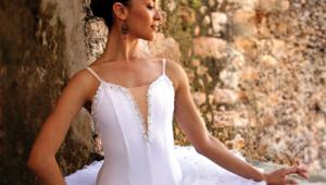
Hollywood Glamour
Color got in the way again when I made this "1940s" portrait. I
wanted to recreate the vintage black and white look of Hollywood's glamour
era.
 |
Her white kid gloves and the oversized pearls are both props that Clay Blackmore
gave to me for the picture. The portrait was created with Photogenic's
Portamaster lighting that I've been using for years. I wrapped a (Shutterbug)
magazine around the bare bulb of the main light to create the spotlight on her
face. Exposure was for the main light. A fill light, two f/stops less than the
main light, kept the shadows from going too dark.
I converted this portrait to black and white, because it screamed for it. So
many of the great publicity shots of that era were black and white. I don't
remember any of them being in color.
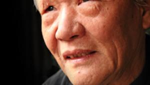
Strong Lighting
This profile of a famous composer of music also needed black and white. Certainly,
strong lighting like this window-lit portrait provides me with enough contrast
to create an exciting black and white image. If you take away the color from
flatly-lit pictures, the remaining black and white images are usually terrible.
 |
In this case the colored veins and marks on his face were a distraction. Do you retouch them out or do you change the picture to black and white, leaving in all the character of his face? This was a no-brainer. In Channels I looked at all three layers of the portrait. The green channel gave me more of what I wanted than the other two channels. A few adjustments in Levels, going to Grayscale to eliminate the color layers and then reverting again to RGB.
|
| |||||||||
- Log in or register to post comments


![]()
Get the Latest Photo Tips, News & Reviews from Shutterbug!
| Camera Reviews Other Reviews | Mobile Reviews Photography Reviews Columns | News | Features | How-To | Resources |
 © 2024 Shutterbug
AVTech Media Americas Inc., USA
All rights reserved