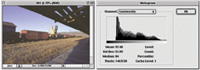
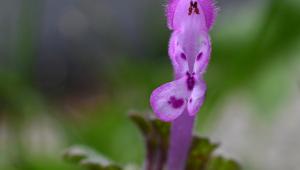
Photoshop, in one version
or another, is the image-editing application of choice by the majority
of photographers. Although it can work miracles with images, the quality
and effectiveness of the result is in large part due to what is done
initially when an image file is brought into the system. This optimization
is often called color correction, and it assumes that the desire is
to remove an unwanted color cast or color imbalance. In addition, the
information in an image file brought into Photoshop very often may not
fully utilize the color space (gamut). Color correction, then, is a
process of using the tools provided in Photoshop with the objective
of fully utilizing the color space available (gamut) and eliminating
any information which detracts from the subject.
|
|
A Good Beginning
The default Image Mode in Photoshop for photographic images is RGB. It
is the Mode in which you work for output to a connected printer. RGB Mode
is 8 bits per color channel, or 24-bit color depth, that has the maximum
potential of reproducing 1.7 million different RGB value combinations,
or that many distinct colors. Today, many capture devices and image sources
function at a greater color depth of 10, 12, 14, or 16 bits, actually
recording many more different colors than 1.7 million.
So, considering the fact some of that information captured is irrelevant
to the subject and will be eliminated as part of the color correction
process, and that the capture itself may have a smaller dynamic range
than the color space (gamut), it makes sense to color correct at the bit
depth of the original capture device, if possible. In other words, the
more information you have to begin with, the more that will be there at
the end once color correction is completed. Unfortunately, only the full
versions of Photoshop supports opening and editing images at greater than
24-bit RGB color depth. However, if you have the option of outputting
from a scanner or digital camera at the device's full bit depth
and saving in a non-compressed format like TIFF, and then using the full
version of Photoshop for color correction, you stand a better chance of
obtaining finished 24-bit RGB files with more color information preserved.
|
|
Photoshop's Color
Correction Tools
The Photoshop tools you will need and those I recommend are only four:
1. Levels
2. Curves
3. Color Balance
4. Hue/Saturation
The one overall, fundamental rule governing the use of the four tools
is that they only be used in the order they appear above. The reason is
very simple and functional, and that is: if you attempt to make a Color
Balance or Hue/Saturation change and then follow with an adjustment of
either Levels or Curves, the adjustments made with Levels or Curves will
also change the values of the color and you will have to redo Color Balance
and Hue/Saturation.
|
|
Photoshop Elements users should,
if they have not already discovered it, know that Adobe has not included
Curves in that application. So, to adjust an image's overall contrast
in Elements I would suggest using the contrast adjustments available in
the Color Variations tool by Lightening or Darkening highlights, midtones,
and shadows selectively. The Color Variations dialog provides the distinct
advantage of selecting and then making adjustments to the image on the
basis of a side by side before-and-after pair of large thumbnail windows.
After using Color Variations to adjust image contrast to provide good
detail in tones throughout the range of the photo, you will need to use
Levels (again) to be sure the gamut is optimized.
One of the utilities that is extremely valuable in all versions of Photoshop
that's accessible from the Edit menu is the Histogram. This graph
provides an indication of how the space in an image file is used by the
information contained. If there is any blank space on either side of the
black graph area that represents image data, then the space (gamut) is
not optimally utilized. This indicates you should use the Levels tool
to spread the available data out to fill the space (gamut). The Histogram
is also useful after you have made an adjustment with a tool like Color
Variations to check if its use has either compressed the image information
or
pushed some of the information out of the gamut space, which is referred
toas clipping, and which should be avoided at all costs to preserve highlight
and shadow detail information.
|
|
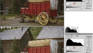
Using Photoshop Levels
To Easily Optimize An Image
The first thing to do after opening a new photo image in Photoshop is
to go to the Image menu, then Adjustments, and click on Levels. If in
the Levels dialog the graph has space at either end, then use your mouse
cursor to move the triangle under the graph in to the point the graph
indicates as the beginning of image information. Then, if the image appears
too light or dark on screen, move the center triangle to set the midpoint
farther left if the image is too dark, or farther right if too light.
Then Click OK and the image information will be expanded to fill the color
space (gamut).
Using Levels To Set
White/Black And Gray And Remove Color Casts
Many of the images acquired from scans of film and prints as well as digital
camera files often contain color casts, colors which are from a source
other than the colors of the subject of the photograph. These color cast
sources may include lighting sources like open sky or the light reflected
from the environment that introduces color to a subject's reflected
image. In scans color shifts may be caused by processing anomalies, the
film base or paper base in a print, as well as color shifts due to age
and decomposition of image dye colors.
|
|
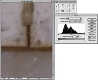
Setting White, Black,
And Middle Gray
Color casts can be removed as part of image optimization using the Eyedropper
mouse cursor tools provided in the lower right corner of the Levels dialog.
Here is where we set the White Point. After opening a new image in Photoshop
use the Navigator to zoom in to the portion of the image with the brightest
highlights so you can see the individual pixels. Also, go to the Window
menu and open the Info dialog so the Info window is on screen. Then, open
the Levels dialog and click on the far right Eyedropper icon button. Move
the mouse cursor over the pixels that make up the brightest highlights
and read the RGB values. The brightest value has the highest numeric values
and if it contains a color cast the R, G, and B values are different.
When you have identified the brightest pixel you want to set as the White
Point of the image click on it.
Next, using the Navigator,
move the enlarged view to the part of the image which has the darkest
shadows in the picture. Then click on the far left Eyedropper icon button,
and move the mouse cursor to the pixels that look the blackest. Again,
using the numeric RGB values read-out in the Info window, find the one
pixel with the lowest values--note if the values for each RGB channel
are different, and if so, that identifies a color cast. With the darkest,
lowest value pixel identified, click on it and the black point will be
set and the color cast removed.
|
|
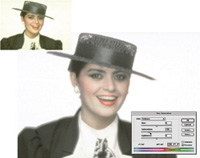
If there is an area within
a photo image which should be neutral gray, then the middle Eyedropper
icon button can be clicked, and, again, using a magnified view of that
area that should be gray, a pixel can be selected and clicked on to shift
the image values to neutral, thus removing the color cast.
In the example shown of a brick wall the scene was illuminated by an open
sky that added a blue cast to the photo, which was removed by setting
the gray point. There is a danger associated with setting the gray point,
and that is if the image does not have a mid-tone color cast all of the
values in the picture can be skewed. This is caused by misidentifying
an area in the image that "should" be gray. So, it should
not be assumed that an image must have the gray point set. Even so, scanned
images in particular may result in cleaner, brighter color by setting
the white and black points and removing any color cast exhibited at the
two ends of the range of brightness values.
Straight Talk About
Using Curves
The function of Photoshop's Curves tool is to change the relationship
of levels of image brightness and darkness relative to each other. When
you open the Curves dialog the image is represented by a straight diagonal
line from the darkest tone at the lower left corner to the lightest at
the opposite corner. (Note: With a gray scale image the Curves dialog
has inverted values with the lightest at the bottom left, and the darkest
at the top right corner.) By clicking the mouse cursor on any value within
the open image on screen a "blip" will appear on the curve
line indicating where on that line the value you clicked is located. If
you use the mouse cursor to click at that point on the curve line a dark
node will appear. The node locks that point in place unless you click
on it, then hold the mouse button down and move the node--the line
then curves in response to the movement and that part of the image will
become lighter or darker depending on whether you move the node upward
and to the left to lighten, or darker if moved downward and to the right.
To use Curves to increase contrast, first set a node at the center of
the curve line to lock in the mid-tone values, and then set a node point
at the center of the lower quadrant as well as at the center of the upper
quadrant. Then move the upper node up and to the left a little, which
will lighten the highlights of the image. Go to the bottom node and move
it down and to the right a little, which will darken the shadow values.
The result is the image appears to have more contrast as well as color
intensity.
If you have an image which is too contrasty, like a portrait that appears
too harsh with poorly defined detail in highlights and shadows, start
with the same setting of three nodes. Then, to reduce contrast reverse
the "S" curve by lowering and moving the upper node to the
right, as well as moving the lower node up and to the left.
Photoshop's Curves tool can be used to correct very specific image
problems as well as just increase or decrease contrast. In the example
of the shot of a rail-yard shop, the shadow in the foreground was originally
very dark, largely obscuring the detail of the tracks converging toward
the shop building. By setting the nodes at the mid point and at the intersection
of the top quadrant, all the mid to lighter values were locked in place.
Then, by setting a node close to the bottom of the curve line and moving
it upward the foreground was lightened opening up the detail in the shadow.
An in-between node was also set and brought down a bit to limit
the lightening to just the darkest values in the shadows.
|
|
When To Use Photoshop's
Color Balance Tool
Photoshop's Color Balance tool has its uses but they are limited
by two factors. Unlike many scanning software color balance tools, the
Photoshop tool only functions on separate Shadows, Midtones, and Highlights
portions of the image--there is no global means to adjust the overall
color balance. In addition, the tool relies on separate RGB sliders that
demand the user have an understanding of how color is structured, rather
than a more intuitive graphic single tool like a color wheel.
The Photoshop Color Balance tool does have advantages, however. In the
original portrait image shown, the subject is illuminated naturally by
light from two windows. The image had a color shift from the one window
to the far right, which resulted in greenish highlights. Using the Color
Balance tool and setting it on Highlights, I moved the Cyan/Red slider
to the Red side until the greenish shift disappeared from the highlights
and the complexion tones.
|
|
Using Photoshop's
Hue/Saturation Tool
Of all the tools to adjust color, Photoshop's Hue/Saturation tool
is both the most powerful and the most complex. Its effective use demands
as much exploration and practice as you can afford. When you activate
Hue/Saturation the dialog provides first of all the Edit choice, with
the default being "Master." If chosen it applies changes globally
to all colors in the image. At the bottom are two color bars that represent
the color spectrum. One bar is static and the other is dynamic to display
any changes input with the three sliders in the Edit section of the dialog.
The Hue slider changes the relative relationship of the two color bars
right to left. If you move the Hue slider to the right a red will become
more yellow in content, or to the left it will become a bluish red. The
Saturation slider moved to the right increases the intensity of color
and to the left reduces the saturation. The bottom slider, Lightness,
does pretty much what it says, lightens and darkens, and is only really
useful when applied to a selected color. At the top again, rather than
Master you can choose any of six bands of color, which, when selected,
activates the appearance of "brackets" between the two color
bars and facilitates selective color adjustments limited to just one color.
The range of the color band selected may be narrowed or expanded by using
the mouse cursor to move the brackets manually. The center, darker section,
is the band that receives full adjustment and the areas in brackets on
each side are a feathered space of gradually decreasing effect.
The portrait example was chosen because in people close-ups there very
often is not a pure white or black in the subject, and using the Set Black/White
Point results in an image that is too contrasty and harsh. So in this
example I used the easy Levels adjustment, leaving just a little fudge
space on the two ends of the Histogram to preserve the soft tones of the
image. However due to age of this scanned slide a yellow coloration had
occurred. So I used Hue/Saturation set on the Edit channel Yellows, and
then clicked on the yellow in the background with the mouse cursor to
adjust the position of the brackets to the actual tint of yellow in the
image.
I then moved the Saturation slider to the left, reducing the yellow saturation
until the tone values appeared gray. Sometimes if you use this method
to remove a strong color shift in an image, the adjacent colors will also
lose too much saturation. Then, move the reduction of the selected color
even 10 or 20 points farther, and switch the Edit mode to Master and increase
Saturation by moving the slider to the right until the adjacent colors
have been restored in intensity.
|
|
Multiple Selective
Color Adjustments
A common source of excess blue in a slide is when the primary light source
is open sky. Hue/Saturation was used to correct this scene of a storm
moving in from the west about midday. I set Edit to Blues, clicked on
the clouds and reduced the saturation drastically. Although the clouds
and much of the image then looked as I remembered, the wheat field was
too rusty colored, so I set Edit to Red, and clicked on the wheat in the
field. (Note: If the color is on the cusp, Photoshop will arbitrarily
rename the chosen color. In this case, "red" has been switched
to "yellow.") I then moved the Hue slider to the right to
make the color more yellow and boosted the saturation resulting in a quite
natural golden-looking rendition of the wheat field in the scene.
|