HP photosmart 7960 Printer

The debate between dye sublimation and ink jet printing has always been about the "presence" of the image, the feeling of continuous tone it imparts to the print. For some digital printmakers the dye sub route was the way to go, but ink jetters argued that the problem with dye sub is that you always have to stick to the manufacturer's proprietary paper, usually limited to glossy and perhaps matte stock. So giving up on some of the true feeling of continuous tone with ink jet was OK because the substrate choices were much greater. The various paper surfaces and feel they gave to the image overwhelmed the slight edge most dye subs give over ink jet.

This tonal exercise of an image was made from a 35mm scan and printed out on HP Glossy with Best resolution setting at 300dpi. The texture in highlights, the tonal scale, and the presence of continuous tone looks and feels like a print from an expensive dye sub printer, quite an accomplishment from a $299 ink jet.
Photos © 2003, George Schaub, All Rights Reserved

Another matter was in the image tone, or color, when it came down to doing monochrome, or even neutral black and white prints. Some printers, especially those who handled pigment inks, have a nasty habit of color shifting during dry down or when viewed under light sources different than the one under which the print was made. Metamerism, the odd name for the color shift/light source effect, became a topic of no little debate. But on the other side of the argument was the longevity of pigment ink prints, rivaling that of an archivally processed fiber-based silver print.

Printer Breakthrough
But whenever you think you hit a wall in digital, and have to compromise to get what you want at the expense of something else, someone comes along and kicks down the wall and changes the rules of the game. While there may be some matters that the new HP 7960 printer might still have to tackle, it virtually eliminates those concerns. For black and white printers it might just be a revelation.

Coming in at about $299, the latest HP printer, the 7960, delivers borderless prints up to 8.5x11" with inking options that should appeal to color and black and white photographers. It can be used, as the parlance goes, computer or computer-less. The computer-less aspect means that you can directly load images right from a memory card. Lift up the top cover and a number of slots show you two things--the amazing proliferation of memory card formats and what this has driven manufacturers to provide, and the fact that the 7960 handles virtually all of them on a direct card to printer basis.

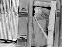
This image was made from a scanned Kodachrome circa 1976, converted to monochrome via Channel Mixer in Photoshop and printed on Legion Paper's Somerset Photo Enhanced Textured, Radiant White. We didn't load any specific profile and printed it out in RGB and got a great print the first time through. The lack of any color shift is a very happy surprise.

Setup And Ink Sets
Setup and making that first print is easy. We loaded the driver software on our diminutive iBook and made the USB connect and we were ready to go. When we put in the ink carts we chose the HP 58 (color) and 59 (gray photo) as we were looking for monochrome prints with the longest archival keeping. Tests have shown (Wilhelm Research) that this combo with HP Photo paper can yield up to 73 years without substantial shifting, good enough for us. When talking with the folks at HP we learned that when printing monochrome the color ink set contributes a bit to monochrome prints, mainly in transitional areas between black and dark gray. We found that placing ink carts was not an elegant affair, and it took us a few minutes to get it right. But it was a hot summer day and perhaps others will find our awkwardness amusing.

Direct From Card Printing
Also inside the top cover is another way to make prints--direct from digital memory cards. You can print directly from all the usual suspects--even the new, tiny xD cards. Once you place the card inside the slot the images begin to load and you can move from one to the next using simple toggle keys on the front of the unit. You can print or not and even preview all the images right on the viewer. It's not the sharpest image we've ever seen on a viewer but it's a real time-saver in making quick prints.

Color Shift Gone
The really pleasant surprise came when making prints from digital files we had previously used on the Epson 2000. The pigment ink prints were beautiful from the Epson, but suffered from metamerism, the shifting of color under different viewing conditions. The Epson produced prints that you could call "the morning after the night before" blues (or more correctly, greens). We would make a print at night under home lighting conditions and they were great. But alas, on awakening the next morning, the prints had a decidedly green cast in the cold light of day. Making prints with a magenta fill, or working with various profiles made the process unpredictable, something you want to avoid when making editions of the same print.

Although our emphasis in testing was on monochrome images we had to try a straight color shot. This image was made with a Nikon D100 in raw mode and sent over to Photoshop 7 as a TIFF. We printed it straight out at Best resolution without any tweaking in the printer settings on HP Glossy. The colors are dazzling and true with clean whites and deep, rich saturated colors throughout.

But enough about metamerism, a topic that will be moot when working with the HP. The prints the first time out from the HP were right on, with an amazing tonal scale that went from open shadow detail to slight texture in the highlights. We had made some prints from the same files using a dye sub (an expensive Kodak unit from a few years back) and a couple of Epson printers. The HP prints, with no question, matched the high-end dye sub and showed all the neutral tonality and gradation one could expect from a very good variable contrast print made on RC silver paper.

There was no dry-down effect, and there was even less of a color cast than we saw from HP on their demo of the product a few weeks previously, which had a slight magenta cast. To make sure results from one image were not skewed we printed from a variety of monochrome image files, including those saved as gray scale, as duotones, and as RGB files. The duotones matched the screen image precisely, the gray scale images were equally good, and the RGB images were great. So as not to appear snobbish we even printed out some color images and we must say they were excellent.

Regardless of whether we worked from a gray scale, RGB, or duotone mode the HP came through with true colors without shifting. This duotone mode print was made from a scanned Agfa Scala black and white slide. The sepia tone matched right up with our monitor image without any effort on our part.

Profiles And Third-Party Papers
While HP has some excellent papers (and in fact many third-party papers look great just using the printer defaults) you might want to use select paper profiles with this printer. To do so download the profile from the paper manufacturer and place it in C:\Windows\system32\ spool\drivers\color. Then in printer properties go to paper/quality and select the paper type and profile and in printer properties again go to color and select ICM color management as the color space. Like I said, you can do this if you want to but I found that going straight up yielded some great results. I tried my easy path with Legion's Concord Rag Soft White and their Somerset Photo Enhanced Textured, Radiant White and was very pleased the first print through. The instructions that came with the printer offer no clue on profiling, something we trust the company will add to their website or other literature in the future.

Tweaking The Print
The Ink and Paper setting on the print dialog box (clicking on Output Options reveals it) allows you to do some nice tweaking, and you can save the settings if they work for you. You can also set different levels of resolution (the printer defaults to Best) but we also tried the slower, and more exacting High Resolution. Doing so seemed to make little difference to us, but more discerning eyes, and more detailed images might benefit from using the High-Resolution option.

This photograph has subtle colors and tones and was made with a Minolta 3-megapixel digicam. The close to 9MB file needed some resampling to get the print up to 8.5x11" size, but you wouldn't know it from the resultant print.

Interestingly, we found that when we set Image Size in Photoshop with this printer we could get very good results at around 200dpi. The folks at HP recommend 300dpi, but again we found little difference in the images we worked with. Be safe and stick around the middle and you should do fine, but test to see what works for you. We're not sure what the lowest limit is, but this lets you get away with larger prints from smaller file sizes, which seems to open up the possibilities for a 3-megapixel camera. Our usual habit is to work at 240dpi as the lowest we would go, but at 200dpi with this printer we were pretty happy.

Another curious thing, though quickly overcome, is that you place paper face down when loading, something we're not used to with other printers. Again, we attribute this to an unusually warm day. The prints on the backside of the paper were pretty good, by the way, even though the HP logo accompanies the image.
But our biggest complaint is that this printer is not available for larger size paper...yet. After seeing the results on our 8.5x11" prints we yearned for a 13x19" capable machine. The ink system and whatever HP has done to yield such neutral, full-scale images in monochrome, and great colors in RGB, call for a lobbying effort to get this printer and its technology available to us all in a larger size.

For more information contact the HP website at www.hp.com.

For more information on Legion Papers go to www.legionpaper.com.

X