- REVIEWS
Camera Reviews 
More Reviews Mobile Reviews Photography Reviews - GALLERIES
- VIDEOS
- BUYER'S GUIDES
The Fine Art Of Online Photography: Back To School Edition
Here are a few ABCs of web design to keep in mind when working on your site. A) Add something new each week. This is doubly important for blogs because search engines look for regular activity; the more and regular activity there is, the higher it will move the site in rankings when people look for photographers. B) Bigger is not necessarily better. Large file sizes cause a page to load slowly and, as I mentioned before in this column, the longer it takes, the more likely a person visiting the site will bail. Big file sizes also means it takes longer for a search engine spider to crawl your site. C) Colors should be simple, avoiding a strong graphic or photographic background. What works in print doesn’t always look good on a backlit monitor. A site’s focus should be on your photographs, not its design.
www.williamlesch.com
Tucson-based William Lesch has photographed the natural world for more than 20 years. His cleanly designed website contains seven portfolios, divided roughly by subject matter. Clicking a portfolio name brings up a scrolling collection of images but also provides text describing how and why Lesch makes these photographs. In Aerials, for example, he talks about how he started shooting these images on the day his son got his pilot’s license, but these are far from what your mind conjures up when thinking “aerial photography.” Lesch brings a painter’s sensibility to his oft-abstract-looking images that are stunning examples of what can be accomplished within a genre too often used to sell real estate or a lifestyle. Instead Lesch takes you on a journey into the unknown with bold splashes of colors interacting with unusual, otherworldly textures.
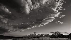
Then there’s the lushly produced Clouds portfolio that appears to have been shot with black-and-white sheet film. There is an elegance as well as seriousness of purpose at work here, as there is in all of Lesch’s work that shows the soul of a true artist, no more so than in the three collections in Painted Light. In each of these—Architecture, Landscape, and Still Life—William Lesch raises the bar, changing everything you know about the technique of light painting. They show that he is not just a master of the procedure but a visionary who knows how to use these tools to take the viewer to new places of thought and imagination.

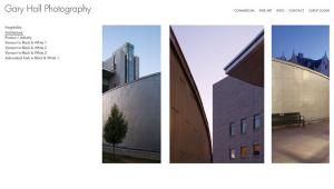
www.davidcotephotography.com
David Cote’s wonderfully clever website design focuses on eight image galleries while tucking a ninth—Portraits—under a menu at the top of the screen while seamlessly integrating a blog he calls Musings. All of this is done with a sense of style and panache with a design that enhances Cote’s impressive photography. The gallery titles are geographic but he tosses in Air Show to see if you’re paying attention. A spectacular lighthouse image got me to look at the Outer Banks – North Carolina collection and sure enough there are brilliant seascape and lighthouse photographs in sparkling color along with a few monochrome images anchored by his strong sense of composition. The Bucks County – Pennsylvania collection explodes with colorful flowers, landscapes, and carefully composed images of covered bridges.
You’ll see that same sense of color in Cote’s Saint Augustine – Florida collection as he tiptoes past gardens and old homes, leaving no trace and taking nothing but these brief glimpses in time. His images of Blue Ridge – Virginia feature bursts of Velvia-like color, although he now captures and prints all of his images digitally. Fans of HDR won’t want to miss the fall image of a water mill. It shows an amazing use of color. People are nowhere to be found in any of these photographs, giving them a sense of timelessness and tranquility, yet David Cote’s warmly captured Portraits show he’s a friendly guy occasionally producing eye-catching images, as in his portrait of “Katelynn” that focuses on her eyes.

www.clintlosee.com
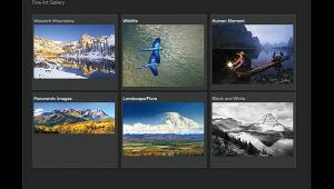
Utah-based Clint Losee specializes in scenic, landscape, and nature photography. His classy-looking website collects images into four portfolios with his latest work featured in a New Releases section. Landing on the splash page launches a slide show that gives you an idea of the breadth of Losee’s work, but you’ll need to dive into the portfolios to see its depth. Each portfolio has large thumbnails that, when clicked, open a larger image that can again be clicked to show a screen-filling photograph that allows you to appreciate the skill and attention to detail in his images. The Scenic: Landscape collection kicks off with what is normally a clichéd subject—railroad tracks into the horizon—but the square format and the beautifully rendered colors take it beyond the ordinary.
What is apparent is that even with a casual look these landscapes are deceptive. Yes, as in “River Morning,” these are pretty pictures but there is a naturalness with a touch of virtual reality that makes you feel as if you can walk into them, enjoying the warmth of the sun on your face. While his Nature portfolio is not well populated, images such as “Riverside” make the click worthwhile. Losee’s view of the urban experience is sprinkled with HDR pixie dust but photographs like “The Bridge” are imbued with the subtlety and strength of design seen in all of his photography. Clint Losee wraps it up with a nicely designed blog that has photo tips, wallpaper, and when combined with “Follow Me On Location” in the About section, gives you a peek behind the curtain of this talented photographer at work.

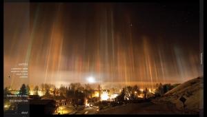
www.vincentnobel.com
September’s Blog-of-the-Month is from Ohio photographer Vincent Nobel and is a ProPhoto blog (www.prophoto.com) created using a template from NetRivet (www.netrivet.com) that does a terrific job of showcasing Nobel’s remarkable nature photography. The blog also provides access to galleries of his images, including one called Leaves that shows how even the most basic subject matter such as a simple tree leaf can be used to create art. Just look at “Maple in Stream Oil” or “Raindrops on Trail Leaf” to see examples of the Nobel touch in action: impeccable composition, dramatic lighting, and flawless craftsmanship enhance the subject matter and make a statement about something many people might just walk past without noticing.
Nobel makes you stop then look at the beauty that can be found in everyday objects. He applies a similarly elegant style in his capture of images in the Flowers collection that’s exemplified by photographs of a single white daffodil—vertical or horizontal, take your pick. Vincent Nobel’s blog should be a daily destination if only to see what’s new with him and to be inspired by the photographs and the words that he occasionally adds to them.

Note: I enjoy showcasing Shutterbug readers’ sites or blogs in this column. If you would like me to consider yours for an upcoming Web Profiles, contact me through www.joefarace.com.
- Log in or register to post comments


![]()
Get the Latest Photo Tips, News & Reviews from Shutterbug!
| Camera Reviews Other Reviews | Mobile Reviews Photography Reviews Columns | News | Features | How-To | Resources |
 © 2024 Shutterbug
AVTech Media Americas Inc., USA
All rights reserved