- REVIEWS
Camera Reviews 
More Reviews Mobile Reviews Photography Reviews - GALLERIES
- VIDEOS
- BUYER'S GUIDES
Camera Raw Workflow; Get The Best Print Quality From Digital Camera Images Page 2
Optimize Gamut |
|
 |
|
|
Step Three--Post Conversion Processing
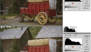
From experience I have found the Histogram display in Camera Raw is not all
that accurate, so to avoid gamut clipping I never tighten the Exposure adjustment
very much in Camera Raw. The first thing I do after clicking OK in Camera Raw
and opening the image in the Photoshop Elements work space is to open Enhance/Adjust
Lighting/Levels and finish optimizing the gamut by discarding any space in the
Histogram not filled with image information. That is really the only function
necessary to adjust a digital camera raw image file that has to be done in Standard
Edit, unless you want a larger final image size for making big prints. Because
I often make 12x18" prints on 13x19" paper, I use the Image/File
Size dialog to increase the size. I have found increasing print size at this
step in processing, and when done to a 16-bit image file, produces a smoother
result than if it is done after editing at 8 bit depth.
The remainder of the image adjustment to get to an ideal result for printing
is most efficiently and effectively done in Quick Fix. Just click on its tab
at the upper right of the Photoshop Elements screen. Before you begin go to
View at the bottom left to display and select Before and After with either a
portrait or landscape preview image. With one exception, the Auto functions
have never provided me with an ideally adjusted image, so I recommend unchecking
the Auto boxes to start fine-tuning your image with the sliders in the Lighting
box in the Quick Fix dialog at the right of your screen. The three Lighting
sliders are functionally named. So, if the Before preview display does not show
enough shadow detail, move the node to the right until it does. Then if the
highlights are a bit burned out go to the Darken Highlights slider and move
the node to the right. Very often, if these two adjustments are made to both
open the shadows and to obtain better highlight detail, the image may seem a
little flat. So, move the Midtone Contrast slider node a little to the right.
After you have obtained more contrast punch in the image, you may need to return
to the Highlight and Shadow sliders to re-adjust one or the other to obtain
a desirable balance in the internal contrast in your photograph. I think with
a little trial-and-error experience you will find you can achieve an ideal balance
that will result in a brilliant print of your photograph.
Quick Fix |
|
 |
|
|
After getting the lighting/contrast just right, very often the image colors lack intensity, so usually I find I need to increase Saturation. Occasionally, if Color Temperature was not set just right in Camera Raw, or you forgot to set it at all, you can use the Hue slider to make a minor adjustment of the color balance of the image to correct if it is too cool or warm. That leaves the Sharpen adjustment slider at the bottom of the Quick Fix tool window. After using Quick Fix numerous times to color correct and edit digital camera raw files, I find the one Auto function that works quite reliably is Sharpen. Give it a try--if you're not satisfied you can always click the Cancel button in the Sharpen window and set the slider manually.
Print/Screen Match |
|
 |
|
|
Step Four--Finishing Up And Saving
With all of the Quick Fix adjustments completed, it is time to return to Standard
Edit by clicking on the tab at the top right of the Photoshop Elements window.
The first thing to do once in the Standard Edit work space is to go to the menu
Image/Mode/Convert and go to 8 Bits/Channel to reduce the bit depth from 16
bit. Then, any post-correction editing can be applied that is not supported
in 16-bit mode. This might include some filter effects as well as cleaning up
dust and scratches or using Transform to make perspective corrections. With
all of your work done on the image you can Save As, changing the file name if
desired and selecting the file format for archiving like TIFF or Photoshop .PSD.
Step Five--Printing
Unless you extend the precise control of the workflow into the printing stage,
much of the effort invested in obtaining an ideal refined on-screen photo image
may be wasted. The reason is that the default printing options available in
printer drivers usually include automatic adjustments to the data the printer
driver receives, and which it then sends to the printer. The reason for this
is the printer manufacturers assume correctly that many users will send image
files to the printer that are significantly less than optimal, that are not
fully or carefully color corrected. So, to avoid making a bad print, the printer
driver adjusts the image to what it "senses" is ideal, which if
the file is already optimal often applies algorithms and limiters, which reduce
contrast, saturation, and brightness. This can produce a disappointing result.
Adobe's Photoshop, however, provides an alternative, allowing Elements
to control color sent to the printer via a "switch" to turn off
printer color management. To actuate Photoshop Elements to control color sent
to the printer you need to pay attention to the bottom of the Elements Print
dialog Color Management section. Where it says Print Space: click on the up/down
arrows so the system profile folder pops up, and then go down the list and select
the profile file for the printer you are using and that identifies the media
(paper type) on which you are printing. In the box below Print Space choose
the Intent: using the drop-down dialog select Perceptual. Then you can click
on the Print button.
When the printer driver dialog window appears select the media (paper) you are
using as well as print quality mode (resolution). Then go to the Color Control
or Color Management section and select Off (No Color Adjustment). Now you can
click Print to send your image to the printer which, following this workflow,
should be very satisfying indeed.
Color Space |
 |
The profile sRGB was configured and adopted over a decade ago to serve as an easy, cheap substitute for color management. It was derived from the mean average of what a typical CRT computer monitor was capable of reproducing in a range of colors. In other words, sRGB is a definition of color based on the lowest common denominator of a range of colors a typical computer monitor could reproduce over a decade ago. By limiting the color range supported using sRGB to the lowest common denominator, it assured files saved from sRGB space would be reproduced similarly by most average monitors. Adobe RGB (1998) is the recommended color space profile for use as Photoshop's work space for doing photographic processing and editing. The range of color variation defined by Adobe RGB is close to the range reproduced by scanned Ektachrome film and captured by a contemporary digital camera sensor, and is significantly "larger." This supports a greater range of color variations than sRGB. If you save a photo image from sRGB the range of colors will be approximately 30 percent less than if the image was saved from Adobe RGB. One color expert commenting on sRGB, I recall, described the color aptly as "cartoon color."
|
| |||||||||
- Log in or register to post comments


![]()
Get the Latest Photo Tips, News & Reviews from Shutterbug!
| Camera Reviews Other Reviews | Mobile Reviews Photography Reviews Columns | News | Features | How-To | Resources |
 © 2024 Shutterbug
AVTech Media Americas Inc., USA
All rights reserved