- REVIEWS
Camera Reviews 
More Reviews Mobile Reviews Photography Reviews - GALLERIES
- VIDEOS
- BUYER'S GUIDES
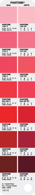
Bridging the Gap Between Solid, Process and Web Color Reproduction with PANTONE color bridge™
Pantone, Inc. has introduced an indispensable tool for accurate color communication across all forms of media -- PANTONE® color bridge™, a guide to bridge the gap between solid, process and Web color reproduction. In creating the new guide, Pantone used the latest technology and quality control techniques, resulting in a markedly improved ability to match solid PANTONE Colors in four-color process printing. PANTONE color bridge also includes data that specifies PANTONE Colors in the RGB color space and in HTML code -- ideal for cross-media publishing to the Web.
 Like
its predecessor, the PANTONE solid to process guide, PANTONE color bridge displays
a solid PANTONE Color and its four-color counterpart side-by-side. In addition
to being developed using a digital process, the book itself is now significantly
larger, as is each individual color swatch. And it is printed on a brighter,
more durable paper stock.
Like
its predecessor, the PANTONE solid to process guide, PANTONE color bridge displays
a solid PANTONE Color and its four-color counterpart side-by-side. In addition
to being developed using a digital process, the book itself is now significantly
larger, as is each individual color swatch. And it is printed on a brighter,
more durable paper stock.
The key impetus to creating a new guide was to make it "better" -- to improve the printed product and enhance the four-color representations of PANTONE Colors. Although printing color has recently been referred to in terms of "color management," the truth is that color is one area of the printing process destined to remain subjective. Every individual perceives color a little differently and so many variables come into play -- ink density, press and proof calibration, paper stock, temperature and humidity, dot gain, screen angles, and many others -- true perfection is probably something that can never be attained. But, PANTONE color bridge is an attempt to get closer to that goal by helping you get better control of your PANTONE Colors. The new guide is a long step in that direction.
A BIT OF HISTORY
The concept of the first PANTONE formula guide was relatively straightforward.
If you print a guide of ink swatches under very close tolerances, and you assign
a number to each color in the guide, you have provided a way for printers, designers
and ink manufacturers to communicate color. If you print 1,000 books and in
every one of these books PANTONE 485 looks like the same shade of red, the designer
can confidently predict that when he specifies PANTONE 485, the printer will
order PANTONE 485 from his ink supplier, and the color of the finished piece
will look very much like the sample swatch of color in the designer's
book, no matter where in the world the final piece is printed.
A simple idea -- but not so simple to implement, because the printing process itself is not perfect. The same ink color can look very different on different paper stocks and will naturally print brighter on coated stock than uncoated. And most importantly, as four-color process printing became commonplace, many of the colors in the PANTONE MATCHING SYSTEM® Publications simply could not be matched with process color inks. It was physically impossible. In modern color management terminology, some of the solid colors are "out of gamut" of the CMYK color spectrum and a perfect match was (and still is) physically impossible.
Pantone responded to this by printing the first PANTONE Process Color Simulator in 1982. The intent was to show the closest available matches to established PANTONE Colors using CMYK inks.
THE CLOSEST SIMULATION
The book effectively demonstrated the difference between solid PANTONE Colors
and the closest simulation of that color achievable with process color inks.
Using the printing process commonly used at this time, the first book was printed
using 133- line screens, paper stock with much less brightener than is used
today, and a YMCK ink rotation.
The possible color matches were severely limited because standard screen tint packages commonly used by printing companies came only in 5% increments. Pantone worked with screen manufacturers to develop a unique 26-step screen tint system labeled A-Z, designed to take into account the limitations of the human eye, which does not see color in a linear fashion. This accounts for the somewhat odd percentages (including fractions) found in the early books. The PANTONE Process Color Simulator provided a closer color match and also provided the screen manufacturers with a way to sell more screens.
Pantone updated its book in 1990 (called the PANTONE Process Color Imaging Guide), by increasing the line screen from 133 to 150 and produced the book using digital imagesetters to more accurately demonstrate the process color result using a laser-generated dot pattern. The A-Z screen tint percentages remained the same to provide compatibility with the software applications.
WHY CHANGE AGAIN?
The PANTONE solid to process guide was last updated in 1999, and advancements
in the printing process, digital imaging and paper technology have continued
to improve the way today's printers actually put ink on paper.
Many printers in 1999 were still using film-based technology and analog proofing systems. To match some of these proofing systems, printers had to make adjustments to compensate for dot gain that occurs on all printing presses. These dot gain adjustments were based on the specific printing conditions in that plant (sometimes printers used special dot gain correction curves for every press in the shop).
These curves meant that the specified 50% dot might actually be 42% when burned on the plate if the "dot gain" was about 20%, a fairly common figure in the industry. In some cases, the analog proofing material itself also had a gain factor, so the curve needed to deal with that too.
With Computer-to-Plate (CTP) systems, linear plates are common. This means a 50% dot on the proof must equal a 50% dot on the plate. That doesn't mean press gain has gone away -- it hasn't. It only means that today's digital proofs use the same press gain as the plates. A 50% dot on the proof should yield a 50% dot on the plate.
The point of all of this is that printers do not print the same way in 2005 as they did in 1999 and it is important that their color matching tools are reflect the same way they work in the "real world." Of course, what is really important is whether all of this attention to detail really does what it is supposed to do -- improve the product.
The first thing you will notice when viewing the new PANTONE color bridge guide is that there is improved accuracy in the reproduction of many of the PANTONE Colors with CMYK equivalents. The truth is, over 95% percent of the formulas have been altered in the new guides to achieve this improvement. Pantone's team used color management software to arrive at the specific color combinations and numbers for the formulas, and also visually evaluated every color and adjusted each of the 1,089 individual color matches further when necessary.
That may seem like a lot of trouble for what might be a very small improvement. But the whole concept of PANTONE color bridge is to create as accurate a color match to the PANTONE MATCHING SYSTEM Colors as printing technology and the variables of process printing allow. The net result is a closer match to the vast majority of colors in the PANTONE color bridge compared to previous editions. And for many of them, the color simulation is markedly improved.
WHAT MAKES PANTONE COLOR BRIDGE BETTER?
Here, in a nutshell, is what Pantone did to make PANTONE color bridge a better
guide:
· Used an ink set that conforms to ISO-2846-1 with strict quality control
· Used #1 grade 80 lb gloss cover paper stock. This paper is both brighter
and more durable than previous editions.
· Used current profiling software to generate starting color recipes.
· Performed both instrumental and visual QC on every color, making adjustments
where required.
· Used a new custom printing press for printing the solid ink colors.
I USE STATE-OF-THE-ART COLOR MANAGEMENT, WHY DO I NEED A PANTONE COLOR
BRIDGE GUIDE?
The merits of using PANTONE color bridge aren't really changed by color
management technology. There is no doubt color management has improved greatly
over the last few years and Pantone took advantage of state-of-the-art technology
to improve the guide. But for most people in the "real world," color
management is not the automatic plug-and-play tool some would like it to be.
There are too few people who understand how to apply ICC profiles and too many
who use color management incorrectly. Incorrectly applied profiles can be much
worse than no color management at all.
But even when you go by the numbers and do everything correctly, color management is still an imperfect tool. While we have come a long way toward putting the specialized viewing traits of the human eye into software, there is still a subjective quality to color that computers have problems discerning. Further, ICC profiles and color matching engines do not factor in the peculiarities in different parts of color space, thereby making absolute colorimetric conversions impossible. Pantone engineers' own experience creating the new guides is a case in point. Although the very best available technology and printing conditions were used, it was still necessary to "tweak" many colors after viewing them with the human eye.
Because PANTONE color bridge is visual, portable and an industry standard, it is certainly the best tool for selecting and matching colors. What could be a more reliable source of determining color than seeing that color in as close an approximation of its final form -- print -- as possible? The guide can be viewed under any lighting conditions, and the user can be assured that the up-to-date PANTONE Guide at the Chicago design studio will match the same edition used by the printer in Los Angeles and the buyer in New York.
And there's one other point: PANTONE Color Guides are often used by designers
to select "just the right color." PANTONE color bridge gives an
instantaneous answer to the question:
What will the CMYK color transformation "do" to the color I pick?
And it instantly tells designers when a transformation can't give them the results
they want. For many designers, having an ink-on-paper version of the color they
can hold in their hand, place on top of a product, and carry in their briefcase
is the ultimate form of color management. It also serves as the designer's
"contract for color" with the printer.
IF THIS IS SO MUCH BETTER, WHY ARE SOME COLORS STILL WAY OFF?
Ah, the trials of CMYK printing! The process ink pigments, unfortunately, have
a very small color gamut -- much smaller than your RGB computer monitor
and much smaller than the human eye can see. In fact, process ink pigments can
only reproduce about 50% of solid PANTONE Colors. It is simply impossible to
reproduce a wide variety of colors using the pigments in process color inks.
Once you have solid red and solid yellow, you can't make the color any
"redder." You could run the density up on the printing press, but
that would affect all of the images and could cause printing problems. Bright
oranges, extremely saturated colors, pastels and fluorescent colors are a problem
when printing with standard process color ink as these are out-of-gamut colors.
PANTONE color bridge cannot expand the gamut of process color inks. The intent of the guide is to show the person selecting the PANTONE Color -- as closely as possible -- how the color will actually print in process inks on the finished product, allowing for an informed decision as to whether the solid PANTONE Color can be printed as process or not.
On the other hand, you will notice that many of the colors in the new PANTONE color bridge guide are closer to the solid PANTONE Color than previous editions. Although the color spectrum of the inks we are dealing with is the same, a digital workflow including the ability to select screen tints for each color in 1% increments, brighter papers, printing plates with slightly less dot gain, and the slightly higher standard ink densities being commonly used, has allowed the guide's engineers to improve many of the color matches.
WHAT WILL THESE NEW FORMULAS DO TO MY EXISTING FILES?
This is a bit of a Catch-22. Pantone made new and better formulas for
many colors, and they will reproduce better on press, but the new improved color
may not match the old color that you and your customer have accepted for years.
In some cases, consistency is preferable to color fidelity.
Of course, it is quite possible to use the old formulas and tables if that is more appropriate. Pantone understood that there is an issue of legacy art, so the new PANTONE color bridge libraries supplement and co-exist with the earlier PANTONE solid to process libraries. This way, the user can choose whichever is more appropriate.
PUTTING THE LIBRARIES TO USE
Many of the most common desktop illustration and page layout programs license
the PANTONE Libraries and make them available as digital color libraries in
their applications. These include all of the Adobe CS product line (Adobe®
Illustrator®, AdobePhotoshop and Adobe InDesign®), QuarkXPress™,
CorelDRAW® and Macromedia® FreeHand®. As it is not possible for
all software companies to update their programs simultaneously, it is difficult
to know what versions of these programs will come with the new PANTONE color
bridge libraries. To solve this issue, the new libraries (PANTONE CMYK PC and
PANTONE CMYK EC) can be downloaded from the Pantone Web site at www.pantone.com.
Pantone has a comprehensive manual for installing the libraries into a wide variety of desktop applications. The manual also gives detailed instructions for opening libraries from within programs. The manual is called the PANTONE color bridge Digital Library User Guide and may be downloaded at www.pantone.com.
There is one more thing to keep in mind. The PANTONE Naming convention is to add a suffix to the PANTONE Color to indicate what might be called the "output intent" of the color. Over the years, the following suffixes have been used:
U = uncoated paper
C = coated paper
M = matte paper
CV = computer video (electronic simulation)
CVU = computer video - uncoated
CVC = computer video - coated
(CV, CVU and CVC are no longer used)
The suffixes PC and EC are for solid to process conversions and were used in
the prior versions of the PANTONE solid to process libraries
PC = PROCESS COATED
EC = EURO COATED
A SYSTEM THAT WORKS IN "THE REAL WORLD"
There is a fine line between getting the best possible color match and printing
the guide with easily achievable press settings. Standards like SWOP® (Specifications
for Web Offset Publications) and GRACOL (General Requirements for Applications
in Commercial Offset Lithography) do not use the full extent of the color gamut
achievable with CMYK inks because, by definition, the standards are an attempt
to cover the broadest range of press printing characteristics. And, of course,
the two standards themselves cover a very different color gamut (GRACOL specs
yield a higher range of achievable colors than SWOP).
SWOP standards were developed for a broad range of Web presses and #5 ground wood paper. To use SWOP for a swatchbook used by both designers and sheetfed printers would severely limit the number of achievable color matches.
Pantone produced the PANTONE color bridge guide in compliance with ISO ink standard 2846-1, and where applicable, ISO 12647-2 for printing the halftone dots. Pantone publishes the specific printing conditions used in producing the guide. The technical information is provided within the guide and is also printed here:
Technical Notes
(These are for the North American/Asian version, EURO has slight differences.)
Workflow: This guide was produced using a complete digital workflow.
Screen Tints: The digitally-produced screens were output utilizing CTP. A Euclidean dot was used.
Color Ink Set: Ink set conforms to ISO 2846-1.
Print Parameters: Where applicable, conforms to ISO 12647-2.
Print Rotation Screen Angles
1. Black (K) 45°
2. Cyan (C) 15°
3. Magenta (M) 75°
4. Yellow (Y) 90°
Target Densities
Measurements were taken with non-polarized ISO Status T reflection density filters.
Black (K) 1.75
Cyan (C) 1.40
Magenta (M) 1.45
Yellow (Y) 1.00
Establish dry-back effects before utilizing these values.
Paper Stock: # 1 grade 80 lb gloss coated cover stock
Line Screen: 175 lines per inch/69 lines per cm
Dot Gain Target Measurements
25% 50% 75%
K 16 20 15
C 13 18 14
M 13 18 14
Y 12 19 14
Dot gain is based on linear plates for a negative plate workflow.
Gray Balance Combinations
Tone C M Y
Quarter 25% 19% 19%
Mid 50% 40% 40%
Three-quarter 75% 64% 64%
Variables
Many variables in the printing process may affect color reproduction, including:
· use of CTP vs. film-based technology
· dot shape and dot gain
· print rotation, form layout
· color registration
· ink color accuracy/density
· variations in paper color, quality and texture
|
| |||||||||
- Log in or register to post comments


![]()
Get the Latest Photo Tips, News & Reviews from Shutterbug!
| Camera Reviews Other Reviews | Mobile Reviews Photography Reviews Columns | News | Features | How-To | Resources |
 © 2024 Shutterbug
AVTech Media Americas Inc., USA
All rights reserved