- REVIEWS
Camera Reviews 
More Reviews Mobile Reviews Photography Reviews - GALLERIES
- VIDEOS
- BUYER'S GUIDES
B And W Negative Scanning
A Step By Step, Easy Way To Quality Images
Scanner software driver pre-scan tools have come a long way in the last few years, but scanning black and white silver-based film negatives has remained a neglected stepchild. This is not to say some scanners don't work OK with some black and white negative films. But if you want optimum quality with all kinds of subjects and a wide range of negative characteristics, there is a better way. That way takes into account what the scanner and its software can and cannot do and how a black and white negative is very different from what a film scanner is primarily designed to scan: a slide or transparency. Density Range & Gamut Ideally this scanner conversion process should be dynamic and flexible and be able to adapt to the variations in densities, internal contrast, and characteristic curve attributes of a wide range of different film negatives. Unfortunately, the process is a single-step compromise, and that is what causes us to suggest a different approach by "doing it yourself." What I am suggesting is that you set the scanner to output the raw data directly from the CCD as if it were a positive image. You also should use the full bit depth of the sensor. After this you can adjust that information manually in Adobe Photoshop to optimize the gamut and invert the image from a negative, in "gentle stages," to a positive. After doing hundreds of black and white scans I've learned that following this course yields a much more ideal and better quality final black and white (gray scale) image file that precisely reflects the unique attributes of the image. It also takes into consideration the way it was captured and how the film was processed. The step by step black and white negative scanning technique I'll detail can be done with most contemporary film scanners and many flat-beds with a film scanning capability. This method works with units that support full-bit output of raw scan data (gray scale 10 bit, 12 bit, or 16-bit output). The software application required is a full-featured image editor that supports editing in high-bit Mode, including Photoshop 5.0 through 6.0, Corel PHOTO-PAINT, Micrografx Picture Publisher, Picture Window, and others. I will detail the procedure using Photoshop 6.0 (Photoshop Elements does not support high-bit Mode, nor does Adobe PhotoDeluxe). |
|
Step By Step B&W Film Scanning
And Processing |
|
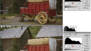
2) When the scanned image is opened in your image-editing application, it will appear as a fairly dark negative image of your subject, much like the negative appears to the eye. The first step to adjust the image is made with Image/Adjust/Levels in Photoshop (or the equivalent gamut, histogram adjustment in your application). This step's objective is to partially adjust the image data to fill more, but not all of the gamut or space available. Move the highlight indicator (triangle slider) in (left) to the first histogram indication of image information. Be watchful of the image as you move the histogram indicator slider so that no detail is lost in the lightest areas (shadows). Finally, if the darkest areas (highlights) are solid black, move the center (mid tone) indicator (triangle slider) also left, in the same direction as the highlight slider was moved, until you can see detail or tone in the darkest parts of the image. Make sure that no detail is lost in the lightest or shadow portions of the image. Now click OK. |
|
3) It's now time to change the negative image you have on screen to a positive. In Photoshop go to Image/Adjust/Invert. Usually the inversion will result in a light, low contrast image on screen, but with visible detail in both shadows and highlights. 4) With a positive image now on screen, again go to Image/Adjust/Levels, and the histogram should fill somewhat more of the space (gamut), and there should be some space with no indication of any image data on both the shadow and highlight side of the histogram. Next, move the shadow side histogram indicator (triangle slider) to the right to the point where the graph information begins to climb vertically. Then go to the highlight, right side, and move that indicator (triangle slider) left to where the graph climbs vertically indicating where image information begins. Now take a close look to see if there is sufficient detail in both highlights and shadows. If not, back the indicator (triangle slider) off, away from the graph a short distance until you see the desired amount of detail. Finally, if the image is too dark or too light in the mid tones, move the center indicator (triangle slider) left or right until you see that the mid-tone values in the on-screen image are at a desirable level, that is, that the image is neither too light nor too dark. |
|
If the negative was normally exposed and developed you should have an image on screen close to an ideal adjustment. If your final goal is an image file for printing, you may want to take this opportunity to make a small print to evaluate what you see on screen relative to print output. If either the print test or the on-screen image is not close to your goal, in Photoshop and most image editors, you can open the History Palette, or go back to successive redos step by step and then re-adjust the steps. For instance, if the inversion resulted in an extremely light on-screen image, you might want to move the mid-tone Levels adjustment further left to make the negative image lighter before inverting. Conversely, if the inversion resulted in a too-dark image with no shadow detail, move both the highlight and mid-tone sliders (triangle sliders) a little to the right, making the negative look darker. 5) At this step of the process you may have an image adjustment that cannot be improved any further, so skip this instruction and go on to Step 8. However if your image is too contrasty and there isn't as much detail in shadows or highlights as you would like, you can both lighten the shadows and darken the highlights in one step. Open Image/Adjust/Curves (Photoshop). If you have used Curves with RGB color images you should notice the graph value direction is the opposite for gray scale images in the Curves graph dialog, with highlights and shadows in opposite corners. To lower contrast anchor the graph line in the center by clicking on it, and click on the diagonal curve line 1/8 down from the top (black) and 1/8 up from the bottom (white). Move the highlight anchor point vertically up and the shadow anchor point down very slightly to create a gentle, inverted "S" curve. Check the shadows and highlights. As you move each anchor point, reduce contrast just enough to make detail visible in the highlights and shadows. (The roof of the mill was too light and there was no detail in the stone bridge to the right of the picture before applying the curve you see illustrated.) Click OK when the adjustment is complete. |
|
6) If your image on screen, after adjusting Levels, looks flat or there isn't sufficient contrast between some local tone areas, as was the case between the gulls on the pier and the water behind them, again open Image/Adjust/ Curves. Set anchor points by clicking on the diagonal graph line at the center and at 1/8 in from top and bottom. However, to create greater contrast between the light tones, move the lower, highlight anchor point down first. Then move the center, mid-tone anchor point straight up. Finally, so no shadow detail is lost, adjust the position of the top (shadow) anchor point to make a straight line from the top of the graph curve to the corner. Now you have changed the contrast in the light tones by making the incline of the lower part of the curve very steep and the upper portion of the curve now flatter, closer to horizontal, producing lower contrast. |
|
7) Occasionally, after Levels are adjusted to provide ideal overall tone distribution, one area or band of tone within an image may be either too light or too dark. In this image the grass behind the Aspen trees in the foreground was too light to be offset against the tree trunks. Again, open Image/Adjust/Curves in Photoshop, then click on the particular tone you want to make lighter or darker. A temporary marker will appear on the Curves diagonal graph line indicating the point position where that tone is represented. As long as you hold the mouse button down the marker remains, so remember the location, and let up on the mouse and move the cursor to that spot remembered on the graph line and click to set an anchor point. Then set anchor points on each side of the selected tone's anchor point. Move the cursor to the selected tone's anchor point and move it up or down at right angles to the graph line and your selected tone in the image on screen will get lighter or darker. In this instance, moving the anchor point up just a shade darkened the meadow grass making the Aspen tree trunks stand out more dramatically. |
|
8) In general, scanner drivers do not support sharpening images as part of the scanning when the output is set at the scanner's maximum bit depth. So, once you have adjusted the tone values in your image editor (Photoshop) you will want to add sharpening. With Photoshop 6.0 you can use the Filter/Sharpen/Unsharp Mask filter even when the image is in high-bit Mode. (Other image-editing applications usually do not support applying a sharpening filter to an image that is in high-bit Mode, so wait until after Step 9 to add sharpening.) When you click on the Unsharp Mask menu item, a dialog box appears providing a zoom thumbnail preview window. Just click the cursor on a part of the image that is at the plane of sharp focus and contains detail that should look sharp. With that sample now in the preview window, you can adjust the three values to sharpen the image ideally. |
|
New users tend to sharpen images too much based on screen appearance, so go lightly. The Amount control value is how strong the sharpening effect is when applied. The Radius is the size of the highlight/shadow offset of the "mask" and should be set relative to the total image size in pixels. In other words, the Radius should be smaller with a smaller image and possibly larger with a large, high-resolution image. The Threshold value shuts off sharpening on the basis of the difference between tone values between associated pixels at the distance set by the Radius. Practically, Threshold allows you to keep any sharpening from enhancing the grain in the smooth tones of a sky area, for instance, so use the slider while observing an area of light, smooth tone in the dialog's preview window. |
|
Essentially the only way to know how much sharpening to apply is to experiment using perceptual judgment first and then make a test print for a final decision. Because the screen image is dithered at anything less than 100 percent magnification it does not provide a good basis for judgment. What looks like very modest sharpening on screen may be sufficient to produce a sharp print. 9) The last step before saving the file is to reduce the bit depth from (10 bit to 16 bit) to 8-bit gray scale. Go to Image/ Mode/8 Bits/Channel, clicking on the 8-Bits menu item to reduce the bit depth. Once this is done you can click on File/ Save As, name and store your finished black and white scan, preferably as a TIFF image file. It's now ready to use once you've spotted and retouched the image to remove any dirt or blemishes. The advantage of this manual method of adjusting a high-bit gray scale positive image of a black and white film scan is that at each step you can make the adjustment in respect of the unique characteristics of the subject and the way it was recorded on film. By separating the process into three stages each change is less steep than if it were just one single, standard process. This assures smoother tone gradations and the opportunity to assure that image detail is preserved at each stage. The saving grace is that you can go back to earlier steps in the processing if you don't get an ideal result at first and modify the adjustments until it is right. This presumes that you are working with an image-editing application that supports multiple levels of redo, or the History Palette in Photoshop. The final advantage is that as you use this method, just like working in a wet darkroom printing with an enlarger, accumulated experience sharpens your perceptual judgment and the results get better and better each time you do it.
|


- Log in or register to post comments


![]()
Get the Latest Photo Tips, News & Reviews from Shutterbug!
| Camera Reviews Other Reviews | Mobile Reviews Photography Reviews Columns | News | Features | How-To | Resources |
 © 2024 Shutterbug
AVTech Media Americas Inc., USA
All rights reserved