- REVIEWS
Camera Reviews 
More Reviews Mobile Reviews Photography Reviews - GALLERIES
- VIDEOS
- BUYER'S GUIDES
After The Shoot
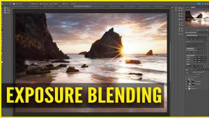
Editing Is A Mist For Digital Photography
Even if you have vowed to
never get involved in the digital imaging revolution, you've got
to admit that you probably are amazed at some of the seamless things
that can be done with photo editing programs like Adobe Photoshop. |
|||
Choose Your Weapon.
Which image-editing program to purchase? If you ever wanted to get into
the graphic arts business for real, then you're pretty much chained
to the industry stalwart, Adobe Photoshop. It's the biggest, most
expensive, and the most pervasive in the graphic arts industry. |
|||
Do you remember the exact day
when you could actually "see" the final image in your head
before you even brought the camera up to your eye? Well, you've
got to develop that same sense of visualization with the digital medium.
I've found that small images intended for web usage can be almost
absurdly high contrast, since the dynamic range of a computer monitor
is far less than that of a photo print or magazine page. Once you've
run enough color prints through your printer you'll begin to understand
the tendencies of your printer and alter both your shooting and editing
style. Since all point-and-shoot digital cameras do substantial enhancing
in the camera, you've got to try and always capture as much raw
information as possible. Once you've achieved a pure white or a
pure black in the digital world, there is no more information, so it's
super important to keep your exposure in the safety zone. I use a point-and-shoot
camera that has a very neutral color balance and doesn't do a lot
of in camera processing. While some have complained about the lack of
"punch" in the images, I like the ability to fix it myself
later, without the camera introducing extra noise or maybe even clipping
the black or white points without my knowledge. Once you know how your
camera and final output device responds, you can make those decisions
during the shoot. |
|||
Luckily for digital imagers,
you can establish a pretty foolproof "standard' right in your
computer. I keep a handful of very small files saved in the "Stan-dards"
folder on my Macintosh. I keep a bright sunny outdoors scene, a handful
of headshots in different light sources, and a couple of product shots.
I have found that even with all of my experience my eye can get fooled
by the monitor, room lighting, subject matter, etc. I'm almost embarrassed
to admit how many times I've delivered beautifully packaged CDs
of images to clients who then had to increase the contrast in order to
bring up the black or whatever. It's a subjective world we live
in, so I like to establish standards. Here's how: take the photos
that have pleased you the most when output, you know, the shots of your
kids that printed up beautifully, the still life shots that looked great,
you choose. Then shrink them down so that they only take up a few inches
of screen real estate. On a 1280x960 monitor that's about 320x240
pixels. I save them as JPEG images and name them "Portrait 1,"
"High Key Product 2," etc. When I'm editing an image,
I pull up the sample and let it sit next to my image while I'm working.
I match the flesh tones and overall gamma of the scene, so I know that
I'm working in a color environment that has proven to work in the
past. |


- Log in or register to post comments


![]()
Get the Latest Photo Tips, News & Reviews from Shutterbug!
| Camera Reviews Other Reviews | Mobile Reviews Photography Reviews Columns | News | Features | How-To | Resources |
 © 2024 Shutterbug
AVTech Media Americas Inc., USA
All rights reserved